Archive for February, 2011
Micromap Software
Posted by Gretchen in Statistics on February 28, 2011
I’ve been reading through Daniel B. Carr and Linda Williams Pickle’s recent book on micromaps – “Visualizing Data Patterns with Micromaps.”
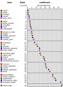
Even without the micromaps the charting recommendations are quite useful. In fact, there was one chart-type in particular that I wanted to copy for my recent buildout study data but I couldn’t figure out how to copy it in Excel. So I wrote to Carr and asked him how they produced it. Basically, it looks like a scatterplot except that it has the x and y axes flipped so that the thing being measured is labeled on the y-axis and the measurements are labeled on the x-axis. The primary thing that attracts me to this layout is the fact that you don’t have to turn your head sideways to read the labels as you would when they are on the x-axis.
You know how it is much easier to browse the book store or library when the books are lined up so you can see them head-on rather than crooking your neck to read the horizontal spines, right? Same thing with graphs. Movie rental stores, back in the days of the VHS tape, originally organized their tapes so that just the spines showed. This saves a lot of space. However, the stores got bigger and they changed their strategy so that the tapes were showing face-out to the isle. This must have increased their sales because it became the accepted practice after a while.
Anyway, Carr quickly wrote back and told me that I was a fool for still using Excel and really why the heck would anyone not use R?! No, he was really much nicer than that, actually, but I do understand his exasperation. I’ve been meaning to learn R for quite sometime. My brother tells me that I have no excuse for not learning it because it is “so easy.” So I really should. But then that didn’t stop me from continuing to look for a work around.
And I found a pretty cool work around! In fact, it’s Carr’s own software found here on the National Cancer Institute site. I was able to download the software, upload my own data into it and have a good-looking graph within 10 minutes. The software does support some changes in presentation like colors, labels, and the like but if you really need to customize a graph like this you’ll have to use R. In fact, Carr has R scripts for most of the graphs in his book and has made them available here.
New Books
I’ve just noticed a slew of new books on the market that seem like they’d be a great fit for cartographers. They are in my cart on Amazon because I haven’t quite finished the three books I’ve got on the nightstand right now. Just by way of explanation – those tutorial books are great and I always feel like every once in a while I should skim through books like that in case there’s something new that I haven’t been aware of.
On nightstand now, i.e., still plowing through:
Hopefully on nightstand soon, i.e., when the other three are all read or at least skimmed:
Calculating Area-Weighted Root Mean Square Error
Posted by Gretchen in Statistics on February 23, 2011
The area-weighted root mean square error is very useful for determining how closely variables match one another while taking into account a normalization factor – in this case, area. We often normalize by area in GIS and cartography in order to better compare one analysis unit with another. Think about a map of U.S. states: the states are such vastly different sizes that most variables, such as incidence and population, are not comparable from state to state if you simply use the raw number. Instead, you must divide the variable by the size of the state to provide an adequate comparison across states.
In yesterday’s post about using ArcMap in a creative way to make a scatterplot, you can see that area is a significant factor in my research on watersheds. For some context, these are small basins in the Pacific Northwest that we are analyzing to determine what their current impervious surface percentage is with two different datasets. One dataset is actual imperviousness as measured by 1-meter NAIP imagery analysis. The other is a derived dataset using landuse codes from tax assessor parcels to predict what current imperviousness is. Those predictions are actually based on that initial dataset, the 1-meter imperviousness, where we came up with average coefficients for how much impervious, on average, is in each landuse group.
To figure out how close they come to being the same, the closer the better, I plotted the values in a scatterplot. However, it would be nice to get an actual measure, and that’s where the area-weighted root mean square error (or RMSE) comes in.
To calculate it, I added up the total area in all the basins first. Then for each basin you determine the difference between the two variables, in other words subtract the value for one from the other. I did all this in Excel. You square those differences in another column, then in another column multiply that answer by the area of the basin. You could definitely do all this in one column, I just liked to see them separately.
Sum that last column, divide the sum with the total area of all the basins, then take the square root of that value. I presented the value as a percentage, so I multiplied this by 100.
When I used 5-meter impervious data I got an area-weighted RMSE of 1.97% and when I used the 1-meter impervious data I got an area-weighted RMSE of 1.05%. That’s really great because it means that the 1-meter data gets me more precision for the model. It still doesn’t definitely tell me how close to accurate I am getting, however, so that’s the next thing for me to explore. There’s always something!
*I’d like to thank the preeminent William Huber for suggesting these analytical procedures a few years ago when I first started doing buildout studies. Note to other solo-consultants: hiring experts in statistics and other fields to review and advise is a small expense to pay to ensure that your project is of top quality.
Making Scatterplots in ArcGIS
Posted by Gretchen in Creativity on February 22, 2011
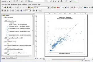
This isn’t your typical mapping task, but I am currently evaluating the effectiveness of a model that uses 1-meter impervious surface data and I needed a scatterplot. Did you know that you can actually make one in ArcGIS? It’s definitely a creative use of the software as it really isn’t a function that you just choose from a drop-down menu. What you are doing is essentially plotting your data points in x,y space.
I had a dataset of basins (aka watersheds) that had a measured imperviousness percentage based on the 1-meter impervious data – basically just an intersect between the two datasets and a summary procedure. Note you could easily do a raster zonal analysis instead, but my data were already in vector. I also had data on the percent impervious of the basins based on a model. In an ideal world the two would match. In other words, y=x.
So I had two variables: the actual impervious and the modeled impervious. Add to that a third variable: size of basin, and that’s all that needs to be on the scatterplot. I figured size of basin is important because it would make sense that larger basins would have less error than smaller basins. So I outputed those three variables into a table and then imported the table as an x,y dataset where x was the actual and y was the modeled.
I guess I should mention that I took the square root of the percentages first, before plotting them on the graph. This preserves the relationships that I’m measuring while reining in the values, so to speak. Then I symbolized by graduated symbols. These were hollow circles to help visualize overlap. I created an y=x line too, then fitted the graph axes where they should go.
Overall I’m quite pleased, both with the visualization and the results. The results show that the data do get pretty close to the y=x line for the most part. There’s quite a bit of scatter in both directions with the very small basins. However, these basins are very small. I think it is safe to say the model does not predict imperviousness in very small basins well.
I may did write an entry tomorrow on calculating the area-weighted root mean square error. That is sure to be extra-exciting! 
Odds and Ends
Firstly, I’m not so sure about that last post. The order of a choropleth legend seems trivial to me, for one. For another, as someone on twitter pointed out, we are mostly used to seeing the high value on the bottom and as someone else on twitter mentioned, low to high is a common way to present numbers.
Second, the New York Times has an interesting article, “Freelance Scholars: A Nomadic Lot” that talks about one scholar’s decision to quit her professorship to move to Rome and build a cartographic history of the urban development of Rome. She wrote a book on the subject titled The Waters of Rome.
Third, the GISCI has updated their homepage to include information about the poster contest. Don’t forget, submissions are allowed all during March, with the last day being March 31.
Choropleth Legend Format
Posted by Gretchen in Best Practices on February 17, 2011
Earlier I posted about Choropleth Limitations. Choropleth maps have legends that show how the colors (or shades of gray, perhaps) match with the values they represent. There are a few different options for the presentation of these legends. In ArcMap, the legend defaults to a vertical style with the highest value (largest number) on the bottom of the list and the lowest value is at the top of the list like this:
I often prefer to push the colors together for a continuous color scheme like this by changing the ArcMap setting to 0 for “patches (vertically).” I also sometimes prefer to change the numbers to Courier New or some other monospaced typeface since numbers line up nicely when they are placed vertically. Like this:
However, I’m currently reading through a book by Daniel B. Carr and Linda Williams Pickle called “Visualizing Data Patterns with Micromaps” that asserts that the high value should be on top since that is how we are used to reading the y axis on graphs. This would change the legend to look like this:
I like to change it up occassionally and create a horizontal legend. I would think that Carr and Pickle would be okay with this since it reads from left to right the same way you would read the x axis on a graph, from low to high:


Recent Comments