There are a lot of standards in cartography regarding font color, choice, spacing, and so on. Here are some examples of just some of the rules or standards. These are all examples from a single, poster-sized map I made a few years ago.

Black is the usual color choice for most labels. The exceptions are brown for contour labels and blue or white for water features. Bold and upper case usually denote high-importance, or at least a higher level in some sort of hierarchy. The usual advice is that the best label placement is above and to the right of the point, however, how often are you presented with a “usual case”? Not as much as you’d like! In this case it had to be up and to the left as that was the only place the label would fit without crossing any of the other features.
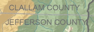
This isn’t a major rule, but it is nice to put county labels next to the county line that they belong to. This is especially effective when (as in this case) there are a lot of other labels on the map. If I had put the county labels in the center of the county they would have been mixed up with the watershed labels that are also on there.
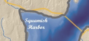
Here the harbor label is in a script font. Usually water features are labeled in white or blue, and in this case only white would do, since the bathymetry is shown in such a deep, dark, shade. Water features can also be written in simple italics instead of script – but remember that it is always nicer to use a font family that includes its own italics face as opposed to using a regular typeface with the italics converter (see Type Tips).
Here’s another example of positioning. The label “BELFAIR” could not be positioned anywhere except above and to the left of the point feature. In this case if the label had been above and to the right it would have crossed the watershed line and also been half-way inside the much lighter background portion of the map.
This label, which is for a watershed name, is not in all caps in order to distinguish it from the county labels. It still had to stand out from the dark green hillshade underneath, necessitating the white shadow.
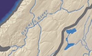
The usual advice for river labels is to make sure they are above the line because words generally have more ascenders than descenders. If you were to put it below the line the ascenders would vary the spacing between the feature and the lettering enough to make it look sloppy. When placing above the line, however, you still need to be mindful of the descenders so the label ought to be placed far enough above it so that the descender does not cross the feature (though as usual we can find effective counter-examples). Another bit of advice is to find the straightest portion of the river to place the label. However, in this case, this river has virtually no straight stretches. Finally, the label here could have been a bit darker in hue so that the second “t” doesn’t get lost on the tributary line.


Recent Comments