Archive for March, 2011
Small Multiples
There are several applications to GIS of the small multiples principle explained by Tufte in “Envisioning Information” and elsewhere.
The obvious application that comes to mind is the visualization of a time series. Sure, you can animate a time series instead, but then there’s the concern that the lack of ability to flick the eye back and forth between moments in time impedes the analysis process. Rather, a better method, if it is doable with your data, is to present the data in the same way in many small maps shown very close to each other.
When attempting small multiples you want the maps to be as close together as possible because the less time your eye needs to sweep from map to map the easier it is to make inferences about the whole dataset. They also commonly have the same spatial extent.
There are other uses for small multiples other than time series depictions. I’ve created quite a few small multiples layouts in my career as a GIS analyst. Here’s a few of them here.
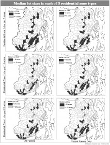
This one illustrates how you can present a variable in a chart-like fashion to show change on two axes. This one was done in 2006. If I were to do it over again I would definitely get rid of all those boxes around the maps. They don’t help.
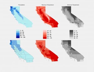
Another small multiples project involved presenting three variables in California with each variable presented first as a continuous raster and second as an area-normalized county breakdown. The legend is shared by the raster and the county maps so it can go in the middle.
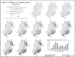
And here’s an example of the time-series small multiples layout. I like having the addition of graphs and charts on the same layout when needed. This one doesn’t have any bounding boxes around the individual maps – much better.
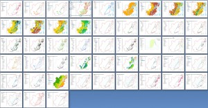
Then there’s the inadvertent small multiples layout that I made just the other day. I wanted to show off some map work that I had just completed on twitpic. All the maps were in a Word document so to show all 48 maps at the same time I just viewed them at about 10% scale or so and took a screen shot. It turns out to give a nice overview of all the different datasets in that project on one screen. A twitter friend mentioned that it was like Tufte’s small multiples, which then gave me the idea to write…guess…this blog post.
So if there is anyway that you can utilize the small multiples concept in your current or forthcoming projects I think you can see that it will make a big contribution. By allowing your map readers to “see” the data and analyze it with their own eye a great deal of credibility can be earned and perhaps even a few new conclusions.
Liven It Up a Little
Posted by Gretchen in Inspiration on March 29, 2011
Whether you are making a presentation or making a map, these sites can inspire you to make it interesting:
Your Content Doesn’t Have to be Boring
Watch the Simmons clip. My favorite part? Where he says, “electronic devices, even the cool ones, have to be turned off during take off and landing.”
Xtranormal Movie Maker
Make a short clip to show off at the beginning or end of your next meeting (even a scrum!). @Taliesn once made one of these where the Queen of England says that I was the best speaker at Ignite Spatial NoCo but alas, I don’t think he ever made it public. 
slide:ology: The Art and Science of Creating Great Presentations
This book, by Nancy Duarte, is great for teaching you how to make lively presentations that people will actually listen to. Mine is often thumbed-through!
On Putting Boxes Around Elements
Posted by Gretchen in Best Practices on March 28, 2011
Putting an “organizing” box around all the elements on a map layout add unnecessary clutter and distracts from the map elements. If you must have separators between elements then use less obtrusive ones like a series of dots. The second map shown here illustrates how big a difference the map layout can look when you take the boxes away.
Map Merchandise Mania
Etsy is a great place to go to buy something unique. I’ve gotten some great things through them. However, today I decided to scour the Etsy items for some crazy map merchandise!

This is a poster being sold on Etsy by delovelyArts. The description is great: “This 11″x14″ print would be a lovely addition to any room in your home.
(Especially if your from Illinois)” Now that’s creative!

Here’s a men’s shirt with a map of “West German Land Usage” on it. Who knew? A while back I made a map of soybean production in the Midwestern U.S. I should have put it on a t-shirt! Darn, I missed that money-making opportunity.

This is a Map of America Necklace. It’s actually kind of cool, really. But to wear it as a necklace? In public? Not so sure. Maybe to the next Ignite Spatial NoCo…

I don’t think I could say enough about this teething toy shaped like Oklahoma. Please tell me what YOU think about it in the comments. Please? Please?
Type Tips II
Posted by Gretchen in Typography on March 23, 2011
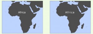
White text on a dark background is easier to read if you increase the letterspacing (called character spacing in ArcGIS). The map on the left has normal letterspacing while the map on the right has letterspacing of +25.
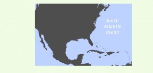
A great, free font to use for streams, lakes, rivers, and oceans is Delicious Italics, shown in the map below (link to download location). This is a true italic, not just a slanted version of the regular version.
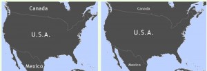
If you combine different point sizes on the same map, make the differences DRAMATIC, like in the map on the right.
*If you liked this post you might also like Typography Rules: A Pictorial Tutorial
Japan Crisis Maps: A Tweet Roundup
Tweets dealing with Japan, GIS, and Cartography, tweeted on March 21, 2011:
Esri Esri
How much did Japan shift? Hardest hit area 17 feet. http://bit.ly/shiftmap #jpquake #esri #usgs #nasa
GEOpdx Justin C. Houk
Radiation visualizations paint a different picture of Japan http://j.mp/dDYXR0
geometrus geometrus
USGS poster about the earthquake in Japan (JPG) http://earthquake.usgs.gov/earthquakes/eqarchives/poster/2011/20110311.php
rob_earthware Rob Davis
by geospatialnews
@geospatialnews See the build up of #quake sequences leading to the March #tsunami in this interactive map http://bit.ly/fYT0zV
GOOD GOOD
Map: see #Japan get battered by 572 #earthquakes in eight days http://su.pr/73f3kR
wblau Wolfgang Blau
Map: The size of the area that has been devastated by the tsunami and the earthquake in Japan, compared to Germany: http://bit.ly/eDL7OD
AifricsWorld AifricsWorld
World map showing many #nuclear plants in #earthquake zones, the red areas indicating the most dangerous> http://bit.ly/fMNztR #japan
Did I miss any good ones?



Recent Comments