Archive for March, 2011
Web Map Usability: Don’t Take Away Features Just Yet!
A Web map needs to be easy to use. Duh. Easy enough concept, but how do you really implement it? You can use usability testing when the Web map is finished but when just starting a project, what principles do you go by in order to achieve this ease of use that everyone so (rightly) covets?
One thing you should not do: get rid of features solely for the sake of simplification. In fact, Donald Norman, the author of several design books, says, “simplicity does not mean fewer features.” To argue his point he talks about tools that are very simplistic in design but yet take a while to learn how to use. A pencil would be a good example of this. Other objects that are simplistic just don’t do very much, like a garage door opener. Yet other objects are simple yet are fairly hard to figure out like a pair of salt and pepper shakers where you can’t determine which is which.
One thing you should do: organize the features in a logical way. Norman’s example for this is an airplane cockpit. There are a whole lot of buttons, levers, and other devices in there but they are organized in such a way as to enhance the usability of the cockpit. I’m not sure that he is arguing that a cockpit is simple, since it seems fairly clear that it is not. However, the central thesis is that
Taking away features increases usability but decreases functionality, and is not really necessary. (In my own words.)
If you can, instead, figure out a way to integrate, blend, and organize those features, you can keep the functionality and increase the usability at the same time!
Somewhat Related:
Take the American FactFinder website – the new version. I tried to use it about a month ago, had some trouble figuring it out*, went to the help feature, and discovered the most unhelpful help ever. No actually, I take that back. Most help files are extremely unhelpful. You know why? Because they simply state the obvious. I want to yell at the help and say things like, “Yes I knew that the box that says ‘parameters’ is the place where I type my parameters, but what I want to know is what the h*$% is a parameter and is there a list of them somewhere?”
*I just discovered that I am not alone in having trouble using it so I feel less like an idiot now.
Not to Complicate Things but…More on Complexity
The other day I posted a checklist of things to evaluate when reviewing a finished map product. There’s a sub-section titled CLUTTER, with most of the items hinting that more is less, complexity is bad, and clutter is worse. There is one item, however, that speaks to the idea that the map ought to have all the layers of information on it that is needed. With that item I was hoping to convey the idea that one shouldn’t take away too much just for the sake of decluttering.
A few years ago I posted a map on Cartotalk for review and was quickly informed that the background had too much white-space. The original idea behind the white-space was, of course, to keep the map simple and uncluttered. But the critics were right in that having some sort of background, even a simple one, gives the impression that there’s something back there. The map reader needed context.
In Donald Norman’s “Living with Complexity” he states, “One fundamental principle is that there is a preferred range of complexity: things that are too simple are boring, shallow. Things that are too complex are confusing, upsetting. People prefer an intermediate level of complexity.”
Map Display Location, Location, Location
Posted by Gretchen in Best Practices on March 16, 2011
We should be thinking not just about the effectiveness of our cartographic products in terms of what they look like and how well they transfer information, but also in how often we get them in front of the right readers and where.
We just got back from a short trip to Breckenridge where my kids and husband went skiing*. They told me that the lifts have maps that show up in front of you while you ride the lift, attached to the safety bar. What a great idea! This way you don’t have people trying to get their paper maps our of their ski coats, accidentally dropping them on the skiers below, or trying to hold them with freezing hands. You simply have the slope map right in front of you at the exact time when you need it!
Have you put some thought into how you can get your latest mapping effort in front of the most readers in the most convenient way?
*It seems I’ve had to explain this a million times lately, but I’ll give it one more go: I skied as a kid quite a bit and wound up hating it due to a long series of minor disasters that finally built up into an admonition that I will never ski again. So as an adult I took up snowboarding and, after two years of trying and never getting the hang of it, I finally gave up. The final blow was, well…a blow to the head, and I have never snowboarded again. It really isn’t worth paying $100 for a lift ticket to slowly glide down on my edge, on a green, all day. So instead of skiing, I read Donald Norman’s new book Living With Complexity and Ellen Lupton’s Thinking with Type. Both great reads!
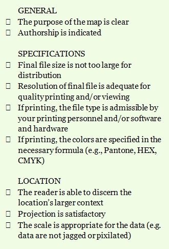
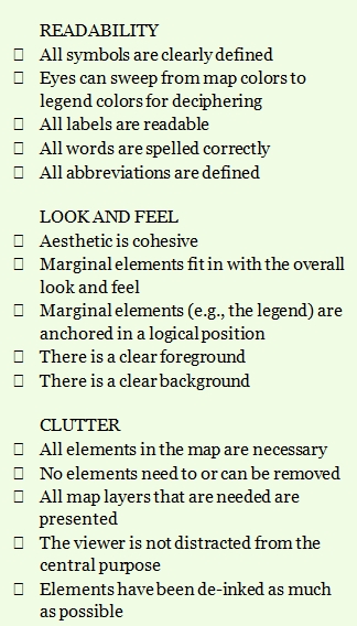
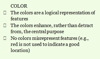
Map Evaluation Checklist
This list can help you evaluate the effectiveness of a map as well as help guide you during the design and implementation phase. If there are worthy additions to be made, please let us know in the comments.
When Creativity Goes Too Far
A new map for Loch Lomond National Park in Scotland was apparently too creative for the locals to stomach. The story is here. (For those of us not in Scotland, I finally figured out that “giro” means something like “scrounger” – a giro is an unemployment check in Britain.) They also named places after current park employees.
This one has nothing to do with maps but goes with the topic: @BillNigh on twitter said today, “Ice cream with pretzels and potato chips embedded in it? I don’t know how you pull that off successfully, but good luck with that.”


Recent Comments