Archive for category Best Practices
Open Discussion Concerning the Best Way to Manage Complex Layer Styling
Posted by G.P. in Best Practices on February 16, 2019
I was ranting earlier this week about project organization. It’s the same old same old. Even in the days where you used ArcView 3.2 (right, because everyone is as old as I am) there were project organization issues. Where do you put data that is shared between projects and where do you put the data that you computed specifically as an intermediate to some final dataset in just one project? We also had the more cartographically centered project tidying but not as much. We didn’t have as many datasets or features to work with, as a general rule, as we do now so an ArcView project would have at most maybe 20 layers and those were easy enough to sort out.
Now I work with OpenStreetMap data with innumerable features and feature combinations in a tiled environment using Fresco or Maputnik and the layer list can get very very very long. There are ways to lessen the length of the layer list, using Mapbox GL expressions to combine things, or using variable names in the icon properties, for example. However, sometimes it is easier to keep them separate so you can see, at a glance, that this is where you’ve put the styling for the pagoda icon so this is where you would need to make it bigger or smaller. Speaking of pagodas, this is where I show off the pagoda icon I just styled up in Inkscape:
![]()
I mean, this is what life is about. (But honestly I love styling things like this.)
If we talk just about hydro lines you can really see what I’m talking about. Within the general class of features referred to in my data as “hydro lines.” I’ve got to style rivers, streams, damns, and dikes in different ways. So far so easy. But I just added in a new class that I had forgotten about earlier: canals. Then there came the realization that canals can be on the surface or underground. Guess what? They can also be intermittent or perennial. Canals are usually portrayed with a casing just like roads so that adds yet another layer of complexity. Remember your 5th grade combinations in math? Once we multiply all these potential outcomes together we get roughly 200 ways to style a canal. Or something like that. (Ok, 6.) But that’s just for canals. Now you add in those variables for the rivers and streams and you get a lot of styling layers that go under the main heading “hydro lines.”
Now try tweaking the size of one of those hydro lines layers. And then try to figure out how it fits into the overall hydro line picture so that you know what else needs to be tweaked. If I increase the width of the intermittent canal I should also increase the width of the perennial canal and so on and so forth.
One way to keep track of all of this is with a spec sheet. These are brilliant and have been used by Mapbox and others in their work. Graser and I discuss these a bit in QGIS Map Design. Here’s our example of a portion of one:
However, they are best to create at the end of a project to illustrate components rather than during the design phase, where one would need an automated process for creating it to keep it always up to date.
On twitter this week, when I was espousing the idea of a Toyota Production System type of process for maps (merely musing, mind you, there isn’t any that I know of at this time), @danrademacher mentioned that he’s used an auto png renderer to spit out test places at many zooms and locations so that things can be examined as you go. @mojodna mentioned that github.com/stamen/vignette was used for this. This doesn’t help organize layers in a project but it does help quality control by dint of providing easy to view comparisons between places and iterations.
@emacgillavry brought up an oldie but goodie: the ScaleMaster spreadsheets by @ColorBrewer. This is more what I had in mind, and I’ve used them successfully for a previous project that used less data. However, I have yet to figure out a way to adequately spreadsheet a list of layers, sublayers, subcategories (underground/overground, intermittent/perennial), zoom levels, casings vs. overlays, and widths. This is what should all be kept track of. At this point I kind of throw my hands in the air and say, hey what about creating a super-complex radial diagram? Something akin to Nadieh Bremer’s work here: https://www.visualcinnamon.com/portfolio/olympic-feathers. Anyone up for the challenge? 😀 (All automatically generated of course.)
Edited to add:
What about a button in the software that “links” certain datasets together programmatically? When one width is increased, they are all increased commensurately. When one width is decreased, they are all decreased commensurately. When you want to change the width of one without changing the others, you unlink them first.
Slow Carto
Posted by G.P. in Best Practices on May 7, 2018
It’s okay to work slowly. Thoroughly. Tangentially. Thoughtfully.
Faced with programming problems that seem to need immediate solving, cartographic deadlines, and server configuration conundrums, what motivates is usually the end-goal: the map product to be served up to the customers. Needing to get to that goal as quickly as possible isn’t everyone’s hang-up but it is mine, and might be yours too.
Giving oneself permission to pour a cup of tea, listen to slow music, and simply explore the issue for an hour or even a day provides such a richness, a broadness, of education, that it could be likened to the learning experiences absorbed when vacationing abroad rather than close to home.
Perfection is attained by slow degrees; it requires the hand of time. -Voltaire

Map credit: Regional Food from Capital Country Villages , by illustrator Tiffanie Brown
————–
A note on working slowly. https://t.co/ItV2KDYqNR
— Gretchen Peterson (@PetersonGIS) May 7, 2018
So true.
— Régis Haubourg (@RegisHaubourg) May 7, 2018
“Give me six hours to chop down a tree and I will spend the first four sharpening the axe.” -Abraham Lincoln
— brandyn friedly (@brandynfriedly) May 13, 2018
Map Take-Aways
Posted by G.P. in Best Practices on April 20, 2017
One key to cartographic success is employing a deft mixture of subtle and forthright elements in order to achieve that most difficult of harmonizations: effortless yet highly informative communication. Here’s an example that came up in my twitter thread just a few moments ago:
Fun read from @TheInTowner about the creation of DC’s 1950 Comprehensive Plan. #ThrowbackThursday https://t.co/lKhmzOr73w pic.twitter.com/yeDtAAnKRH
— NCPC (@NCPCgov) April 20, 2017
Here we see several elements that help to achieve the right balance:
- Masked basemap: focuses reader attention on the area of interest while also providing geographic context.
- Gray titling: “DISTRICT OF COLUMBIA” is in a light gray color, which minimizes its appearance despite its being diffused across the legend box. You see this often with titles in all-caps.
- Black titling: “LAND USE PLAN” is what the map author really wants you to read first, so this is both in black and all-caps.
- Legend box in light gray: since the light-gray text elements could blend with the light-gray masked basemap, the legend box is needed in this case, but it is kept subtle.
- Bold colors for the landuses: landuse plan maps are notorious for their cartographic difficulty in that the combination of landuses and basemap information can make for an entirely cluttered aesthetic. Making the landuses the number one focus point was a good idea for this map.
- Polygon boundary colors in slightly darker shades: slightly darker polygon boundaries in the same hue as the polygons helps to define the boundaries of the polygons while not overwhelming the map. Black boundaries on all polygons would not have served well here.
On the importance of rapid information transmittal
Posted by G.P. in Best Practices on June 30, 2016
While reading this news piece on bitcoin this morning I came across this chart:

Just the top portion of the chart
Since this was some quick pre-work reading on a subject I follow from time to time but don’t study in-depth, I spent only about 5 seconds looking at the chart before I determined that it would be too much effort to understand. I thought to myself, “I know this chart is probably revealing some amazing truths and is well-done, because I trust the New York Times Graphics Department, but I’m not going to take the time to understand it this morning.”
This was a huge reminder to myself that this is precisely the way that 99% of map readers react to complex maps that they see. The lesson? If you want the majority of the readers to understand something at a glance, keep it as close to a normal, popularly familiar, map style as possible. But, you say that you are a leader in the cartography field who’s job it is to come up with fancy new visualizations?
While it may be true that only the lead dog sees the landscape (hat tip Alan Weiss), the lead dog has to navigate and interpret that landscape for its pack. Likewise, a cartography leader needs to make sure that his/her followers understand the map quickly and clearly.
Here’s a map-based example. I think that the map shown here is a little too strange to invite a quick interpretation for the reader overall. Furthermore, the legend info pertaining to the colors is actually found in the article text whereas it would have been nice to have it also accompanying the map:

Tax map
(Please note: I never want to discourage innovation nor do I ever want to discourage individuals from publishing for fear of getting critiques like this. While I am critiquing the amount of time it takes to interpret this map I do like the varying transparency, the subtle background color, the thin white lines to unobtrusively denote county boundaries, and the use of orange as a counterpoint to the blue. There are many successful things about the map and I always think to myself that it could just be me having trouble with the other bits and that there’s a possibility everyone else completely understands this thing at a moment’s glance. TLDR: this is just one persons opinion and likely to be wrong.)
So what do you do if you still want to use one or many innovative visualization techniques in your cartography?
Answer 1: That’s perfectly okay if the map can be interpreted very quickly despite the fact that it looks different than what we’re used to. Hint.fm/wind comes to mind as an excellent example of a new technique that was actually easier to understand than any prior techniques for showing wind.
Answer 2: Leave the more complex cartographic innovation for media that invites longer perusal such as, but not by any means limited to:
- Map focused books
- The Sunday magazine instead of the regular paper
- Scholarly articles
- Twitter map nerd feeds
- Advanced conference tracks
- Github repositories
- Educational tutorials
——————-
On the Importance of Rapid Information Transmittal https://t.co/OJRDTRxTrv #cartography
— Gretchen Peterson (@PetersonGIS) June 30, 2016
Always, always keep in mind that the patience of the audience is much more limited than the patience of the creator https://t.co/dsYdsFXYyk
— Brian Timoney (@briantimoney) June 30, 2016
Visual thresholds for cartographic features
Posted by G.P. in Best Practices on December 4, 2015
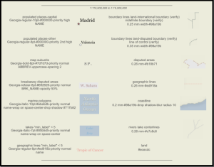
I was surfing posts on GIS stack exchange, as one does, when I came across this post featuring a French textbook figure on cartographic visual constraints. It’s a handy little reference piece on minimum point sizes, gap widths, line widths, area differentiation thresholds, and so on, so I translated it to English to share with you here.

I’m not by any means a French speaker so if you see any problems with the translation please let me know and I will fix the graphic. (Edited 12/10/15 as per Bennett’s comment below.) I’ve left the commas instead of replacing them with periods, due entirely to laziness and my faith in your intellectual agility.
Visual thresholds for cartographic features https://t.co/7SXFTaU4S3
— Gretchen Peterson (@PetersonGIS) December 4, 2015
Because Halos
Posted by G.P. in Best Practices on December 18, 2014
Mostly, halos around labels on maps look bad. Especially when they are large and in high-contrast with the background. For example:

We typically prefer what has been referred to recently as masking halos. These are fairly thin and match the background color. For example:

Any questions?

-
You are currently browsing the archives for the Best Practices category.
The Books


Recent Comments