Archive for April, 2011
Conference Goings-On
I spent two days in Olympia, WA (well, okay, actually it was in “Grand Mound,” WA) this week at the salmon recovery conference. It was held at Great Wolf Lodge which created an interesting dichotomy considering there was a conference being held in one part of the facility and there was a waterpark full of children in the other half, complete with Radio Disney being piped everywhere. Some of the conference goers did venture to the waterpark. In fact, one of them was spotted in a suit and flip flops.
I was thrilled to share a booth space with Leaping Frog Films. Cool movies, cool people. You can order their short educational movies online or hire them to make a movie for your organization. I didn’t give out much except a large postcard, on recycled paper of course, touting my GIS services, another postcard showing off my husband’s company Mapbiquity, and some custom pens. The pens were a big hit but their efficacy has yet to be determined. At any rate, it is fun to give away pens. Another company was giving away chapstick with their company name on them. That was a nice idea.
While there I met with a new client (who wasn’t part of the conference but happens to work very nearby) and it made me think about how important it is to listen, process, and be comfortable to ask the right questions. Sometimes this is just a matter of compatibility between people and sometimes it is a matter of the consultant needing to feel like they are on a peer-level with their clients or potential clients. If you don’t feel like you are on a peer-level you can sometimes promise too much or be hesitant to ask the “dumb”, but necessary, questions that an outsider needs to ask. Remember, the client is immersed in their business so they simply cannot tell everything a newbie needs to know about it and you will have to ask those questions. Never feel like those “easy” questions are too dumb to ask or you get into a lot of trouble (at worst) or do a lot of extra, unneeded, work (at best).
It was also wonderful to see all the folks from one of my oldest clients and hang out with them. I do most of my work remotely so it is nice to reconnect face-to-face every once in a while. I firmly believe it is worth it to make that effort with your far-flung clients. Maybe that is why I’ve had the pleasure to help them with their GIS work since 2003. Most importantly, I learned at the conference that there are a huge number of people who are working toward bettering salmonid habitat in the Pacific Northwest and they will be the ones who we can thank many years from now for having helped to bolster and protect that important natural, cultural, and culinary resource!
Type For Maps Movie Preview
Posted by Gretchen in Booklet, Typography on April 20, 2011
Head over to the booklets page to see a complete preview of Type For Maps. I always wish I could flip through a book on-line like you can at the bookstore (of course, you can do this with some, but not all, books on Amazon) so I created a virtual flip-through for you. You can see each page at a glance this way to get a much better idea of what is in it. I really do believe this booklet is something every GIS professional and cartographer ought to have in their back pocket. Barring that, it would be good if every GIS professional and cartographer had it on their computer. 
Those of you who have already bought it, it would be great if you could leave comments here so that others who are considering the purchase can make a more informed decision. Thank you so much.
Type For Maps E-Booklet Is Now Available
Posted by Gretchen in Booklet, Typography on April 19, 2011
Type For Maps, my newest e-booklet is now completed and ready to help you choose a typeface for your next mapping project!
WHAT IT IS: 50 fonts showcased on 25 pages – two per page – in a way that makes it easy for you to flip through and select something you can use. There are 20 system fonts described and illustrated. By system font I mean fonts that you are likely to have on your PC. There are 20 free fonts described and illustrated. Free fonts can sometimes be of poor quality. The ones described in this booklet are great for mapping and of high quality. There are 10 for-fee fonts described and illustrated. Sometimes it is best to pay a little bit of money to get a very good font with a lot of options. Cartographers often need condensed fonts for creating teeny-tiny labels and/or typefaces that have a lot of varieties such as bold, italic, small caps, etc and these for-fee fonts fit the bill.
I want to give a huge THANK YOU to the two primary reviewers: Hans van der Maarel, of RedGeographics and Franςois Goulet, of FG Cartographix.
I do not have the website updated with the booklet information yet. Booklet Page For More Information and a Complete Preview. If you would like to purchase it right now please, by all means, do so! I want it out there in the world, helping GISers and cartographers RIGHT NOW! It is 38 pages total and costs $9.95. It is a pdf, 7.5 mb. Just click the Add To Cart button and it’ll take care of the purchase and automatically send you the file.

A sample booklet page is shown here.

Edited to add some early praise for Type For Maps via twitter:
@geometrus
awesome as usual – will buy one in a moment! RT @petersongis: The Type For Maps E-Booklet is now available! http://bit.ly/gI3xNi
@aspectbusiness Sarah Palmer
Whoot .. got it! ‘Type for Maps’ an excellent compliment to ‘Colors for Maps’ … Very cool 
@amandahstaub Amanda Taub
Yeah! It has finally arrived! RT @PetersonGIS: The Type For Maps E-Booklet is now available! http://bit.ly/gI3xNi
elliothartley Elliot Hartley
Needed some #GIS inspiration for a new project so purchased @PetersonGIS Color and Type for #Maps, looks good! http://ow.ly/4GZbt
Edited again to add praise via email:
Hello Gretchen,
It’s great to have access to a resource which has been put together by someone in the biz. Have also been putting your GIS Carto. book through it’s paces. Money well spent from my perspective! Just wanted to pass on a big Thank You! for making both references available for those of us in need of a bit of guidance\inspiration. A wonderful resource that I’m putting to use, immediately!
All the best,
Jamie Whitters
Thanks everyone! I welcome any/all feedback.
Lazy Design
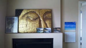
Looking at the mantle above the fireplace in my office is discomfiting. The five objects displayed were placed there unceremoniously when we moved into this house two years ago and they have not been moved since. On the bright side, it gives me a great platform to review some map design principles.
- WHO’S WOLF PICTURE IS THAT ANYWAY? The wolf picture belongs to another member of the family and really isn’t “me” but I put it up there anyway. This is what happens when you put things on a map to appease other people: they don’t match and you don’t care whether they look good or not because they aren’t yours. Logos, I’m looking at you. We are often forced to put logos on maps that just don’t integrate well but we do it because we have to. Try to at least change the positioning even if you can’t change the shape or colors of those logos.
- DID I REALLY COVER UP THE BUDDHA’S NOSE? It seems like the eyes and nose of the Buddha are probably the major aspects of the whole design, yet I covered up the nose anyway. Figure out what the best part, the most central idea, the biggest bang part of your map is and highlight it, don’t hide it.
- WHY ARE THE THREE WATERCOLORS SEPARATED? The three watercolors are by the same artist and on the same subject. They should be grouped together – especially since there are three of them (architect’s rule of three!). If you have similar elements on the map that can be grouped together, do so in groups of 3 or 5. This works well in map legends. If you’ve got 5 road types put them all together, slightly separated from the other legend items, for example.
- TOO MUCH CLUTTER? Even though there are 5 items grouped on the mantle (see above) it still looks bad. There are too many items. What would look best is just the Buddha with maybe two simple vases, one tall and one short, hanging out next to it. That would be three objects and the vases wouldn’t compete with the Buddha. If you can get rid of things on the map that don’t add value then take them off. If you get rid of too much (notice how I didn’t say I should only have the Buddha – no, it could have those companion vases) then it’ll be boring and bare.
- TOO FLAT? All those pictures are flat. A good map design can have many shapes and textures as long as they are all integrated into the big picture.
Type For Maps: A Sneak Peek
I’m still working extremely diligently to try and get Type For Maps out to reviewers by the end of today. If that doesn’t happen it’ll be by the end of tomorrow at the latest. There are always so many little details to go over like alignment, fact checking, and text edits that you don’t necessarily want to think about at the beginning of the project but that, nevertheless, have to get done. There’s also the small problem of one of the fonts – one that is widely used and respected – not appearing correctly on my screen. I believe the designer has posted a faulty download file so I’ll have to get that resolved.
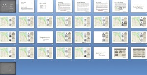
Here’s a sneak-peek at the booklet in layout mode:

Crossing-fingers for a publication date of Tuesday, April 19, 2011!!!


Recent Comments