Archive for category Design
Using Seamless Images in Cartography
Occasionally the cartographer comes across a need for a seamless image, seamless pattern, or seamless texture. A seamless image is one that, when duplicated and set side-to-side with the original, creates a larger image that does not have any visible boundary between the two smaller images. They are also called repeating patterns.
Here are three examples of this in action.
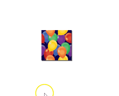
New Year’s Map Balloons Image

I searched for the above image on istockphoto with the keywords “seamless balloons.” Try searching for seamless images yourself. Notice that the balloons on the sides of the image are not whole. They don’t become whole balloons until the image is pieced together like so:
Here’s a demonstration of how this kind of image is useful in a map. This demo is in QGIS. I start by showing you what happens when you use a non-seamless image file and then finish with the seamless image from above so you can see the massive difference in visual quality that results:
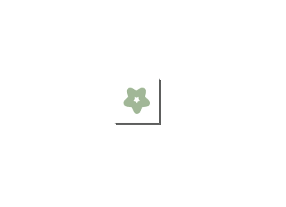
A Seamless Orchard Pattern, and Others
Repeating white space is fine in some patterns. Here we have a very simple pattern piece made with just one image element surrounded by white space. For this demonstration the image is enlarged and the white space rectangle and the floret image are grouped together. It creates a uniform pattern when tiled:
This was used in a vector tile implementation of a complex map style. Implemented on the map, this seamless pattern appears like this:
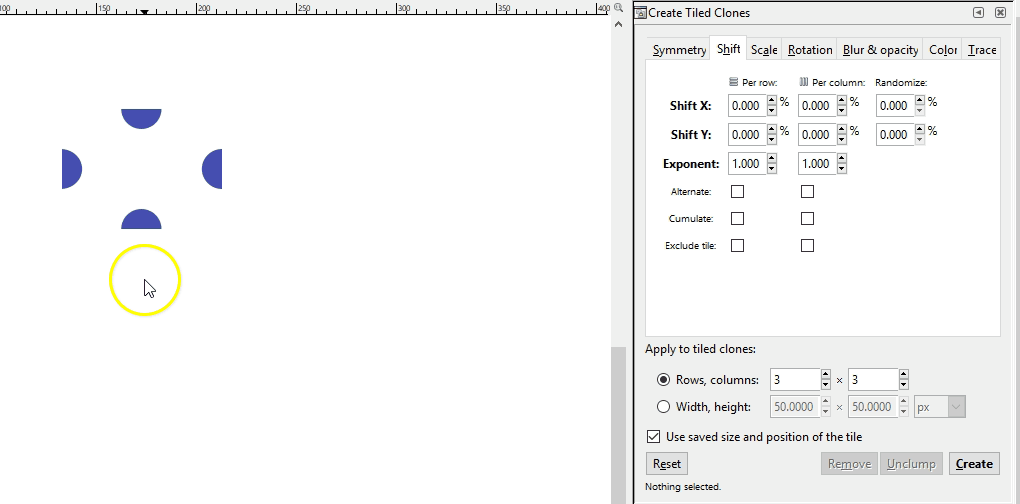
If a pattern with an offset is desired instead, a somewhat more complicated pattern must be created. If you are adept at graphic software like Inkscape, you can create these yourself with special attention to pixel size ratios, x and y coordinate locations, and clipping to ensure the separate components are formatted with the exact spacing required. Here I demo a different Inkscape tool than the demos above where I just copied and pasted: the Edit-Clone-Create Tiled Clones tool. It is the same concept, we are repeating the original image, but it is a lot faster.
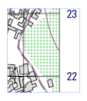
Note that you can also create linear patterns for things like hedgerows or power lines. Here is a hedgerow symbol:
Remember, the image file you give to your map software will be just that initial piece of the pattern. The software will take care of the tiling for you. Here we see the hedgerow pattern in use as part of a Mapbox GL JS style.
Hatch Textures
Last, we have hatching textures. These are used frequently in cartographic design and so should be part of our toolkit. Creating a seamless hatch fill is a decidedly more difficult task than the others because of the line angles. It will look something like this which may be counter intuitive. This is zoomed in for demo purposes. The original hatch png is only 6px x 6px.

Here you see how it fits together:
It pays to have one of these in SVG format because it is likely that you’ll want to make changes to the colors and transparencies. For example, let’s say you’re wanting to use a diagonal hatch fill to denote natural areas in an interactive world-wide map. Many natural areas span both land and water features so it can be useful to create a semi-transparent hatch fill or a hatch fill with no background color at all to cover these areas. In this way the reader can see where the natural area is covering water and where it is covering land. In other cases you may want a non-transparent background fill, especially for smaller area features.
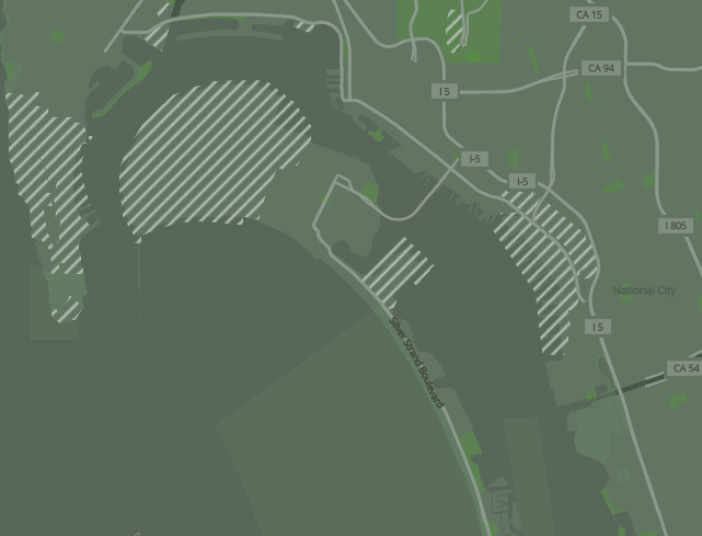
Here is that same hatch fill pattern shown above, except in different colors to identify military areas in a vector tile implementation of the Humanitarian OpenStreetMap style. This military area is covering some water but the hatch is non-transparent:
Here, that same little sprite (a png file created with the svg and made into a sprite) was changed to white diagonal hatches with no background color in order to allow the land/water boundaries to show through. This is in our camo style vector tile demo:
While it is true that GIS software comes with pre-rendered seamless image patterns for your use, there may indeed come a time when you need to create your own. What a good tool to have in your toolkit!
Creating Compelling Map Presentations: Borrowing From Web Design
What if we used maps to “sell” an idea in the same way that newer websites are selling their products? This approach would be a hybrid between what some are calling “story mapping,” and small multiples, set up in such a way as to quickly convey your idea while visually explaining each component. You could argue it is also like a very simplified poster presentation.
Take a look at part of the AWS Lambda landing page:

Here’s an example mock-up showing how we could apply the pattern shown above to a map project:

Essentially what it comes down to is a highly organized, static, presentation of complex data with annotations to help the map reader understand the issues while also giving them the visuals to absorb the information. You know what they say:
Give a person a map and they’ll click away; give a person a story and they’ll stay.
(Ok, I said that.)
Cartonotes
Presenting a few random cartonotes from various digital maps I’ve been working on lately:
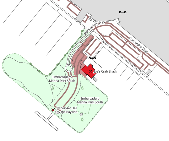
Indicate marine parks, preservation areas, and state beaches that extend into the water as transparent polygons with solid or dashed outlines. This allows the feature to be seen without giving the impression that it is solid land or some other solid feature.

When symbolizing road features it can be easiest to simply use a single color for all road types. This is simple but effective.

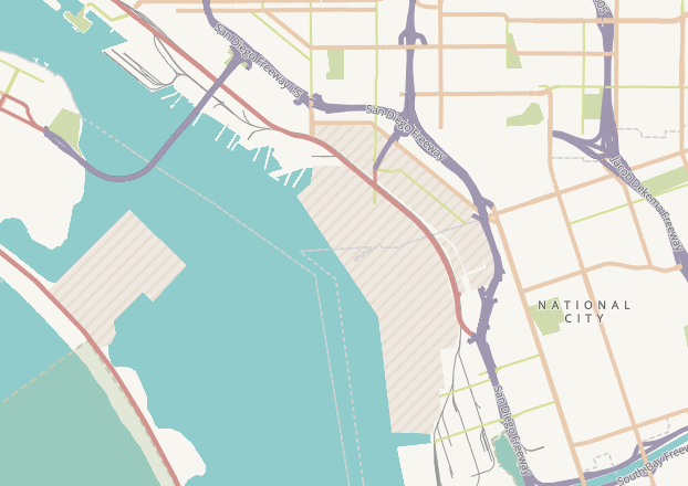
However, if you are interested in more complex road symbology using road casings and different colors for the different classes (e.g., highway, primary, secondary), then take care to make sure that bridges are separated and placed on top of the other road features.The feature order list will be something like this:
- highway bridges
- primary bridges
- secondary bridges
- highway, not bridges
- primary, not bridges
- secondary, not bridges
In other words, the bridges go above everything else that isn’t a bridge, even if the bridge is of type primary or secondary. You can see a secondary bridge (peach color) in the screenshot below that runs over a highway (purple color).

It is pretty typical to use the same hue with a slightly darker value for polygon outlines, as shown in the airport outline below. Hexcolortool is handy for lightening or darkening a color by a given percentage. Of course you can also adjust the value in the HSV color system or the lightness in HSL color system to achieve this.

Labels for features that are higher in order do not necessarily need to be darker in color. In the following example label hierarchy is achieved with larger state labels in a lighter color, while city labels are smaller but darker.

A New Kind of Directional Icon
Maps that use projections in which North is only constant along meridians are disingenuous when it comes to their north arrows and scale bars, since both scale and North vary depending on where they are on the map. On large scale maps this matters very little. On medium and small scale maps, however, this matters a lot. The typical solution for the directional indicator is to display graticule lines instead of a north arrow. There are some potential solutions for scale bars, too, but I will focus only on the directional indicators in this post.
The problem with using graticules is that they can clutter up the map unnecessarily. You can seek to minimize that clutter by using thin gray line symbology. In this example, you see how a thin gray graticule looks. Also notice that the north arrow that I’ve placed here solely for purposes of illustration is definitely erroneous for most parts of this map.

You can go a step further and run the graticule lines only over the portions of the map that aren’t as important: the oceans, for example. That isn’t always possible, especially for those of us who make extensive use of single-layer basemaps such as that shown above, where there is no way to place the graticule layer between the oceans and the land. In this particular example it wouldn’t much help to run the graticules solely over the ocean area anyway, since there is too little ocean area compared to the land area and therefore only a single meridian line would be visible.
In no way is a graticule grid covering this entire map a bad thing. But what if there might be another option to consider on maps that have a lot more information?
What if we made an icon out of the graticule grid to illustrate the directions, placed in a corner of the map just as we would have done with a north arrow if it had been an equirectangular projection? An illustration of this is probably the best way to explain it:

Zooming in to the lower-right corner of the map:

To create this–and here I’m using ArcMap but it should be a very similar process in your GIS of choice–I created a new polygon data layer and edited it such that it contained one polygon of the extent of the map. This was pasted into a new data frame and that new data frame was set to the same projection as the first, then this data frame was zoomed to the extent of the new polygon layer. Now they both show the same exact location.
The new data frame needs to have the same height/width ratio as the main data frame so that the exact same graticules will show up in your graticule icon that would have shown up on the map itself had you placed them there. In this case the main page is 8.5 by 11 inches, so the secondary data frame is .77 by 1 inch.
The graticules, from Natural Earth data, are placed in this data frame and styled as thin gray lines, and the data frame is placed in the corner of the map along with the cardinal direction indicators in a nice serif font with matching gray font color.
As a side note, if anyone has seen this technique on any other existing maps please let me know as I have not yet come across it, and I would edit the “new” out of the title of this post accordingly.
I’ve been using a new vector tile style editor to create some maps. The editor is called Maputnik and is still in early development, but it is usable even at this early stage. I’m really impressed with how much of the mapbox gl js spec has been implemented and the multitude of complex tasks that it makes easy.
Here’s a couple of screenshots from a style I’m working on called Camo:


Notes on a Map
I like to keep a Google Doc full of inspiration maps for whatever projects come up. Here’s one that’s in my inspiration doc and a few notes on techniques that are de rigueur in journalism mapping.

Overall, this map by The Washington Post is clean and crisp. The hillshade is very subtle but not non-existent. We have an area indicated by dark gray shading and labeled straight on the map with a dark gray label. This is a good reminder that sometimes a map key isn’t needed if you can label the item(s) directly on the map.
They’re using a thin white halo around the place names in the main map (note halos are not present around “SYRIA” in the inset though I’m not sure if that was intentional). All caps are used for country names in bold black. We have bold black mixed case for major cities and regular black mixed case for minor cities. Blue italic serif font is used for the water feature labels. This constitutes a nicely executed, normal, typeface hierarchy.
The main two things that I really want to point out here, though, are the arrows and the arrow labels. The arrows indicate movement by means of gradual increases in arrow thickness, arcs, and gray drop shadows. Each arrow label matches the color of the arrow that it labels. This “pattern” of using arrows in this manner is something I’ve only recently taken note of, whether this means they are a newish development in map styling or not, I think they’re very effective.
-
You are currently browsing the archives for the Design category.
The Books


Recent Comments