Archive for November, 2010
Cartography and Cooking
Posted by Gretchen in Cartography Profession, Education on November 29, 2010
*Cooking was on my mind the last week or so. I don’t know why. It maybe had something to do with Thanksgiving. 
Cartography and cooking: they both start with C but they have something else in common, too. If you are a cook then you know that it takes a lot of time to become very proficient at it. At the very beginning of your cooking experience it doesn’t matter if you use recipes or try to cook without one – often the finished product is less than stellar. It doesn’t take too long though (maybe 3-6 months, I’d guess) before you become pretty good at using recipes if you don’t deviate from them. Then it takes a good 10 years of cooking with recipes before you are really able to start cooking things that are of your own design and that actually end up tasting good.
I tweeted something about this the other day and @entchev reminded me that Malcolm Gladwell’s “Outliers” states that research shows it takes 10,000 hours of practice at a task or skill before you reach expert status. Some of the examples in the book are The Beatles and various child musical prodigies (they just practiced more!)
This idea of 10,000 hours, broken into years, is about 10 years of practice part-time. Most people can only sustain a concerted effort at practice for 4 hours a day. If for some reason you could practice diligently for 8 hours a day, then it would only take 5 years for you to reach expert status.
The way this relates to cartography is:
- You shouldn’t expect to be good at it right away
- You should use “recipes” a lot those first 10 years
- Recipes include: inspiration pieces, pre-defined color palettes, using the same fonts that you’ve seen on another map, finding out how others have handled mapping the geography of your map’s area and following that lead, looking up and using map standards for symbols, colors, label placement, etc.
- Once you’ve managed 10 years of cartography in this manner you’ll be able to make maps without so much up-front work
Thanksgiving Break
Since Thanksgiving is coming up here in the U.S., I’ll be taking a break from blogging for a few days. I hear site traffic is low during this time of year anyway – though I wouldn’t know from personal experience considering this is only the 6th month of the blog. Speaking of Thanksgiving, I want to thank everyone for reading! It has been a lot of fun coming up with topics, writing, and working to get more GIS/cartography products out there that people can actually use.
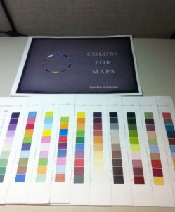
In other news, @LearonDalby printed out his copy of Colors For Maps and arranged it in a way I hadn’t even thought of before. He’s placed all the pages so that the vertical color palettes, which are on the right-hand side of every page, show at once. I imagine this is a good way to get a good overview of all the options. He posted a picture of it (shown below) over on Ow.ly.
I’ll be spending the time between now and my next post trying to figure out things such as: what is the difference between the City of Bremerton’s comprehensive plan and zoning layers? How can I calculate potential buildout in excel instead of ArcMap? How do I convey to meeting participants that the map that is shown has attributes that aren’t shown – I didn’t actually delete anything? And many, many other such things, judging by the mental to-do list. 
Have a very Happy Thanksgiving.
Map Balancing Tricks
Posted by Gretchen in Best Practices, Design on November 22, 2010
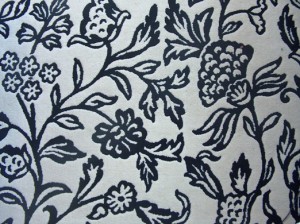
Last night I was sitting in the living room, drinking tea, thinking about not much of anything. My eye wandered to the rug on the floor (a portion of which is shown below). It’s very inexpensive but pretty cool looking. I got to wondering what it is that I like about it. One thing is that the pattern is very uniform across the entire extent. The balance between white-space and line work is just about equal throughout. While each individual part of the pattern is nice, it is really the picture as a whole that makes it pleasing.
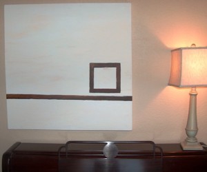
Juxtapose this with something else in the living room: a picture I painted about five years ago. I also think it is pleasing, but in a very different way. This painting (shown below) definitely does not have an equal balance of white space versus line work. In fact, it is quite the opposite. It has a very strong weight in a very small part of the overall piece – where the square is – and then a lighter weight along the line, and no weight elsewhere.
As I pondered that for a moment it came to me that maps are very much like these two objects in their aesthetic qualities. A map with an equal pattern of figure-ground like in the rug is quite elegant and a map with a strong focal-point like in the painting also has a positive aesthetic. Think about these in terms of a typical city-map where the grid is somewhat uniform across the whole map and a city map at a smaller scale (city and surrounding rural areas) where the city becomes the focal-point and the rural areas become the empty-space.
Now, following from this, it occurred to me that it is very lucky when a cartographer has one of these two options to choose from when composing a map. Often, a cartographer has to work with an area that has a geometry that does not fit in to either a pattern or a focal-point composition. It is in these instances when we grumble about the odd geometry of the landscape. It’s these times when we spend hours trying to make the data fit into one of the molds.
These situations are very difficult and can be the bane of the cartographer’s work. However, here are some techniques which you may find helpful in some situations. Please add your own tricks in the comments!
- Increase detail in sparse regions by adding more data, labels, or heavier hues
- Decrease detail in denser regions by generalizing lines, removing labels, decreasing symbol-size
- Use color to minimize odd geographic regions to achieve either a continuous balance or a strong focal-point
- Change the scale to a more visually balanced area – use location maps to show the overall area if you’ve zoomed in too far
- Try an oblique view (graphics software)
- Create more visual emphasis in some places and less in others with masking layers (same map, but lighter in areas, heavier in others)
How To Sell Your Products Online
Posted by Gretchen in Cartography Profession on November 19, 2010
*This is a post I made a couple of weeks ago on CartoTalk.
After I posted about my new Colors For Maps booklet (available here), someone suggested I write-up my experience building a webpage to sell items online. I think my advice will only apply to those who want to sell electronic products, but you never know.
The short answer is: I hired a good web designer and she did all the work. 
The longer answer is that the web designer chose from a variety of products and possible combinations of things. In the end we decided to use E-Junkie (terrible name but a good product) in conjunction with PayPal and Google Checkout. E-Junkie is only $5/month to sell up to 10 separate products as long as they are under 50 mb in size. I happened to find a 90 day free trial coupon as well. My booklet is about 3 mb in size so it was no problem. Large map files would be more expensive to sell through this site.
E-Junkie interfaces with PayPal and Google Checkout – you have to get accounts at all three of these places. So the user can choose which option they want to use to pay. My booklet has only been for sale for one week now but I can tell there’s a definite preference for using PayPal – around 80% of the purchases are through PayPal. Both PayPal and Google Checkout charge you every time there is a sale. If you won’t have a high income through your sales you’re looking at something like 59 cents per item sold.
The nice thing about PayPal is that the buyer can use a credit card – there is no need for the buyer to have a PayPal account. Why not just use PayPal and Google Checkout – why use E-Junkie? Because E-Junkie handles the order fulfillment process. I don’t manually send the purchaser anything. All these services give you the email addresses of the people who are purchasing though Google allows the buyer to use an encrypted email address so that the seller doesn’t see the real address. Even though I have sold my GIS and Creativity webinar through Google Checkout for a long time now, I would never use the email addresses for marketing. Most individuals and businesses wouldn’t – I hope! I sell the webinar through Google Checkout (it’s a pretty big video file) and I have to fulfill the orders myself. Perhaps I will shell out the money to get this done through E-Junkie at some point though.
Cartographic Adventures: Topic Areas To Explore
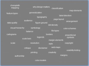
If you are a GIS professional who wants to learn more about map design, there are a number of areas that you can focus on in your quest to communicate through functional and elegant mapping. GIS Cartography: A Guide to Effective Map Design focuses on the major areas of color, typography, layout and creativity. It also provides an introduction to cartographic standards for 18 commonly used data-types such as roads, hydrography, elevation, and so on.
Within those major topic areas are a great number of sub-topics that can be explored individually. In this slide I attempted to record a few of those topics, though I am sure to be missing some. The intent of the slide was originally to simply joke about the sheer number of potential things that a nascent cartographer should learn, which is why it is laid out in a bit of a jumble. But it’s also a good visual for choosing what your next cartographic learning adventure will be.
Cartography Office Personalities
Posted by Gretchen in Cartography Profession on November 15, 2010
I’ve never been in an office with multiple cartographers. I’m not sure I want to be. Cartographers can be a particularly particular bunch – but not all in the same way. This, I imagine, could lead to difficulties. Euphemistically we might call these difficulties differences of opinion.
For example, I wonder how a coffee table in the lobby of a cartography office, laden with design, GIS, CAD, and cartography magazines and journals might morph over the course of a day. I think what would happen is…
First, Cartographer #1 walks in to the office in the morning, chipper and ready to start the day. #1 sees the coffee table with the magazines and journals and decides that they need to be arranged. Now, Cartographer #1 is an old-school type who favors traditional design. Accordingly, #1 fans the magazines and journals out on the coffee table in an orderly manner so that the beginning few letters of each title is visible. They cover most of the coffee table this way.
Cartographer #2 walks in a little while later with coffee in-hand. #2 is a modernist who sees the world in a more hip yet confusingly retro kind of way. (Thus – modern.) #2 sees the fanned-out magazines on the table, considers briefly that the magazine-fan method is reminiscent of visits to grandma’s, and proceeds to stack up the magazines and journals into one neat stack. #2 places the stack off-center, considering that this will give the whole thing a bit of an edgy feel.
Lastly, in walks Cartographer #3 (who could be the boss, perhaps). #3 remembers that there is a journal article that will assist in today’s work-tasks. With insouciance, #3 riffles through the stack, scattering magazines and journals about, until the right one is found. Cartographer #3 takes the journal and leaves the rest in a chaotic heap.
I believe that at various times, even during the same day, I would be like Cartographer #2 and Cartographer #3, but not like Cartographer #1. Except for the being chipper part. I am chipper at times.  Which cartographer are you?


Recent Comments