Archive for November, 2010
Using Screenshots for Rough Maps
I was thinking today that I needed a new method of sending quick maps to clients. As I’m going about a project I’ll be discussing certain bits with clients and colleagues and inevitably it seems like it would be easier if they could simply look at my data. The best thing to do in this situation is to use screen-sharing but many of my conversations are via email while we discuss things in between meetings (well, okay, while they are in meetings – I usually sit on my rear all day actually working 
So the logical thing to do, and that which I have always done, is to make a quick layout in ArcMap, stick the legend on there and export it to attach to an email. This bothers me because the maps are terrible looking given their draft form, and they take too long to make. When something takes a while and is terrible looking it seems like there must be a better way.
Today I thought of it. It seems obvious now, but why not simply send a screenshot to the client or colleague? That way you don’t have to fool with a legend in layout view because the table of contents is right there. The other great positive about this is that it is automatically known to be a draft, in-progress work due to the fact that they are looking at a screenshot. I don’t have to caveat the bad-looking map as a “rough map” or a “very draft map.” This way the recipient of the thing can focus on the question being asked instead of the presentation of the data.
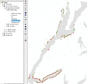
Today I did this twice. Once for a map of an area near Bremerton, WA showing a proposed regulatory area and the old zoning:

And the other time for some quick examples of what some data looked like after I converted it from a table of lat/longs:
So that’s it. I think from now on all my quick-maps will be screenshots.
Organizing Your Files
If you use a computer to do your work, um, yeah, that’s you…then you need to know how to organize your files appropriately. I was recently at another person’s computer doing some GIS work for them and their files needed some help! The first step is to come up with a basic structure that works for you.
The file structure I use goes like this: I have a Projects folder with sub-folders named for each client. I am fortunate in that almost all of my clients are repeat clients so in each of those I have another sub-folder with the name of the project for that client. Within that are the following folders: Projects (mostly .prj files), Data, Invoices, Maps, Contract, Reports, Maps, Research, Documentation, Presentations. Those are the basic ones though not all projects use all the folders and some have other folders like: Metadata, StatementOfWork, Extensions, Exports, MeetingNotes, TimeLog (I don’t use this much anymore as most of my projects are now value-based fees), TempGISFiles, Code, Styles.
I also have a SharedData folder that has sub-folders named for the type of data (not the originating agency) that’s in it. This folder is separate from the Project folder and contains data that are going to or could be used for many projects. So, for example, there’s a Parcels folder with parcels from many counties for which I regularly do work. If I had named the folder for the county it wouldn’t be as intuitive to me.
Your system may differ, and it may differ a lot. But the point is to have a system in the first place. It won’t be perfect and there is no point forcing a system on your employees either, unless it is for shared resources. However, having a system in place does make things very easy as the number of your projects increases. I’m able, for example, to move entire projects elsewhere for archiving after they are a few years old, with ease.
The Forest AND the Trees
Posted by Gretchen in Best Practices, Workflow on November 8, 2010
(This picture was taken on a rare sunny day in Poulsbo, WA, many years ago.)
“You can’t see the forest for the trees” is a common refrain when someone is paying too much attention to detail and not enough on the big picture. A cartographer who spends 90% of project time on such things as which orange-brown hue to use, which font to use in the legend, and deciding whether to use mixed case or upper-case for labels, will soon run out of time for what is just as important: the gestalt of the map. Without a unified presentation, a map product may not hold a readers attention long enough for those details to be fully appreciated or even understood.
A cartographer who spends 90% of project time on the big picture such as the visual hierarchy, choosing unified colors, and element placement also risks something: that there will not be time left to ensure the accuracy and readability of the information in the map. After all, a map that looks great at first-glance but contains inaccuracies, confusing labeling, or other such detail-problems will be useless.
These, then, are the two dangers: spending too much time examining the trees OR spending too much time thinking about the forest’s overall visual impact. How much time we spend on each of the two elements is going to depend on the cartographer’s level of experience. If the cartographer is well skilled in map details but not in big-picture elements then this cartographer is able to spend less time on the details and more on the overall picture. The opposite is also true. However, I would posit that many cartographers who are skilled in one area and not the other spend an inordinate amount of time on the portion that they are already skilled at and less on what they are not. In other words, we tend to get better at what we are good at and do not increase our skill in what we are not so good at. You shouldn’t have to spend a lot of time with the parts of map-design that you are skilled at, leaving you more time to focus on those aspects that do not come as easily to you.
A typical work-flow, using the forest and trees analogy, goes back and forth between the two aspects of map-making. It might look like this:
10% – Forest
30% – Trees
20% – Forest
30% – Trees
10% – Forest
In this example I’ve split the time up to be 60% detail work and 40% big-picture work. In my mapping projects I probably spend too much time on the big-picture items and not enough time on the detail work. (Please note that for analytical GIS projects I use an entirely different approach – often focusing first on details before circling back to the big-picture.)
Readers: how much time do you typically spend on big-picture versus detail work?
Integrated Instructions
Posted by Gretchen in Best Practices, Web Maps on November 6, 2010
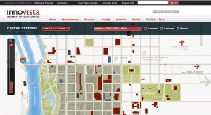
Should a user need to read directions before using a Web map? No. Should a user need to click through 5-pages of instructions before being allowed to view a Web map? Never! (There really is a Web map out there that has 5-pages of instructions.)
It’s all about integrated instructions now. Check out the Innovista Web map from the University of South Carolina for an example of how to do this nicely.
Making and Using the Colors For Maps Booklet
It took about 2.5 months to create the Colors For Maps booklet. I had the idea a while before I actually started working on it though, because I wanted to wrap up two of my GIS projects before embarking on the map booklet project. It turned out to be a good idea because what started as a simple idea rapidly became a lot of work. (Isn’t that always the way?) I’ve long been into using inspiration pieces to find colors for map projects but I do know that even that short-cut can sometimes take a while. I also am into keeping a “shop book” once you have some colors that work out well. However, even though I recommend keeping track of the colors, I wasn’t taking my own advice. If I wasn’t even taking my own advice I figured other people probably weren’t either! So I made this booklet, thinking that at the very least, it would become my shop book. And beyond that I hoped it could help others as well.
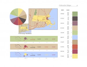
Coming up with color schemes that worked became pretty easy for me after the first few. I often had to tweak the scheme (a color here and there) once I put it into the map but beyond that it was not very hard work. One problem was that I could only come up with one or two of them a day. Once you’ve spent 2 hours working on two color schemes, you just get burned out on colors. When I started dreaming about color palettes and the mechanics of putting them into the booklet template I figured I was pretty well steeped in the process. 
One of the buyers sent me a few direct messages on twitter yesterday. Here’s the conversation:
Buyer: and thank you for the hard work in putting this together. Question: are any of the palettes recommended for colour blindness?
Me: I didn’t make specific recommendations but there are deuteranope simulations of the sample map on each palette page.
Buyer: Oh, yeah. I wasn’t familiar with the specific term and missed the feature while flicking through. Really impressive work!
Buyer: Have you thought of letting people downld 1 sample palette pg free? I’m sure you’ll get many more purchases subsequently.
Since I thought the idea of showing one of the sample pages (shown above) was a good one I thought I’d show it here on the blog. The sample page above is from page 9, which happens to be the first page in the Coordinated Palettes section. Below is a map I used in an example at a recent talk I gave at Colorado State University in which I used the colors from the palette page shown above.
Creativity and GIS
Posted by Gretchen in Creativity on November 3, 2010
A few years ago I put together a little booklet called “Integrating Creativity Science With GIS.” It was an accompaniment to an hour-long webinar* that I gave with Stephen Few** on the same subject. My aim was to get geoprofessionals who have jobs centered around analytical work to start thinking more creatively. When an analyst is able to use creative problem solving, the analytics have potential to become more powerful and profound. You can view the booklet here.
*The webinar is available for download (it’s $55) on my company site here.
**Stephen Few is the guy who wrote Information Dashboard Design, among other books.


Recent Comments