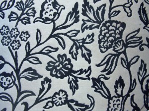
Last night I was sitting in the living room, drinking tea, thinking about not much of anything. My eye wandered to the rug on the floor (a portion of which is shown below). It’s very inexpensive but pretty cool looking. I got to wondering what it is that I like about it. One thing is that the pattern is very uniform across the entire extent. The balance between white-space and line work is just about equal throughout. While each individual part of the pattern is nice, it is really the picture as a whole that makes it pleasing.
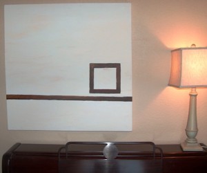
Juxtapose this with something else in the living room: a picture I painted about five years ago. I also think it is pleasing, but in a very different way. This painting (shown below) definitely does not have an equal balance of white space versus line work. In fact, it is quite the opposite. It has a very strong weight in a very small part of the overall piece – where the square is – and then a lighter weight along the line, and no weight elsewhere.
As I pondered that for a moment it came to me that maps are very much like these two objects in their aesthetic qualities. A map with an equal pattern of figure-ground like in the rug is quite elegant and a map with a strong focal-point like in the painting also has a positive aesthetic. Think about these in terms of a typical city-map where the grid is somewhat uniform across the whole map and a city map at a smaller scale (city and surrounding rural areas) where the city becomes the focal-point and the rural areas become the empty-space.
Now, following from this, it occurred to me that it is very lucky when a cartographer has one of these two options to choose from when composing a map. Often, a cartographer has to work with an area that has a geometry that does not fit in to either a pattern or a focal-point composition. It is in these instances when we grumble about the odd geometry of the landscape. It’s these times when we spend hours trying to make the data fit into one of the molds.
These situations are very difficult and can be the bane of the cartographer’s work. However, here are some techniques which you may find helpful in some situations. Please add your own tricks in the comments!
- Increase detail in sparse regions by adding more data, labels, or heavier hues
- Decrease detail in denser regions by generalizing lines, removing labels, decreasing symbol-size
- Use color to minimize odd geographic regions to achieve either a continuous balance or a strong focal-point
- Change the scale to a more visually balanced area – use location maps to show the overall area if you’ve zoomed in too far
- Try an oblique view (graphics software)
- Create more visual emphasis in some places and less in others with masking layers (same map, but lighter in areas, heavier in others)


Recent Comments