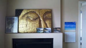
Looking at the mantle above the fireplace in my office is discomfiting. The five objects displayed were placed there unceremoniously when we moved into this house two years ago and they have not been moved since. On the bright side, it gives me a great platform to review some map design principles.
- WHO’S WOLF PICTURE IS THAT ANYWAY? The wolf picture belongs to another member of the family and really isn’t “me” but I put it up there anyway. This is what happens when you put things on a map to appease other people: they don’t match and you don’t care whether they look good or not because they aren’t yours. Logos, I’m looking at you. We are often forced to put logos on maps that just don’t integrate well but we do it because we have to. Try to at least change the positioning even if you can’t change the shape or colors of those logos.
- DID I REALLY COVER UP THE BUDDHA’S NOSE? It seems like the eyes and nose of the Buddha are probably the major aspects of the whole design, yet I covered up the nose anyway. Figure out what the best part, the most central idea, the biggest bang part of your map is and highlight it, don’t hide it.
- WHY ARE THE THREE WATERCOLORS SEPARATED? The three watercolors are by the same artist and on the same subject. They should be grouped together – especially since there are three of them (architect’s rule of three!). If you have similar elements on the map that can be grouped together, do so in groups of 3 or 5. This works well in map legends. If you’ve got 5 road types put them all together, slightly separated from the other legend items, for example.
- TOO MUCH CLUTTER? Even though there are 5 items grouped on the mantle (see above) it still looks bad. There are too many items. What would look best is just the Buddha with maybe two simple vases, one tall and one short, hanging out next to it. That would be three objects and the vases wouldn’t compete with the Buddha. If you can get rid of things on the map that don’t add value then take them off. If you get rid of too much (notice how I didn’t say I should only have the Buddha – no, it could have those companion vases) then it’ll be boring and bare.
- TOO FLAT? All those pictures are flat. A good map design can have many shapes and textures as long as they are all integrated into the big picture.


Recent Comments