There are several applications to GIS of the small multiples principle explained by Tufte in “Envisioning Information” and elsewhere.
The obvious application that comes to mind is the visualization of a time series. Sure, you can animate a time series instead, but then there’s the concern that the lack of ability to flick the eye back and forth between moments in time impedes the analysis process. Rather, a better method, if it is doable with your data, is to present the data in the same way in many small maps shown very close to each other.
When attempting small multiples you want the maps to be as close together as possible because the less time your eye needs to sweep from map to map the easier it is to make inferences about the whole dataset. They also commonly have the same spatial extent.
There are other uses for small multiples other than time series depictions. I’ve created quite a few small multiples layouts in my career as a GIS analyst. Here’s a few of them here.
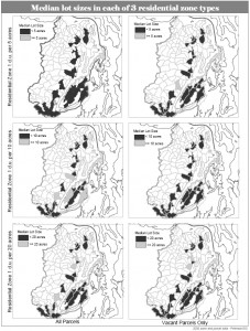
This one illustrates how you can present a variable in a chart-like fashion to show change on two axes. This one was done in 2006. If I were to do it over again I would definitely get rid of all those boxes around the maps. They don’t help.

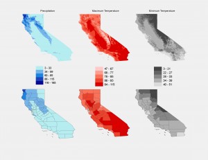
Another small multiples project involved presenting three variables in California with each variable presented first as a continuous raster and second as an area-normalized county breakdown. The legend is shared by the raster and the county maps so it can go in the middle.

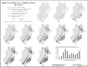
And here’s an example of the time-series small multiples layout. I like having the addition of graphs and charts on the same layout when needed. This one doesn’t have any bounding boxes around the individual maps – much better.

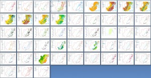
Then there’s the inadvertent small multiples layout that I made just the other day. I wanted to show off some map work that I had just completed on twitpic. All the maps were in a Word document so to show all 48 maps at the same time I just viewed them at about 10% scale or so and took a screen shot. It turns out to give a nice overview of all the different datasets in that project on one screen. A twitter friend mentioned that it was like Tufte’s small multiples, which then gave me the idea to write…guess…this blog post.

So if there is anyway that you can utilize the small multiples concept in your current or forthcoming projects I think you can see that it will make a big contribution. By allowing your map readers to “see” the data and analyze it with their own eye a great deal of credibility can be earned and perhaps even a few new conclusions.


Recent Comments