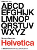
Helvetica is a typeface with a history of over 50 years of near-ubiquitous use, especially on signage. It’s also used quite a bit in the U.S. Government (tax-forms!).
About three years ago some independent documentary film makers released a movie about the history of the typeface and what’s more: graphic design in general. One of my favorite typeface personalities, Mathew Carter, is interviewed on it – it was worth it for me just for that bit. There is a lot more to see and learn in the movie, however, and I recommend it for all design geeks who seek inspiration and entertainment.
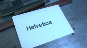
My only complaint is the over-weighted importance that they place on typefaces – but I suppose if they hadn’t done that they wouldn’t have a compelling movie either. Hey, you’ve probably never seen the process of putting letters together on a frame dramatized in quite this way before! And the beginning sequence, where you watch this process along with the rest of the printing procedure (inking, pressing, etc.) is almost mesmerizing.


Recent Comments