I was ranting earlier this week about project organization. It’s the same old same old. Even in the days where you used ArcView 3.2 (right, because everyone is as old as I am) there were project organization issues. Where do you put data that is shared between projects and where do you put the data that you computed specifically as an intermediate to some final dataset in just one project? We also had the more cartographically centered project tidying but not as much. We didn’t have as many datasets or features to work with, as a general rule, as we do now so an ArcView project would have at most maybe 20 layers and those were easy enough to sort out.
Now I work with OpenStreetMap data with innumerable features and feature combinations in a tiled environment using Fresco or Maputnik and the layer list can get very very very long. There are ways to lessen the length of the layer list, using Mapbox GL expressions to combine things, or using variable names in the icon properties, for example. However, sometimes it is easier to keep them separate so you can see, at a glance, that this is where you’ve put the styling for the pagoda icon so this is where you would need to make it bigger or smaller. Speaking of pagodas, this is where I show off the pagoda icon I just styled up in Inkscape:
![]()
I mean, this is what life is about. (But honestly I love styling things like this.)
If we talk just about hydro lines you can really see what I’m talking about. Within the general class of features referred to in my data as “hydro lines.” I’ve got to style rivers, streams, damns, and dikes in different ways. So far so easy. But I just added in a new class that I had forgotten about earlier: canals. Then there came the realization that canals can be on the surface or underground. Guess what? They can also be intermittent or perennial. Canals are usually portrayed with a casing just like roads so that adds yet another layer of complexity. Remember your 5th grade combinations in math? Once we multiply all these potential outcomes together we get roughly 200 ways to style a canal. Or something like that. (Ok, 6.) But that’s just for canals. Now you add in those variables for the rivers and streams and you get a lot of styling layers that go under the main heading “hydro lines.”
Now try tweaking the size of one of those hydro lines layers. And then try to figure out how it fits into the overall hydro line picture so that you know what else needs to be tweaked. If I increase the width of the intermittent canal I should also increase the width of the perennial canal and so on and so forth.
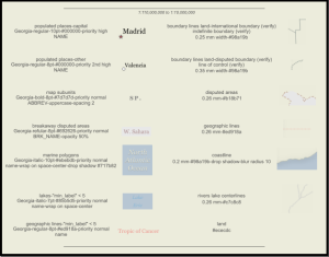
One way to keep track of all of this is with a spec sheet. These are brilliant and have been used by Mapbox and others in their work. Graser and I discuss these a bit in QGIS Map Design. Here’s our example of a portion of one:

However, they are best to create at the end of a project to illustrate components rather than during the design phase, where one would need an automated process for creating it to keep it always up to date.
On twitter this week, when I was espousing the idea of a Toyota Production System type of process for maps (merely musing, mind you, there isn’t any that I know of at this time), @danrademacher mentioned that he’s used an auto png renderer to spit out test places at many zooms and locations so that things can be examined as you go. @mojodna mentioned that github.com/stamen/vignette was used for this. This doesn’t help organize layers in a project but it does help quality control by dint of providing easy to view comparisons between places and iterations.
@emacgillavry brought up an oldie but goodie: the ScaleMaster spreadsheets by @ColorBrewer. This is more what I had in mind, and I’ve used them successfully for a previous project that used less data. However, I have yet to figure out a way to adequately spreadsheet a list of layers, sublayers, subcategories (underground/overground, intermittent/perennial), zoom levels, casings vs. overlays, and widths. This is what should all be kept track of. At this point I kind of throw my hands in the air and say, hey what about creating a super-complex radial diagram? Something akin to Nadieh Bremer’s work here: https://www.visualcinnamon.com/portfolio/olympic-feathers. Anyone up for the challenge? 😀 (All automatically generated of course.)
Edited to add:
What about a button in the software that “links” certain datasets together programmatically? When one width is increased, they are all increased commensurately. When one width is decreased, they are all decreased commensurately. When you want to change the width of one without changing the others, you unlink them first.


Recent Comments