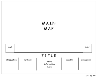
Once the audience for the map is properly investigated (see Part 1 in this series) it is time to consider the look and feel of the map. This part is going to depend a lot on what kind of map you are making: web map or static (paper) being the biggest two types. Regardless of what type of map, however, it is a good idea to start with sketch maps of potential layout designs.
These sketch maps work best when they are drawn by hand so that technology doesn’t get in the way of the design. When presenting to test-audiences you can always move these into a digital medium like the one shown above after sketching them by hand.
The sketch maps force you to consider which layout elements will be needed to support the map before getting too steeped in their details. For example, while sketching you may create an area for a legend, north arrow, and data source descriptions but you will be thinking about how they look in relation the larger design instead of wondering which data sources should be cited, how to design the legend, and so on.
The sketch map helps designers of web maps, in particular, in that it allows the web map designer to quickly and efficiently try out novel presentation methods (of which there is still a lot of room for growth in this medium). For example, many of our developer colleagues feel that traditional web maps that mimic GIS software by including clickable legends do not make sense to casual web users. A web user who views your web map may be better served with an entirely different approach. The sketch map is the place to start if you want to create and visualize new approaches for conveying legend information.
If you are working on a print design / static map project, the sketch map should be mindful of the shape of your geographic area. Is the area you are mapping oblong, rectangular, square, or oddly shaped? Does this affect where you will place the margin elements such as north arrow, scale bar, and legend?


Recent Comments