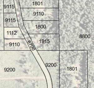
We often hear about simplifying and reducing in relation to map design. However, if you have enough time and patience to manipulate a lot of data layers and a lot of labels, you can make a complex map look good. So when do you know if your complex map is effective?
- When all the labels are legible
- When labels do not overlap
- When whitespace – or empty space – is still there
- When background and foreground are distinguishable
- When the colors are cohesive
- When there’s still a noticeable balance, either continuous pattern or strong focal point (see Map Balancing Tricks)


Recent Comments