I’ve been reading through Daniel B. Carr and Linda Williams Pickle’s recent book on micromaps – “Visualizing Data Patterns with Micromaps.”
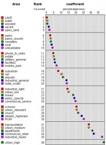
Even without the micromaps the charting recommendations are quite useful. In fact, there was one chart-type in particular that I wanted to copy for my recent buildout study data but I couldn’t figure out how to copy it in Excel. So I wrote to Carr and asked him how they produced it. Basically, it looks like a scatterplot except that it has the x and y axes flipped so that the thing being measured is labeled on the y-axis and the measurements are labeled on the x-axis. The primary thing that attracts me to this layout is the fact that you don’t have to turn your head sideways to read the labels as you would when they are on the x-axis.
You know how it is much easier to browse the book store or library when the books are lined up so you can see them head-on rather than crooking your neck to read the horizontal spines, right? Same thing with graphs. Movie rental stores, back in the days of the VHS tape, originally organized their tapes so that just the spines showed. This saves a lot of space. However, the stores got bigger and they changed their strategy so that the tapes were showing face-out to the isle. This must have increased their sales because it became the accepted practice after a while.
Anyway, Carr quickly wrote back and told me that I was a fool for still using Excel and really why the heck would anyone not use R?! No, he was really much nicer than that, actually, but I do understand his exasperation. I’ve been meaning to learn R for quite sometime. My brother tells me that I have no excuse for not learning it because it is “so easy.” So I really should. But then that didn’t stop me from continuing to look for a work around.
And I found a pretty cool work around! In fact, it’s Carr’s own software found here on the National Cancer Institute site. I was able to download the software, upload my own data into it and have a good-looking graph within 10 minutes. The software does support some changes in presentation like colors, labels, and the like but if you really need to customize a graph like this you’ll have to use R. In fact, Carr has R scripts for most of the graphs in his book and has made them available here.


#1 by Hugo Estrada on March 1, 2011 - 2:28 pm
You are so right. It looks so self-evident once you show the graph with the labels horizontally that it is hard to believe that people didn’t figure this out before.
As for learning R, R In Action is a pretty good tutorial/book on R. I have tried a few R tutorials before, but I feel that I have gotten it faster with this book. http://www.manning.com/kabacoff/
#2 by Gretchen on March 1, 2011 - 5:31 pm
Thanks for the book recommendation! I may check that out one of these days when I decide to get serious about this R thing. Which will probably be right about when I absolutely can’t find another work around.