Archive for category Crazy
Map Curmudgeon
It’s been 4 years since I started writing this blog. So that means I’m now old and curmudgeonly. This was startling apparent today when these three things occurred to me:
- If you edit a publication with a circulation around say 1 million, and you include a picture of a person squatting on a table in what is ostensibly supposed to be a business-setting, then shame on you for sloppy work. As my highschool yearbook teacher would say, “nothing is illegal about printing that picture, but ethically, you will want to think hard about including a picture in a publication that might make the person in the picture embarassed.” Or maybe everyone thinks squatting on tables is perfectly accceptable business practice these days. Beats me.
- In the same publication an article by a pre-eminent cartographer shouldn’t be composed of 5/6 ridiculous non-meaningful chatter about why maps are great and 1/6 description of why the author is great. How about giving us some real ideas about how to be better cartographers? At the least provide us with a modicum of value. Please.
- Finding a dataset on something as simple and as ever un-changing as the Oregon Trail shouldn’t be difficult. Instead, you try to find, say a shapefile of the Oregon Trail (a single line, or perhaps a single line with a loop at the western most end) and you’ll wind up in a maze of government web pages where it as if each page is a government employee passing off the request to another (i.e., a link), who then immediately passes you off to another employee as if it isn’t their problem. That’s how hard it is to find a dataset with a single line of the Oregon Trail. And before you tell me that it’s available in ArcMap as a dataset you can get through their online service, I’ll tell you that indeed you can but it is utterly useless because you can’t make a local copy of it and you can’t even trace it with the tracing tool.
And because I’m not ever going to be eternally sour, let’s leave this rant with a triple set of tips on how to make your maps better:
- Learn some digital cartography, I don’t care if it’s big-name online or open-source online, your clients/customers/constituents need you to know this. I know you’ve got your expertise in your niche. Maybe you are an expert in parcels for the county, an expert in salmon (raising hand), or a geologist who can use GIS to find the best archaeological sites, you still need to know how to make compelling (or at least usable) digital, zoomable maps. It’s actually quite difficult to learn this skill if you’re not a dev. But it’s doable (raising hand again) and pretty necessary.
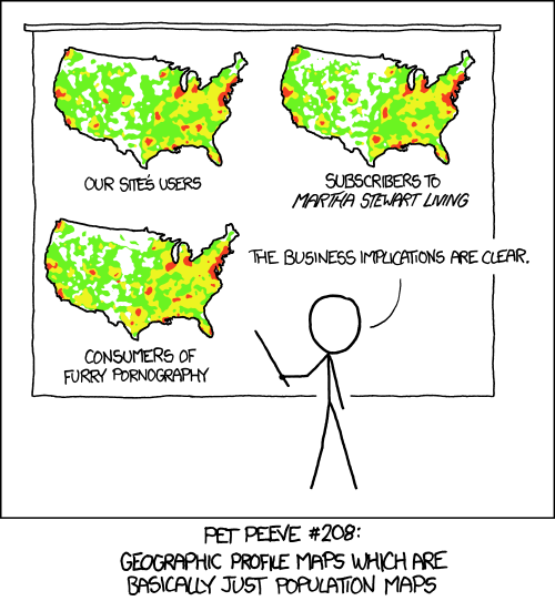
- Give us something other than sensational maps. Pop maps have had their day and we now crave intellectual, even sophisticated, if you will, maps that teach us what’s important today around the world.
- A two-hour sequester of 2-4 people brainstorming how to take your county’s parcel map from passable to extremely useful is not to be underestimated.
There are lots of tips to impart but I also want to be wary of pedantry. There are plenty of absolutely amazing maps out there changing the world today. Let’s leave with the London Tube Map in 3d:
Unmitigated Audaciousness at the Museum
I visited the Denver Art Museum’s exhibit of Modern Masters yesterday to gain some inspiration for my latest basemap design. There are over 40 artist’s works on display, borrowed from the Albright-Knox Art Gallery, from now until June 8, 2014.
My favorite take-away from the exhibit? The obvious courage and audacity that artists need in order to convey the importance of their finished pieces. If you read this blog often, you’ll know that I’ve remarked quite a bit on the impact of criticism, how to encourage it, and how to deal with it (throwing in some pertinent references to one of my favorite writers, Mark Twain, as a matter of course).
To exemplify these twin traits of courage and audacity, there was the unstated, yet implied, feeling of greatness in all the works despite their huge variance in style from impressionist to cubist and from surrealist to pop art. For artists to apply such varied techniques all within the time-span of a century was quite a feat in light of a general public’s need for constancy and more gradual change. In short, selling themselves and their revolutionary works most certainly required unmitigated audaciousness, which these artists had in no small supply.
How much audaciousness do we need as cartographers? Given the plethora of brand-new tools and those that are maturing to such an extent as to provide vastly new and robust techniques, I’d say there is a great parallel here and a great lesson for us. While our new and maturing tools provide us with the abilities to make great new maps that teach the world geography lessons of a much different sort and with more impact than in the past, we will need to practice the art of backing up our new styles with sufficient aplomb to get them widely adopted.
Now for the personal nit-picking portion of the post. I got waylaid in an attempt to take a non-flash photo of one of the descriptions that had caught my eye and that I had wanted to remember to blog about. Yes, a museum person took me to task! The outcome was that I have forgotten the quote and artist it was attributed to.  The gist of it was, however, that when a critic told an artist that it looked like a particular piece of art must’ve taken no time at all to paint, the artist had replied that the critic must have not taken any time at all to look at the painting. Oh, to have such snappy replies!
One little painting in the exhibit spoke the most to me and I do remember it despite not being able to take pictures*: Henri Rousseau’s Flowers in a Vase, 1909**. Rousseau’s critics ridiculed him for his “childlike style” though his fellow artists appreciated his “pure, untrained approach.” I always favor the more simplistic approach, which isn’t to say that the meaning behind a map should be simplistic, but rather that the explanatory text and the overall message should be clear even if the work that went into it was quite difficult.
So get out there and do something crazy. Make a map like nobody’s ever seen before and do your bit to further our understanding of the world.
*What museum doesn’t allow non-flash photography these days? Are they crazy?! I also must mention here that there’s a book on display that has to do with the principles of color. Though one might not expect to gain much actual intelligence from it given that one of the gems was something like “yellow is the color of depression and sadness,” which is–ahem–much debatable, it sure would have been great if someone from the museum had bothered to respond to my twitter inquiry as to what the book was, given that I couldn’t take a damned picture of it to remember! Okay, rant over…
**Also known as “Bouquet of Flowers with an Ivy Branch.”
Imagining Disclaimers of Yore
******Note: From time to time old posts are resurfaced on this blog. This one is from Jan 5, 2011. A relative recently saw these maps in person but unfortunately said it was too dark in the hall to take good pictures.******
I’ve been doing a little thinking about map disclaimers lately. This led me to the creative exercise of trying to imagine what the disclaimers on historic maps, if there had been disclaimers, would have said. Perhaps something like, “Beware the dragons in the western seas, the producers of this map are not responsible in the event of your death by a dragon or any other related water beast.”
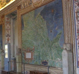
In the Gallery of Maps in Vatican City, Rome, there are 40 huge maps on the walls created by the 16th century cartographer Ignazio Danti*. If the commissioner of the maps, Pope Gregory XIII, had required Danti to include map disclaimers I imagine they might have said something like this:
Pope Gregory XIII provides these data as is. The Vatican Palace, Rome, is not responsible for any adverse outcomes associated with using these maps for the administration of the state, merchandise freight calculations, voyaging or other such uses. The locations of episcopal and archiepiscopal seats, cypress trees, castles, and battlements are not at a survey scale and are not complete.
*These maps are extremely accurate given the limitations of the instruments at the time and the sheer scope of the project. At that time, the tools used to determine geographic location were: compasses, Astrolabes, and gnomons (the part of a sundial that sticks up and creates a shadow).
Ten Almost-Famous Map Quotes
Here’s some famous “quotes” “about maps.”
“Whenever you find yourself on the side of the boss’s map ideas, it is time to pause and reflect.”
Map Twain
“I have not failed. I’ve just made 10,000 non-normalized choropleths.”
Thomas A. Mapitson
“Great minds discuss cartography; average minds discuss events; small minds discuss people.”
Eleanor Compass Rose
“Anyone who has never made a mistake has never tried building a tileset for zooms one through eighteen for the world in 12 languages with three separate worldviews of administrative boundaries.”
Albert Conformal Einstein
“If you can’t include a hundred layers, then include just one.”
Mapper Teresa
“Ask not what OpenStreetMap can do for you. Ask what you can do for OpenStreetMap.”
John F. OpenSource
“Aesthetic is worthwhile in itself.”
Amelia Map<3
“If your actions inspire others to dream more, learn more, do more and become more, you are a cartographer.”
John Query Adams
“The greater danger for most of us lies not in setting our aim too high and falling short, but in setting our aim too low and worrying about the pronunciation of choropleth.”
Mapalgebraelo
“When one door of mappiness closes, another opens; but often we look so long at the closed door that we do not see the one which has been opened for us.”
Mapen Keller


Recent Comments