Archive for category Creativity
Making Scatterplots in ArcGIS
Posted by Gretchen in Creativity on February 22, 2011
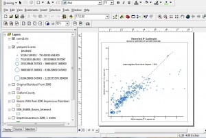
This isn’t your typical mapping task, but I am currently evaluating the effectiveness of a model that uses 1-meter impervious surface data and I needed a scatterplot. Did you know that you can actually make one in ArcGIS? It’s definitely a creative use of the software as it really isn’t a function that you just choose from a drop-down menu. What you are doing is essentially plotting your data points in x,y space.
I had a dataset of basins (aka watersheds) that had a measured imperviousness percentage based on the 1-meter impervious data – basically just an intersect between the two datasets and a summary procedure. Note you could easily do a raster zonal analysis instead, but my data were already in vector. I also had data on the percent impervious of the basins based on a model. In an ideal world the two would match. In other words, y=x.
So I had two variables: the actual impervious and the modeled impervious. Add to that a third variable: size of basin, and that’s all that needs to be on the scatterplot. I figured size of basin is important because it would make sense that larger basins would have less error than smaller basins. So I outputed those three variables into a table and then imported the table as an x,y dataset where x was the actual and y was the modeled.
I guess I should mention that I took the square root of the percentages first, before plotting them on the graph. This preserves the relationships that I’m measuring while reining in the values, so to speak. Then I symbolized by graduated symbols. These were hollow circles to help visualize overlap. I created an y=x line too, then fitted the graph axes where they should go.
Overall I’m quite pleased, both with the visualization and the results. The results show that the data do get pretty close to the y=x line for the most part. There’s quite a bit of scatter in both directions with the very small basins. However, these basins are very small. I think it is safe to say the model does not predict imperviousness in very small basins well.
I may did write an entry tomorrow on calculating the area-weighted root mean square error. That is sure to be extra-exciting! 
How I Made Valentine’s Day Stickers
Posted by Gretchen in Creativity on February 7, 2011
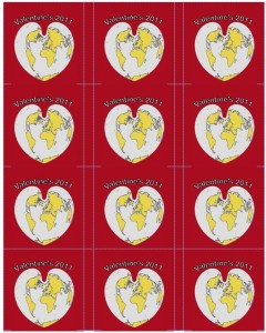
To make these Valentine’s Day stickers, I ordered these 2.5″ diameter white labels, then created an ArcMap project using the continent and world30 layers rendered with colors chosen from page 16 of Colors for Maps (colors 6, 1, 9, and 4). The projection was set to World Bonne (an old heart-shaped projection, not really in use anymore). The 2″ by 2″ map was imported into a Word template for the stickers. The Word background was set to the same background color as the map image.
Getting the text on there was difficult. I wanted it to say Happy Valentine’s Day but there just wasn’t enough room. I settled on Valentine’s Day 2011. Here’s the way they look in Word:
If you want to print these yourself: Click here to download the .docx file, then click Valentines2011.
After that it was just a matter of printing them on the InkJet. My elementary-school aged kids will be giving these out along with their valentine cards!
Imagining Disclaimers of Yore
Posted by Gretchen in Creativity on January 5, 2011
I’ve been doing a little thinking about map disclaimers lately. This led me to the creative exercise of trying to imagine what the disclaimers on historic maps, if there had been disclaimers, would have said. Perhaps something like, “Beware the dragons in the western seas, the producers of this map are not responsible in the event of your death by a dragon or any other related water beast.”
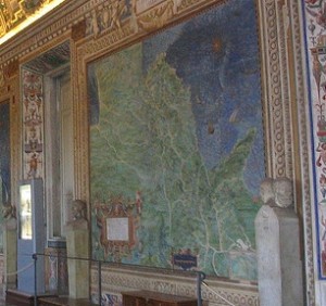
In the Gallery of Maps in Vatican City, Rome, there are 40 huge maps on the walls created by the 16th century cartographer Ignazio Danti*. If the commissioner of the maps, Pope Gregory XIII, had required Danti to include map disclaimers I imagine they might have said something like this:
Pope Gregory XIII provides these data as is. The Vatican Palace, Rome, is not responsible for any adverse outcomes associated with using these maps for the administration of the state, merchandise freight calculations, voyaging or other such uses. The locations of episcopal and archiepiscopal seats, cypress trees, castles, and battlements are not at a survey scale and are not complete.
*These maps are extremely accurate given the limitations of the instruments at the time and the sheer scope of the project. At that time, the tools used to determine geographic location were: compasses, Astrolabes, and gnomons (the part of a sundial that sticks up and creates a shadow).
Creativity and GIS
Posted by Gretchen in Creativity on November 3, 2010
A few years ago I put together a little booklet called “Integrating Creativity Science With GIS.” It was an accompaniment to an hour-long webinar* that I gave with Stephen Few** on the same subject. My aim was to get geoprofessionals who have jobs centered around analytical work to start thinking more creatively. When an analyst is able to use creative problem solving, the analytics have potential to become more powerful and profound. You can view the booklet here.
*The webinar is available for download (it’s $55) on my company site here.
**Stephen Few is the guy who wrote Information Dashboard Design, among other books.
Activate Your Inner Innovator
Posted by Gretchen in Creativity on October 6, 2010
Did you know that creativity is something that everybody possesses and that all you need to do is activate it? When you need a burst of creative energy the easiest method to employ is a creative exercise that is designed to free your brain from verbal processing and into visual processing, which then allows for novel and innovative ideas to flow. There are a lot of exercises you can do, many of which take mere seconds from start to finish.
One of these is something that will take you somewhere between 10 seconds and 20 seconds to accomplish. Please don’t tell me you can’t spare that amount of time.  This is from the book referenced in yesterday’s post.
First, draw free-form squiggles on a piece of paper. They might look like this:
Now add in a circle ( o ) and an open triangle ( < ) on it somewhere:
And there you go: a free-form bird. Next time you go into one of those meetings where you are supposed to come up with solutions (yes, I hear meetings sometimes have these kinds of goals, though usually the goal is to show off how much you know to your colleagues) doodle these on a piece of paper while you think. Your creative brain will awaken and the ideas will begin formulating.
What’s even better is that the ideas you do have will likely come in the form of visual ideas instead of verbal ideas. If you can get the rest of your group to visualize a potential idea too, then the group will evaluate it much more effectively (realistically) than it would with just words.
How We Spend Our Time
Posted by Gretchen in Creativity on September 24, 2010
According to this interactive graphic from the New York Times, people spend a lot of time working, eating, sleeping, and maybe doing some traveling and socializing during their days. The graphic is pretty nifty to click around on, so give it a try. A snapshot of what it looks like is here:
That light blue band on the bottom is for “relaxing and thinking” time, which I was both happy and not happy to see. On the one hand it is nice to see that the category even exists at all but on the other hand it looks pretty darn tiny. I care about relaxing and thinking time because it is so important for creativity.
Without downtime, you can pretty much expect creativity to come to a halt. With creativity being so important in the construction of good quality maps, since no two mapping circumstances are exactly the same, a person engaged in mapping on a day to day basis needs to incorporate this into a typical day.


Recent Comments