Archive for October, 2010
Almost Done: Colors Booklet
I’m nearing the end of a 2-month long project to create a booklet of colors specifically geared toward the geoprofessional. While there are some great ways to “cheat” and develop a color palette (see Shell We? post), it does take some time to do it. The aim of this booklet is to cut out any semblance of actual work on the reader’s part, allowing a reader to pick a successful color palette instantly. 
And, like Elmore Leonard said, “I try to leave out the parts that people skip,” meaning that the booklet is high on substance and low on fluff. I hope to announce its availability for download on this site very soon. Probably in the next two weeks, fingers crossed.
I’d love to hear from you in the comments. If there’s anything concerning color that you think would be great to have in the booklet let me know. I know there are geopeeps out there reading these posts regularly and it’d be great to get a discussion going (but perhaps not on the use of the term geopeeps which I know may be a bit too technical for some people).
Usability
Posted by Gretchen in Cartography Profession, Inspiration on October 21, 2010
Did you know that there have been studies on the usability of ATMs? In one case, an ATM design company figured out that most customers simply wanted to withdraw cash from the machines. From this the company decided to make it super-easy for a customer to perform this one major function. The other functions were still there, but the entire design was built around making it easy to withdraw cash.
The major finding of another study* was that there is a high correlation between ATM interface aesthetics and how easy people felt it was to use the system.
Lesson: aesthetics are important because they relate to perceptions on ease of use. Design the major function first and fill in details around that so the major function is always the first and foremost thing a user interprets. The application to maps? Pretty obvious?
If this topic interests you head on over to Users Fix Parking Ticket Machine Interface Themselves.
*Kurosu, M. and Kashimura, K. Determinants of the Apparent Usability, Proceedings of IEEE SMC, (1995), 1509- 1513.
Also confirmed by Noam Tractinsky in Aesthetics and Apparent Usability: Empirically Assessing Cultural and Methodological Issues.
Spell Check
Posted by Gretchen in Best Practices on October 20, 2010
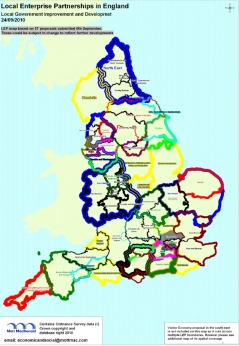
This is just a simple reminder post to always spell check your map products! Here’s a map that was recently published on the web. Among other problems, it has a spelling issue. In the sub-title no less:
Here’s the spelling error:
So, to sum-up, always spell check!*
*This photo is from a site called cakewrecks. If you want to laugh your head off and waste hours of your day, you’ll head to that site straight-away.
Fun With Legends
*Note, I wrote a whole long post on this and it got lost on the way to the presses. Here is the shortened version.
Yucky default legend, good only for maps that you don’t care about:
Here’s a really nice way to present a color ramp. Yes, this was done in ArcMap. You just have to convert the legend to graphics, ungroup them, then fool around with all the settings and move things around until it looks decent:
What if you want to go nuts and turn a color ramp onto its side? (A very easy way to give a more professional/unique look to a legend.) Use a screen shot program – I use MWSnap – to take a screen shot of that portion of the layer properties dialog that shows the color ramp horizontally. Then just insert that image into the map. You have to keep the size small since the resolution may be low, but that hasn’t been a problem for me so far. Here’s where you clip it from the layer properties dialog:
Constantly Amazed
It’s amazing how much I don’t know. I met someone the other day who looked through my book and started talking about colors with specific attention to how the Pantone color scheme works. Pantone is not mentioned in my book, mainly because the main-stream GIS software doesn’t use Pantone colors, instead it uses HSV and RGB. You may also need to know HEX and maybe be familiar with Munsell if you do soils GIS. But Pantone? Not high on the list of priorities. However, it is definitely interesting, especially as I’ve gotten very into color theory lately.
This new acquaintance let me in on a little of the history of Munsell – how it had been in a bit of a competition with Pantone for the “big” business (textiles, printing) but Pantone pretty much cornered the big-business market. Interesting stuff. Most of us don’t think about this at all, you just pick a color, use whatever system gets you that color, and call it good.
The Pantone color guide, which displays the Pantone Matching System (PMS), is $165.00 off their website but you may be able to get it cheaper through Amazon. What it does is provide exact colors that can be replicated exactly as they are shown on the guide, no matter what is used to produce the color. You are supposed to purchase the guide every year because the colors yellow over time.
Typography Rules: A Pictorial Tutorial
Posted by Gretchen in Best Practices, Typography on October 12, 2010
There are a lot of standards in cartography regarding font color, choice, spacing, and so on. Here are some examples of just some of the rules or standards. These are all examples from a single, poster-sized map I made a few years ago.

Black is the usual color choice for most labels. The exceptions are brown for contour labels and blue or white for water features. Bold and upper case usually denote high-importance, or at least a higher level in some sort of hierarchy. The usual advice is that the best label placement is above and to the right of the point, however, how often are you presented with a “usual case”? Not as much as you’d like! In this case it had to be up and to the left as that was the only place the label would fit without crossing any of the other features.
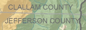
This isn’t a major rule, but it is nice to put county labels next to the county line that they belong to. This is especially effective when (as in this case) there are a lot of other labels on the map. If I had put the county labels in the center of the county they would have been mixed up with the watershed labels that are also on there.
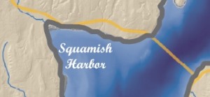
Here the harbor label is in a script font. Usually water features are labeled in white or blue, and in this case only white would do, since the bathymetry is shown in such a deep, dark, shade. Water features can also be written in simple italics instead of script – but remember that it is always nicer to use a font family that includes its own italics face as opposed to using a regular typeface with the italics converter (see Type Tips).
Here’s another example of positioning. The label “BELFAIR” could not be positioned anywhere except above and to the left of the point feature. In this case if the label had been above and to the right it would have crossed the watershed line and also been half-way inside the much lighter background portion of the map.
This label, which is for a watershed name, is not in all caps in order to distinguish it from the county labels. It still had to stand out from the dark green hillshade underneath, necessitating the white shadow.
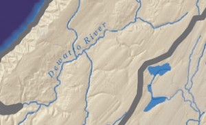
The usual advice for river labels is to make sure they are above the line because words generally have more ascenders than descenders. If you were to put it below the line the ascenders would vary the spacing between the feature and the lettering enough to make it look sloppy. When placing above the line, however, you still need to be mindful of the descenders so the label ought to be placed far enough above it so that the descender does not cross the feature (though as usual we can find effective counter-examples). Another bit of advice is to find the straightest portion of the river to place the label. However, in this case, this river has virtually no straight stretches. Finally, the label here could have been a bit darker in hue so that the second “t” doesn’t get lost on the tributary line.


Recent Comments