Archive for December, 2010
New And Effective Map Design Qualities
Posted by Gretchen in Best Practices, Design on December 7, 2010
Some of the best, new cartography products out there have these qualities:
- Oblique views: Especially for maps of cities and towns both because of the scale and the subject. The view gives the reader a sense of being involved in the map instead of looking down from above.
- Subtle hillshading: The days of overly detailed elevation data used as backgrounds are over. So are the days of the dramatic black and white hillshade. Now we see hypsometric tinting that alludes to the slope of the land serving as a backdrop for the more salient features of the map instead of competing with them. If your elevation data are too detailed – generalize!
- Labels placed with care: Labels are not auto-generated and auto-placed. They are hand-placed as graphic elements where they will be most legible but least obtrusive.
- Integrated graphics: Graphics are used to enhance the display for informational maps. For example, I recently saw the use of magnifying glasses placed along the margins, each with a magnified view of a different part of the map shown inside.
- Background balance: Analytical maps, especially, can veer toward having backgrounds that are too simplistic (perhaps the cartographer does not want the background to compete with the data) to backgrounds that are too detailed (where the cartographer feels more information is more informative). Analytical maps that are effective will have a balance with enough background to provide a simple location awareness but not so much that it obscures the data.
- Integration: The rendering of objects is consistent within an overall scheme of color, line-weight and translucency so that nothing is jarring.
- Taste of reality: Some newer maps are taking on a look that is hard to describe. They are a blend of real and fake, sort of like a computerized world. This is achieved by the use of high-resolution imagery draped with 3-4 layers of hues for each type of feature such as grass, trees, and houses.
Google map labels, blanket maps, and an old map
Posted by Gretchen in Typography, Web Maps on December 6, 2010
This morning I’d like to share three very interesting links:
1) Blog post by Justin O’Beirne: (the actual blog post is down so this link takes you to the Google blog mention – but definitely try to read Justin’s original post if it goes live again) Excellent explanation of why the Google maps’ labels are more effective than those of its competitors. The findings can be directly applied to any maps you yourself make too, whether you make web maps or static maps. The two big take-aways are that thick, white, non-translucent, labels are important to enable label legibility over a busy map background. The second is that the density of labeling can and should be artificially reduced immediately surrounding those areas that are most dense to further set the dense areas apart from the sparse areas. These are all illustrated brilliantly in the article.
2) Haptic Lab: Blankets and bags made of quilting, where the quilted stitches make up a pattern very much like a map – perhaps a map of your home town to snuggle into. These are made by Haptic Lab Inc.
3) The Impossible Tulip of Cartography: The 12-foot long Chinese map of the world from 1602. Interesting nick-name, interesting map.
Take Note When Other People Make an Effort
Posted by Gretchen in Inspiration on December 2, 2010
When you encounter examples of people making a great effort in their everyday work lives, whether it is in fiction or non-fiction, take note. They are an excellent reminder to try a little harder, think a little more, and create better solutions. Here are just two examples that I came across this week that have inspired me:
- In a book called Shift: How to Reinvent Your Business, Your Career, and Your Personal Brand
by Peter Arnell, the author describes how he came to devise the name and advertising angle for the clothing line DKNY: “I went out and began to photograph all the abbreviation logos of New York for inspiration. Late one night I was working in the studio…I spelled out DKNY in bold Helvetica letters…” He also states, a few pages earlier, “Whatever you take in becomes part of you. Give yourself permission to tap into that storage vault in your life and career. Your own capital grows from your constant aggregation of knowledge and experiences.”
- Lately I’ve been watching a lot of Poirot
movies. In practically every movie, the main character, the detective Poirot, talks about how he has to use his “little gray cells” to solve a case. In most TV shows and movies today there is mostly action. Not even mere references to the act of thinking are allowed.
 Poirot, however, is a good reminder that all action and no thinking never gets you anywhere. In one particularly interesting scene Poirot leaves everyone in the middle of an unsolved case to go home and sleep. The other characters are angry at his lack of action, but in the end it is his “sleeping on it” that brings him the wisdom to nab the culprit.
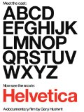
Movie: Helvetica
Posted by Gretchen in Typography on December 1, 2010
Helvetica is a typeface with a history of over 50 years of near-ubiquitous use, especially on signage. It’s also used quite a bit in the U.S. Government (tax-forms!).
About three years ago some independent documentary film makers released a movie about the history of the typeface and what’s more: graphic design in general. One of my favorite typeface personalities, Mathew Carter, is interviewed on it – it was worth it for me just for that bit. There is a lot more to see and learn in the movie, however, and I recommend it for all design geeks who seek inspiration and entertainment.
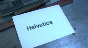
My only complaint is the over-weighted importance that they place on typefaces – but I suppose if they hadn’t done that they wouldn’t have a compelling movie either. Hey, you’ve probably never seen the process of putting letters together on a frame dramatized in quite this way before! And the beginning sequence, where you watch this process along with the rest of the printing procedure (inking, pressing, etc.) is almost mesmerizing.


Recent Comments