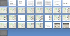
I’m still working extremely diligently to try and get Type For Maps out to reviewers by the end of today. If that doesn’t happen it’ll be by the end of tomorrow at the latest. There are always so many little details to go over like alignment, fact checking, and text edits that you don’t necessarily want to think about at the beginning of the project but that, nevertheless, have to get done. There’s also the small problem of one of the fonts – one that is widely used and respected – not appearing correctly on my screen. I believe the designer has posted a faulty download file so I’ll have to get that resolved.
Here’s a sneak-peek at the booklet in layout mode:

Crossing-fingers for a publication date of Tuesday, April 19, 2011!!!


#1 by Damien Demaj on April 18, 2011 - 4:13 pm
Hi Gretchen,
I look forward to seeing the final version of your Type for Maps booklet. Before you go live with the booklet I thought I’d add a few comments for your users to consider (if you don’t mind!).
Firstly, it is really important for GIS users and cartographers to not get too bogged down when choosing fonts for their maps.
The process of selecting a font is really one of elimination. For example; most users will be firstly limited to the fonts on their machine. Then they need to decide whether to use San Serif or Serif fonts (or a combination of both). The user should also consider whether their map is for screen display or print. By this point they will have removed many fonts from their selection set. Then of course some fonts will be further eliminated purely because of practical and aesthetic reasons.
So very quickly a user can narrow their selection down to 4-5 fonts to use for their map.
Also if the user is adding paragraphs of text to accompany the map then they need to understand how to select the correct font for headings, paragraph & sentences of text. Fonts that work as single pieces of text on a map may not necessarily work well as paragraph text.
These are just few rules I follow when selecting fonts to use for a map. I hope your users find them useful!
Regards,
Damien Demaj
Esri Online Cartographic Product Engineer
#2 by Gretchen on April 18, 2011 - 9:00 pm
@Damien Thanks for your helpful hints. I agree that it can be relatively easy to narrow down the options to just a few depending on what you have available. It’s also great to be able to compare and contrast system fonts that come with your OS to some of the higher-quality free fonts and to paid fonts to see what else is out there. I do believe that by changing the text just a little bit you can make a big impact and set your maps apart from the others.