Archive for category Booklet
Type For Maps Movie Preview
Posted by Gretchen in Booklet, Typography on April 20, 2011
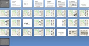
Head over to the booklets page to see a complete preview of Type For Maps. I always wish I could flip through a book on-line like you can at the bookstore (of course, you can do this with some, but not all, books on Amazon) so I created a virtual flip-through for you. You can see each page at a glance this way to get a much better idea of what is in it. I really do believe this booklet is something every GIS professional and cartographer ought to have in their back pocket. Barring that, it would be good if every GIS professional and cartographer had it on their computer. 
Those of you who have already bought it, it would be great if you could leave comments here so that others who are considering the purchase can make a more informed decision. Thank you so much.
Type For Maps E-Booklet Is Now Available
Posted by Gretchen in Booklet, Typography on April 19, 2011
Type For Maps, my newest e-booklet is now completed and ready to help you choose a typeface for your next mapping project!
WHAT IT IS: 50 fonts showcased on 25 pages – two per page – in a way that makes it easy for you to flip through and select something you can use. There are 20 system fonts described and illustrated. By system font I mean fonts that you are likely to have on your PC. There are 20 free fonts described and illustrated. Free fonts can sometimes be of poor quality. The ones described in this booklet are great for mapping and of high quality. There are 10 for-fee fonts described and illustrated. Sometimes it is best to pay a little bit of money to get a very good font with a lot of options. Cartographers often need condensed fonts for creating teeny-tiny labels and/or typefaces that have a lot of varieties such as bold, italic, small caps, etc and these for-fee fonts fit the bill.
I want to give a huge THANK YOU to the two primary reviewers: Hans van der Maarel, of RedGeographics and Franςois Goulet, of FG Cartographix.
I do not have the website updated with the booklet information yet. Booklet Page For More Information and a Complete Preview. If you would like to purchase it right now please, by all means, do so! I want it out there in the world, helping GISers and cartographers RIGHT NOW! It is 38 pages total and costs $9.95. It is a pdf, 7.5 mb. Just click the Add To Cart button and it’ll take care of the purchase and automatically send you the file.

A sample booklet page is shown here.

Edited to add some early praise for Type For Maps via twitter:
@geometrus
awesome as usual – will buy one in a moment! RT @petersongis: The Type For Maps E-Booklet is now available! http://bit.ly/gI3xNi
@aspectbusiness Sarah Palmer
Whoot .. got it! ‘Type for Maps’ an excellent compliment to ‘Colors for Maps’ … Very cool 
@amandahstaub Amanda Taub
Yeah! It has finally arrived! RT @PetersonGIS: The Type For Maps E-Booklet is now available! http://bit.ly/gI3xNi
elliothartley Elliot Hartley
Needed some #GIS inspiration for a new project so purchased @PetersonGIS Color and Type for #Maps, looks good! http://ow.ly/4GZbt
Edited again to add praise via email:
Hello Gretchen,
It’s great to have access to a resource which has been put together by someone in the biz. Have also been putting your GIS Carto. book through it’s paces. Money well spent from my perspective! Just wanted to pass on a big Thank You! for making both references available for those of us in need of a bit of guidance\inspiration. A wonderful resource that I’m putting to use, immediately!
All the best,
Jamie Whitters
Thanks everyone! I welcome any/all feedback.
Type For Maps: A Sneak Peek
I’m still working extremely diligently to try and get Type For Maps out to reviewers by the end of today. If that doesn’t happen it’ll be by the end of tomorrow at the latest. There are always so many little details to go over like alignment, fact checking, and text edits that you don’t necessarily want to think about at the beginning of the project but that, nevertheless, have to get done. There’s also the small problem of one of the fonts – one that is widely used and respected – not appearing correctly on my screen. I believe the designer has posted a faulty download file so I’ll have to get that resolved.
Here’s a sneak-peek at the booklet in layout mode:

Crossing-fingers for a publication date of Tuesday, April 19, 2011!!!
Nothing To See Here
There’s no real post for today because I’m bogged down trying to get the draft of the new typography booklet done. My aim is to get the draft done by Wednesday so I can send it out to reviewers and have it back by early next week for revisions. However, the list of things to complete before that happens just keeps getting longer, it seems.
The booklet is not just some hacked together piece of junk. I’m at least 30 hours into the implementation (that doesn’t count thinking and designing time). One decision I made was to showcase only 40 fonts. I was originally going to showcase 60 fonts but then I realized that that was not going to help people. The main aim of the booklet is to help a GIS person choose a great font to make their cartographic output more professional. A side bonus could be that the map will be more unique (if they decide not to use Arial!) though in many cases what we want from a map design is to ensure that the typeface will not stand out so uniqueness is not always part of the GIS person’s goals.
So, to ensure that I was actually helping things I decided to keep it to 40 fonts. I figure if I showcase 60 then I’m not really making the GIS person’s job easier as there will be that many fonts to wade through. Besides, with the 40 that I do show, there are plenty of great options to choose from.
Currently I’m doing those editing tasks that take more time then you would ever imagine. This afternoon, for example, was spent rounding up the necessary verbiage for trademarks and registered trademarks since many fonts fall under one of those categories. The next thing to do is run through my checklist of possible error-points including making sure that all font names are spelled correctly (as they can be very creative with their spellings) and that the correct designer name and spelling is listed under the fonts. I’ve got a check list going that could rival a pilot’s checklist so those are only a couple of the many things to do.
It is exciting to be closer to finished, however, and to see how the finished product is going to look!
Making and Using the Colors For Maps Booklet
It took about 2.5 months to create the Colors For Maps booklet. I had the idea a while before I actually started working on it though, because I wanted to wrap up two of my GIS projects before embarking on the map booklet project. It turned out to be a good idea because what started as a simple idea rapidly became a lot of work. (Isn’t that always the way?) I’ve long been into using inspiration pieces to find colors for map projects but I do know that even that short-cut can sometimes take a while. I also am into keeping a “shop book” once you have some colors that work out well. However, even though I recommend keeping track of the colors, I wasn’t taking my own advice. If I wasn’t even taking my own advice I figured other people probably weren’t either! So I made this booklet, thinking that at the very least, it would become my shop book. And beyond that I hoped it could help others as well.

Coming up with color schemes that worked became pretty easy for me after the first few. I often had to tweak the scheme (a color here and there) once I put it into the map but beyond that it was not very hard work. One problem was that I could only come up with one or two of them a day. Once you’ve spent 2 hours working on two color schemes, you just get burned out on colors. When I started dreaming about color palettes and the mechanics of putting them into the booklet template I figured I was pretty well steeped in the process. 
One of the buyers sent me a few direct messages on twitter yesterday. Here’s the conversation:
Buyer: and thank you for the hard work in putting this together. Question: are any of the palettes recommended for colour blindness?
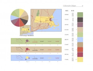
Me: I didn’t make specific recommendations but there are deuteranope simulations of the sample map on each palette page.
Buyer: Oh, yeah. I wasn’t familiar with the specific term and missed the feature while flicking through. Really impressive work!
Buyer: Have you thought of letting people downld 1 sample palette pg free? I’m sure you’ll get many more purchases subsequently.
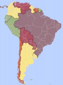
Since I thought the idea of showing one of the sample pages (shown above) was a good one I thought I’d show it here on the blog. The sample page above is from page 9, which happens to be the first page in the Coordinated Palettes section. Below is a map I used in an example at a recent talk I gave at Colorado State University in which I used the colors from the palette page shown above.
The Colors For Maps Booklet
Posted by Gretchen in Booklet, Color, Inspiration, News on November 2, 2010
Colors For Maps – This takes you to the purchase page.
I’ve been so busy over the last couple of days getting everything set for the debut of “Colors For Maps,” my newest publication. It’s a 40 page booklet containing 30 color palettes chosen for their usefulness in map designs of many types.
So far, these are the review comments I’ve gotten:
“This is well worth the $10 Gretchen is charging for the booklet. Maybe next we can persuade Gretchen to come out with a poster that we can print on our plotters.” Amanda Taub, GIS Analyst, GISP (via the LoneGISPro group)
“I would use this information in this book. We are constantly making quick prints for executives (Governor or Legislature). There is an art and a science to portraying the information appropriately and you only get one brief chance to get it right. We have used [an online color-picking site] for several years…but it doesn’t always give us exactly what we need. This booklet takes the next step.” Learon Dalby, Geo Program Manager, State of Arkansas (via email).
“Just bought it…Nice!” @fgcartographix (via twitter).
For those who have already purchased the booklet, please do let me know either in the comments or via email what you think of it.
Special thanks goes out to the peer-editors, which are listed on the booklet page. But also I need to make sure that my web designer – Becky Dobbins – gets full credit for the wonderful job she did setting up the booklet page and making sure it interfaces with PayPal and Google Checkout (you can pay via credit card with PayPal too) with a seamless and secure check-out.
I’ll write more about the making of the booklet in future posts. For now I am going to sit back, relax, and enjoy this vanilla with vanilla cupcake my husband bought me to celebrate the booklet being done…finally. 


Recent Comments