Archive for category Inspiration
Author Pedestal?
Posted by Gretchen in Inspiration on January 18, 2011
In the book I wrote about how modern maps need to have authorship information such as the author’s name, perhaps their affiliation, website, or other contact information. I stress that this is secondary or tertiary to other aspects of the map in that it only needs to be seen by those who look for it. Therefore it should remain unobtrusive in the overall design.
Tufte talks about how important it is for an author to place his or her name on the map, not just the organization’s name. The idea is that this holds the author accountable and ostensibly will result in a better product.
The 16th century cartographers took this concept to a completely new level, however. This authorship pedestal is found on a map by Augustine Herman Bohemiensis in 1670 of Virginia and Maryland:
Just for fun, I wondered what it would look like if we used authorship pedestals today:

I sent my authorship pedestal to a long-time client the other day, as a joke, to inform him that all my maps for him will now bear this insignia. His response was that the pedestal should be higher. 
Scale Bar Inspiration
Posted by Gretchen in Inspiration on January 11, 2011
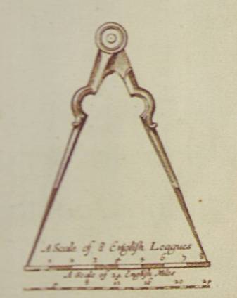
Looking for a new scale-bar idea? Well, maybe you weren’t looking for something quite like this. This scale bar is from a map of Virginia and Maryland authored by Augustine Herman Bohemiensis in 1670.

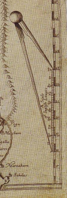
Here’s another one with the same idea, from a 1619 map by William Baffin and Thomas Roe titled “A Description of East India.”

And this one, from the same century, is from a 1664 map of New York (but at the time called New Amsterdam). It is so striking because it is in color! Who has ever seen a scale bar in color? What a strange concept. This one could potentially be implemented in a modern map, actually, perhaps on a children’s educational map.

Take Note When Other People Make an Effort
Posted by Gretchen in Inspiration on December 2, 2010
When you encounter examples of people making a great effort in their everyday work lives, whether it is in fiction or non-fiction, take note. They are an excellent reminder to try a little harder, think a little more, and create better solutions. Here are just two examples that I came across this week that have inspired me:
- In a book called Shift: How to Reinvent Your Business, Your Career, and Your Personal Brand
by Peter Arnell, the author describes how he came to devise the name and advertising angle for the clothing line DKNY: “I went out and began to photograph all the abbreviation logos of New York for inspiration. Late one night I was working in the studio…I spelled out DKNY in bold Helvetica letters…” He also states, a few pages earlier, “Whatever you take in becomes part of you. Give yourself permission to tap into that storage vault in your life and career. Your own capital grows from your constant aggregation of knowledge and experiences.”
- Lately I’ve been watching a lot of Poirot
movies. In practically every movie, the main character, the detective Poirot, talks about how he has to use his “little gray cells” to solve a case. In most TV shows and movies today there is mostly action. Not even mere references to the act of thinking are allowed.
 Poirot, however, is a good reminder that all action and no thinking never gets you anywhere. In one particularly interesting scene Poirot leaves everyone in the middle of an unsolved case to go home and sleep. The other characters are angry at his lack of action, but in the end it is his “sleeping on it” that brings him the wisdom to nab the culprit.
The Colors For Maps Booklet
Posted by Gretchen in Booklet, Color, Inspiration, News on November 2, 2010
Colors For Maps – This takes you to the purchase page.
I’ve been so busy over the last couple of days getting everything set for the debut of “Colors For Maps,” my newest publication. It’s a 40 page booklet containing 30 color palettes chosen for their usefulness in map designs of many types.
So far, these are the review comments I’ve gotten:
“This is well worth the $10 Gretchen is charging for the booklet. Maybe next we can persuade Gretchen to come out with a poster that we can print on our plotters.” Amanda Taub, GIS Analyst, GISP (via the LoneGISPro group)
“I would use this information in this book. We are constantly making quick prints for executives (Governor or Legislature). There is an art and a science to portraying the information appropriately and you only get one brief chance to get it right. We have used [an online color-picking site] for several years…but it doesn’t always give us exactly what we need. This booklet takes the next step.” Learon Dalby, Geo Program Manager, State of Arkansas (via email).
“Just bought it…Nice!” @fgcartographix (via twitter).
For those who have already purchased the booklet, please do let me know either in the comments or via email what you think of it.
Special thanks goes out to the peer-editors, which are listed on the booklet page. But also I need to make sure that my web designer – Becky Dobbins – gets full credit for the wonderful job she did setting up the booklet page and making sure it interfaces with PayPal and Google Checkout (you can pay via credit card with PayPal too) with a seamless and secure check-out.
I’ll write more about the making of the booklet in future posts. For now I am going to sit back, relax, and enjoy this vanilla with vanilla cupcake my husband bought me to celebrate the booklet being done…finally. 
Usability
Posted by Gretchen in Cartography Profession, Inspiration on October 21, 2010
Did you know that there have been studies on the usability of ATMs? In one case, an ATM design company figured out that most customers simply wanted to withdraw cash from the machines. From this the company decided to make it super-easy for a customer to perform this one major function. The other functions were still there, but the entire design was built around making it easy to withdraw cash.
The major finding of another study* was that there is a high correlation between ATM interface aesthetics and how easy people felt it was to use the system.
Lesson: aesthetics are important because they relate to perceptions on ease of use. Design the major function first and fill in details around that so the major function is always the first and foremost thing a user interprets. The application to maps? Pretty obvious?
If this topic interests you head on over to Users Fix Parking Ticket Machine Interface Themselves.
*Kurosu, M. and Kashimura, K. Determinants of the Apparent Usability, Proceedings of IEEE SMC, (1995), 1509- 1513.
Also confirmed by Noam Tractinsky in Aesthetics and Apparent Usability: Empirically Assessing Cultural and Methodological Issues.
Tidying up…Maps?
Posted by Gretchen in Inspiration on September 19, 2010
Here’s a fun talk by Ursus Wehrli about tidying up art. I’m wondering if anyone in the geo-world would have a go at tidying up maps?


Recent Comments