Archive for category Typography
Type For Maps Movie Preview
Posted by Gretchen in Booklet, Typography on April 20, 2011
Head over to the booklets page to see a complete preview of Type For Maps. I always wish I could flip through a book on-line like you can at the bookstore (of course, you can do this with some, but not all, books on Amazon) so I created a virtual flip-through for you. You can see each page at a glance this way to get a much better idea of what is in it. I really do believe this booklet is something every GIS professional and cartographer ought to have in their back pocket. Barring that, it would be good if every GIS professional and cartographer had it on their computer. 
Those of you who have already bought it, it would be great if you could leave comments here so that others who are considering the purchase can make a more informed decision. Thank you so much.
Type For Maps E-Booklet Is Now Available
Posted by Gretchen in Booklet, Typography on April 19, 2011
Type For Maps, my newest e-booklet is now completed and ready to help you choose a typeface for your next mapping project!
WHAT IT IS: 50 fonts showcased on 25 pages – two per page – in a way that makes it easy for you to flip through and select something you can use. There are 20 system fonts described and illustrated. By system font I mean fonts that you are likely to have on your PC. There are 20 free fonts described and illustrated. Free fonts can sometimes be of poor quality. The ones described in this booklet are great for mapping and of high quality. There are 10 for-fee fonts described and illustrated. Sometimes it is best to pay a little bit of money to get a very good font with a lot of options. Cartographers often need condensed fonts for creating teeny-tiny labels and/or typefaces that have a lot of varieties such as bold, italic, small caps, etc and these for-fee fonts fit the bill.
I want to give a huge THANK YOU to the two primary reviewers: Hans van der Maarel, of RedGeographics and Franςois Goulet, of FG Cartographix.
I do not have the website updated with the booklet information yet. Booklet Page For More Information and a Complete Preview. If you would like to purchase it right now please, by all means, do so! I want it out there in the world, helping GISers and cartographers RIGHT NOW! It is 38 pages total and costs $9.95. It is a pdf, 7.5 mb. Just click the Add To Cart button and it’ll take care of the purchase and automatically send you the file.

A sample booklet page is shown here.

Edited to add some early praise for Type For Maps via twitter:
@geometrus
awesome as usual – will buy one in a moment! RT @petersongis: The Type For Maps E-Booklet is now available! http://bit.ly/gI3xNi
@aspectbusiness Sarah Palmer
Whoot .. got it! ‘Type for Maps’ an excellent compliment to ‘Colors for Maps’ … Very cool 
@amandahstaub Amanda Taub
Yeah! It has finally arrived! RT @PetersonGIS: The Type For Maps E-Booklet is now available! http://bit.ly/gI3xNi
elliothartley Elliot Hartley
Needed some #GIS inspiration for a new project so purchased @PetersonGIS Color and Type for #Maps, looks good! http://ow.ly/4GZbt
Edited again to add praise via email:
Hello Gretchen,
It’s great to have access to a resource which has been put together by someone in the biz. Have also been putting your GIS Carto. book through it’s paces. Money well spent from my perspective! Just wanted to pass on a big Thank You! for making both references available for those of us in need of a bit of guidance\inspiration. A wonderful resource that I’m putting to use, immediately!
All the best,
Jamie Whitters
Thanks everyone! I welcome any/all feedback.
Coming Soon: New E-booklet
Posted by Gretchen in News, Typography on April 6, 2011
I’m working on a new e-booklet. It was in the planning stage for a couple of months, then in the design stage for a few weeks, now it is in the implementation phase. The topic is:
Typography
That’s the first announcement of the topic though on Twitter I did post a few “teaser” pictures of the book layout. I was trying not to give too much away with the teaser pictures but some feedback was given that they gave so little away it was like nothing at all. 
The major thing I had to figure out during the planning stage was whether or not a booklet on typography was going to be even possible. It’ll be distributed as a pdf, which means the fonts will have to be embedded in the file, which means that any font that is under a for-fee commercial license would not be able to be showcased. I briefly tried to get one of the major font companies to provide permission to use their fonts in the booklet but this was immediately (though politely) declined. I am sure that if it were to be a print-only publication then this would have had a different outcome. This is because showcasing a for-fee font on paper would not then mean that the book owner had access to the font files as it has the potential to do with the pdf format.
However, that issue is now fixed and I’m now firmly in implementation mode. The two major goals that I’ve been keeping in mind in this phase is:
- Make it extremely useful
- No filler
I’m really hoping that the publication date will be either next week or the week after that but we’ll see how things go. In all, I’m very excited about this product as it’ll be a very handy reference for GIS and cartography types as well as for myself!
Type Tips II
Posted by Gretchen in Typography on March 23, 2011
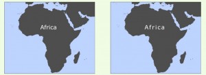
White text on a dark background is easier to read if you increase the letterspacing (called character spacing in ArcGIS). The map on the left has normal letterspacing while the map on the right has letterspacing of +25.
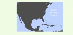
A great, free font to use for streams, lakes, rivers, and oceans is Delicious Italics, shown in the map below (link to download location). This is a true italic, not just a slanted version of the regular version.
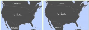
If you combine different point sizes on the same map, make the differences DRAMATIC, like in the map on the right.
*If you liked this post you might also like Typography Rules: A Pictorial Tutorial
Typefaces for Cartography Annotation – Part 3
Posted by Gretchen in Typography on January 13, 2011
Welcome back to the series on typefaces that are great for labels at differing sizes (especially small sizes). All examples are in 16 pt.
Frutiger
Useful in many contexts including small point sizes of course. This one is a highly legible, fairly simple looking font, not to mention well-known and often used.
![]()
ITC Stone
The great thing about the stone font is that it has three styles: serif, sans serif, and informal (serif shown here). If you have a need for different styles that also happen to be complimentary and some originality thrown in, then this is one to consider.
![]()
Sabon
With complex lettering this is a very interesting typeface that adds dimension and weightiness to a map. Sophisticated and different.
![]()
Georgia
One of my favorites even though I hear Willie Nelson’s “Georgia” in my head every time I choose it from the font menu. It is a popular serif, highly readable, and a good alternative to Times New Roman.
![]()
You might also be interested in:
Typefaces for Cartography Annotation – Part 1
Typefaces for Cartography Annotation – Part 2
Typefaces for Cartography Annotation – Part 2
Posted by Gretchen in Typography on January 10, 2011
(Also check out Typefaces for Cartography Annotation – Part One in this series.)
All examples are shown in 16 pt.
Helvetica
This typeface has 34 different fonts to choose from, including compressed, condensed, and narrow options. Arial and MS Sans Serif are similar. Its clarity and its generic form make it non-obtrusive.
![]()
Meridien
Meridien is a fluid and fairly complex typeface. The italic version shown here looks really good when labeling oceans and lakes. The way the serifs wisp out to rounded points make it look nice on maps with a certain nobleness.
![]()
FF Parable
This typeface looks great at small sizes, perhaps due to its very short descenders. It is a good choice for a map that will have a lot of levels of hierarchy within the text elements where you want something a little different looking. An added bonus is its three small cap fonts that would be nice for titles and other prominent text.
![]()
Beorcana
While developed for book type and therefore nicely legible at small sizes, it also looks quite nice at larger sizes. This calligraphy-inspired typeface is very interesting to the eye even though it is a sans-serif.
![]()


Recent Comments