Archive for category Typography
Typefaces for Cartography Annotation – Part 1
Posted by Gretchen in Typography on January 4, 2011
You Might Also Be Interested In:
Type For Maps, my e-book on typography
Typefaces for Cartography Annotation – Part 2
Typefaces for Cartography Annotation – Part 3
This post is the first in a series and is inspired by a thread on typophile where typefaces that look good in cartographic annotation are discussed. Some of the typefaces recommended on that thread are shown here.
For cartographic labeling, we are usually interested in using typefaces that are legible at small sizes and that have a variety of fonts. By variety of fonts, I mean that it contains options like: boldface, oblique, reverse-oblique, small caps and so on. A typeface with a variety of fonts is helpful in that it can be used to produce a map with a rich label hierarchy that still looks unified.
To be legible at small sizes it is important that the letters be compact, have short ascenders and descenders, and have a fairly even line-weight. Something like this font, called Grassy, will not be a wise choice, for example…

With those ideals in mind, here are a few typefaces that you may want to consider in your next mapping project. All are in 16pt:
GARAMOND you likely have already heard of this font, a serif with a lot of history.

CISALPIN a relatively new font created specifically for cartography for legibility at small sizes. It only has five varieties, however, and they cost $54.00 each. You can find it here.

GILL SANS created in 1926 and fairly classic looking.

VENUS MAGER compact with some added height. You can find it here.

Papyrus – A Font For All Times*
Posted by Gretchen in Typography on December 29, 2010
I’ve just learned about the font called papyrus. Yes, this may seem strange to you but I’ve never used it on anything I’ve ever written or mapped. I saw the font – not knowing what it was . . . elsewhere . . . and commented on it. Apparently I am just about the last cartographer to have heard of the incontrovertible fact that this font’s popularity is at about the height of a graticule tick mark. That is to say that there are people who don’t like it.
Its main offense is that it is overused. How can this be? Perhaps I have been hiding under a rock – entirely possible – but this font actually struck me as refreshing when I saw it. Not that I spend my days researching the intricacies of the font landscape, mind you. Not that I spend more than a few minutes a week actually considering fonts either. I’m betting most of us don’t.
So that’s why it is always so nice when those who do know a thing or two about this subject come out and declare for the rest of us the end of a font’s usefulness. Now, if only those same people could let us all know what the big-name fonts of tomorrow will be. No, they are probably hoarding that knowledge for themselves so that we font novices will continue blindly carrying on with our unfashionable fonts.
I also learned that there are some sites that cater exclusively to the bashing of the papyrus font. I won’t list them here as I think it is a little weird to bash a font. I’m really against negativity of any sort, actually. Why can’t we all just be happy?** I wrote this post to give you the knowledge that I lacked in this regard (of course, if it is true that the whole world is against papyrus then you’ve just wasted your time reading this since you already knew all about it) so you can trudge forth on your daily cartographic excursions with more aplomb.
The contrarian in me is already wondering if I should submit a map titled “I Love Papyrus!” to some designy, cartography-y event.
*Meant to be tongue-in cheek seeing as how most agree it is not a font for OUR times.
**Please don’t attempt to answer that deep question.
Google map labels, blanket maps, and an old map
Posted by Gretchen in Typography, Web Maps on December 6, 2010
This morning I’d like to share three very interesting links:
1) Blog post by Justin O’Beirne: (the actual blog post is down so this link takes you to the Google blog mention – but definitely try to read Justin’s original post if it goes live again) Excellent explanation of why the Google maps’ labels are more effective than those of its competitors. The findings can be directly applied to any maps you yourself make too, whether you make web maps or static maps. The two big take-aways are that thick, white, non-translucent, labels are important to enable label legibility over a busy map background. The second is that the density of labeling can and should be artificially reduced immediately surrounding those areas that are most dense to further set the dense areas apart from the sparse areas. These are all illustrated brilliantly in the article.
2) Haptic Lab: Blankets and bags made of quilting, where the quilted stitches make up a pattern very much like a map – perhaps a map of your home town to snuggle into. These are made by Haptic Lab Inc.
3) The Impossible Tulip of Cartography: The 12-foot long Chinese map of the world from 1602. Interesting nick-name, interesting map.
Movie: Helvetica
Posted by Gretchen in Typography on December 1, 2010
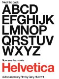
Helvetica is a typeface with a history of over 50 years of near-ubiquitous use, especially on signage. It’s also used quite a bit in the U.S. Government (tax-forms!).
About three years ago some independent documentary film makers released a movie about the history of the typeface and what’s more: graphic design in general. One of my favorite typeface personalities, Mathew Carter, is interviewed on it – it was worth it for me just for that bit. There is a lot more to see and learn in the movie, however, and I recommend it for all design geeks who seek inspiration and entertainment.
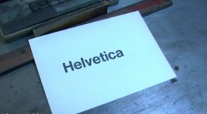
My only complaint is the over-weighted importance that they place on typefaces – but I suppose if they hadn’t done that they wouldn’t have a compelling movie either. Hey, you’ve probably never seen the process of putting letters together on a frame dramatized in quite this way before! And the beginning sequence, where you watch this process along with the rest of the printing procedure (inking, pressing, etc.) is almost mesmerizing.
Typography Rules: A Pictorial Tutorial
Posted by Gretchen in Best Practices, Typography on October 12, 2010
There are a lot of standards in cartography regarding font color, choice, spacing, and so on. Here are some examples of just some of the rules or standards. These are all examples from a single, poster-sized map I made a few years ago.

Black is the usual color choice for most labels. The exceptions are brown for contour labels and blue or white for water features. Bold and upper case usually denote high-importance, or at least a higher level in some sort of hierarchy. The usual advice is that the best label placement is above and to the right of the point, however, how often are you presented with a “usual case”? Not as much as you’d like! In this case it had to be up and to the left as that was the only place the label would fit without crossing any of the other features.
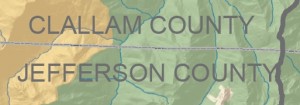
This isn’t a major rule, but it is nice to put county labels next to the county line that they belong to. This is especially effective when (as in this case) there are a lot of other labels on the map. If I had put the county labels in the center of the county they would have been mixed up with the watershed labels that are also on there.
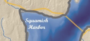
Here the harbor label is in a script font. Usually water features are labeled in white or blue, and in this case only white would do, since the bathymetry is shown in such a deep, dark, shade. Water features can also be written in simple italics instead of script – but remember that it is always nicer to use a font family that includes its own italics face as opposed to using a regular typeface with the italics converter (see Type Tips).
Here’s another example of positioning. The label “BELFAIR” could not be positioned anywhere except above and to the left of the point feature. In this case if the label had been above and to the right it would have crossed the watershed line and also been half-way inside the much lighter background portion of the map.
This label, which is for a watershed name, is not in all caps in order to distinguish it from the county labels. It still had to stand out from the dark green hillshade underneath, necessitating the white shadow.
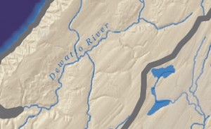
The usual advice for river labels is to make sure they are above the line because words generally have more ascenders than descenders. If you were to put it below the line the ascenders would vary the spacing between the feature and the lettering enough to make it look sloppy. When placing above the line, however, you still need to be mindful of the descenders so the label ought to be placed far enough above it so that the descender does not cross the feature (though as usual we can find effective counter-examples). Another bit of advice is to find the straightest portion of the river to place the label. However, in this case, this river has virtually no straight stretches. Finally, the label here could have been a bit darker in hue so that the second “t” doesn’t get lost on the tributary line.





Recent Comments