Archive for category Workflow
How To Get Points Into ArcMap From Google Earth
I’ve had several clients ask me how to do this lately so I figured I’d write up a quick how-to. There are probably a myriad of ways to do this. Outlined here is just one of those ways.
Each time I’ve been asked about this the situation has been that a client has gone onto Google Earth, eyeballed some locations and jotted down the latitude and longitude pairs for those locations. Then they’ve tried to import these into ArcMap and had the points show up in very unexpected places. The issue is, of course, about getting the correct projection. Don’t forget that latitude is your y value and longitude is your x value.
Google Earth uses a Simple Cylindrical projection, WGS84 datum. Once you have your points in a table, import the table into your ArcMap project. Then…
2) Go to Tools–>Add XY Data, choose the table from the drop-down list
3) Put the x coordinate in the x field drop-down list, same with the y
4) Click Edit for the coordinate system
5) Click Select
6) Geographic Coordinate Systems
7) World
8) WGS 1984.prj
9) Click okay
10) right click the layer that it just created in the table of contents, click Data, then Export Data and save it as a shapefile. This makes it into a permanent shapefile.
Always Deliver a Map with an Explanation of your Design Decisions
When you hand over the final version of a map, there are two things you can do to prevent the receiver from criticizing it. You know what kind of criticizing I’m talking about. The kind that starts out, “hey, that looks great, could you just change…this…and this…and this…and oh yeah, just rework the whole color scheme, okay…?” The two best things you can do to prevent this kind of treatment is:
- Make the map completely awesome, and
- Explain every and all detail including color choices, label placement, etc., and how you came to make those design decisions*.
Preemptive explanations are much more effective than defensive explanations (i.e., after the criticism), and they help to educate the recipient, which they will usually appreciate.
If you are sending the map or link to the finished product via email your best bet is a short introductory “here it is” followed by a long explanation. This is one of the few times when it is acceptable to send an email of this length. However, remember to separate the long explanation from the main body of the email so that if the reader so chooses, they can skip the fine print. Your recipient may be a very busy person and you want to make it clear that the explanatory text is optional reading. If criticism still follows this email you can simply say, “oh yes, I explained that choice in the email, let me walk you through it…”
If, after doing your best at explaining your decisions, they still want changes made you have these choices:
- Make the changes,
- Make the changes but remove your name/company name from the product, or
- Walk away from the project.
I don’t believe I’ve ever had a big enough problem that I can’t feel right about simply making the changes. I always appreciate feedback and am lucky to have some really great clients who I can work with well. But I do know that there are rare occasions when other cartographers have had a draconian client with unalterable garish tastes or a never ending string of changes, and in those cases you will have to put your foot down.
*Note that you can also explain design-decisions as you go. This opens you up to criticism even before you are done, though! Which means that the client may not “get” your overall vision, so tread carefully. With most clients, it works to do a little bit of both. Also note that the scope of the project is important. Small projects may simply need a delivery and explanation at the end while very large projects sometimes require a lot of back and forth with mock-ups, layout choices, and so on.
More Cooking Analogies!
You’re not going to believe this, but I’m about to make my second analogy between cooking and cartography on this blog.*#
Yesterday I had another cooking related epiphany. While watching one of those house-finder shows a lady mentioned that she wanted a private kitchen that isn’t open to the rest of the house. She said that cooking is a private activity. I think she’d be hard-pressed to find a private kitchen in the U.S., where it seems like everyone wants an open kitchen where they can talk to people and have company while cooking.
It struck me that map makers might have different preferences in this regard as well. Some of us enjoy making a map with input from others throughout the process while others would rather wait until they feel like it is complete before sharing the product with everyone. Which approach do you think results in a better product?
Hey, at least when you have an open kitchen everyone can see all the hard work that has gone into the meal. Maybe they’ll appreciate it more and maybe you’ll work harder to make it better. (We won’t mention the fact that an open kitchen also invites people to witness your cooking disasters. Like the time you threw the Pyrex full of canned tomatoes across the kitchen like a Frisbee, where it flew past your mother’s right shoulder, hitting the floor and breaking into a million pieces where to this day you still find a bit of tomato on the ceiling from time to time. Oh, that wasn’t you? I don’t know where I got that story then.)
*Cartography and Cooking post
#Hey, if baseball can be applied to every business under the sun, why not cooking?
Interviewing the Map Audience
One of the first things you do when tasked with making a new map is to find out what the audience for the map needs to see in that map. It sounds simple enough but, incredibly, this step is skipped in a lot of mapping projects. Your audience – whether it is one person like your boss or client, one organization, or the readers of a magazine in worldwide circulation – needs to be considered. With most audience types you can either talk to the person who will be receiving the map or you can poll a cross-section of potential map-readers.
You might think that you need to come up with a list of questions to ask the map audience, and you’d be right. But here I want to focus on the thing you can do at the very beginning of your interaction with the map audience, before you start in on the detailed questions. You need to ask them:
What questions should the map answer?
So here you see that instead of giving you answers, per se, they are going to give you questions! Some example questions that the audience may give you are:
- Where is X most prevalent?
- Does the spatial distribution of X correlate with the spatial distribution of Y?
- What landmarks are along the route?
- What direction does X line feature flow?
- How does X relate to its surroundings?
- and so on
Now, the best part of this technique is that it gets the audience to focus on what really matters with the map: it’s story. It might be a bit cheeky, but it would be nice to ask at the end of the interview: if the map answers these questions, will you consider it a success? Now, you don’t have to actually ask this question but what I am getting at is that you’ve gotten the audience to focus away from the design-aspects of the map and toward the real meaning of the map. This leaves the design choices, which the audience sometimes gets very side-tracked by, up to you. Perhaps you can make it clear, up front, that your design choices (font, color, layout, and so on) will support and enhance the map in relation to those questions.
Once the map is completed, you must always listen with a careful ear toward any criticism that it may receive. However, if you feel that your design still has merit despite, for example, a criticism on the use of color, you can defend the choice in relation to how it helps to answer one of the questions gathered during the initial interview. For example, “I used that color in order to call specific attention to the landmarks, which was one of the things you asked for.”
Motivation Gimmicks
I just love to learn about all the systems people have to get out of their work doldrums, perk up, and plunge in to the day’s tasks as though they’ve just downed 3 quad ventis. These systems, or as I like to call them, gimmicks, involve white boards, cartoon drawing, markers, online and offline to-do lists, yoga at your desk, moving your work location, changing the lighting, talking to someone about the work you’re not doing, and so on.
I guess there are people out there who choose one or two of these things and actually have a routine of doing them every day. Kudos to them but I haven’t been routine-oriented since discovering that having routines with small children only makes your life more miserable when you realize that you almost will never be able to do them on a set schedule.
There are times when a motivational gimmick isn’t even necessary. Like the time a client called me on a Thursday wanting to convert his old backpack GPS unit to use with ArcPad. The work involved trips to specialty electronics stores in the city for hard to find parts, calls to my electrical engineer degree-holding brother, the purchase of an iPAQ handheld computer to run the ArcPad on (okay, this was MANY years ago), and about a million hours of work (plus or minus), to be finished and delivered by the following Tuesday morning before the client left for his annual 6 week salmon fishing excursion. (The GPS was for his company to record manhole locations, not the salmon fishing.) Those are times when the challenge, the potential monetary reward, and the tight deadline release enough adrenaline to achieve hyper-speed over the course of a short project like this one. And no gimmick is needed.
For those everyday tasks, however, these types of gimmicks can be great. I definitely like the to-do list, which I implement variously on yellow-pads, blank printer paper, and in Word, depending on my mood. I’ve never gotten so far as to keep a notebook with movable tabs and evolving task-lists like in Getting Things Done but I’ve seen it in action and I know that for some people (who are able to stick to routines), it can work really well.
Another great gimmick idea was given to me by a friend who is a CAD drafts-person. She digitizes house plans for a living. If she’s got a deadline and needs to work late, she’ll put on an audio book that keeps her absorbed while she works. That would have been great for me last year, when I spent a solid two weeks heads-up digitizing impervious surfaces off of 2006 NAIP imagery*. At the time I made-do with radio. By the way, I hear di.fm is pretty nice to work to. For most of my work, lots of focused thinking is required, so this wouldn’t be the best gimmick.
Sometimes when I just need a quick kick-in-the-pants, the gimmick of visualizing images of high-achieving people doing great things works. You can aid this gimmick with real pictures, too. I suggest starting with taking a look at what great lengths our colleague, Peter Batty, will go to make his projects achieve their highest impact:

So, perhaps this discussion helps you the next time you need some motivation to get cracking. If not, at least, its afforded you the opportunity to procrastinate a few minutes longer.
*NAIP imagery doesn’t have infrared bands. In forested regions, a supervised or unsupervised classification via image processing algorithms will not be able to detect roads that “disappear” under canopy. After classifying the imagery using GRASS I had to do this heads-up digitizing of roads, and even some roof-tops, in order to achieve an acceptable level of accuracy.
Screenshots Are A Timesaver
Several weeks ago I wrote about using screenshots for rough maps. This past week I’ve been doing just that for a project. This particular project isn’t about making beautiful maps – it was mostly about building a database of onsite septic systems to be honest with you – though I try not to mention that in everyday conversation. In addition to the data creation effort part of the project there was also a data gathering portion and a data analysis portion.
Now, with most GIS projects it seems that 50% of the effort is on the data and 50% is on the analysis of the data. There’s the time it takes to ask for and receive data, create data, pre-prep data, and learn about the data that should always be figured in to any GIS effort or it will go over time and over budget. The septic system project is one that actually consisted of 90% data prep work and only about 10% analysis work.
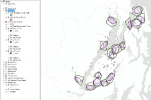
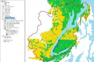
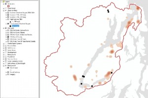
Now that it is time to transfer data and results to the client I need a quick and easy way to give the clients an overview of the vast amount of data collected and created and a few of the analytical results as well. The easiest way was with screenshots. It simply would have taken too long to create an automated map book that looked at all decent. Since I already had a master project file with all the data displayed nicely for web-casting to the clients and stakeholders, I simply selected certain layers, took screenshots, selected other layers, took screenshots, and repeat. They will also get the whole data package, layer files, and project files, but this makes me know for certain that they will see the items that I want to highlight in the correct symbology. If the client so wishes, these maps can be finalized into higher resolution maps with real legends and such. There are 42 maps, all of the same geographic area. Here are a few:


Recent Comments