Archive for January, 2011
Beginning a Cartography Project, Part 1: Your User
(This series is inspired by an article that I read that ranted about those who consider design at the end of a project instead of at the beginning. This article, however, did not offer any solutions as to how to go about it. I provide some of those solutions here. Please add your own in the comments to help the other readers out!)
Users: the audience for your finished map
Before you begin a cartography project, you must take some time to examine the needs of your users. To do this, first ask yourself whether the user is a narrowly defined person/group or whether it is a broad audience.
Narrowly defined users can be, for example: your boss, the executive suite at your company, or permit applicants.
Broad audience users can be, for example: readers of National Geographic, visitors to a non-niche website, or national park visitors.
Narrowly Defined Users
It’s not too hard to identify what these users already know and don’t know. In terms of what they already know, this can help you add items to the map that the user is used to and therefore will increase the map’s credibility and ease-of-use. It can also help you decide what is not necessary to include on the map, since it is already known. For example, let’s say you have to present a paper map to a group of county commissioners. If you already know that the county commissioners are used to seeing paper maps with USGS topographic backgrounds, then you could use a USGS topographic background on your own map. It also stands to reason that those commissioners are pretty familiar with the basic geography of their county so prominent county-name labels would not be necessary.
The narrowly defined users also have a certain number of things that they don’t know (i.e., the reason for the map). List these and ensure that your map covers all of them. Keep an agile design philosophy as you go so that you can incorporate new items as they come, since it isn’t always possible to enumerate all the unknowns at the beginning – though easier here than with broad audience users. For example, you could be making a map for a school redistricting committee. Your list of user unknowns might be include current district boundaries, population density, demographics, and future population growth patterns. Make sure that all the items on this list make it onto the final map. These items will drive the design in that you must revisit the list during implementation to ensure that these items stand out.
Broad Audience Users
If you have broad audience users then the first thing to consider is what kind of context you need. This can be difficult for you if you are too familiar with the data because you won’t be able to determine which details will be helpful to the user and which will simply obfuscate the results. Ask several potential users for their input at this stage. Ask them what basic geographic elements they will need to gain a quick overall understanding of the location. Then make several mock-ups and ask them for their input again, specifically in terms of what elements are potentially confusing to them. For example, a map of oil usage statistics in the U.S. for an international magazine audience might be originally created with abbreviations for the surrounding countries of Canada and Mexico. Your test-users will point out that the abbreviations, while perhaps known to those in the U.S., should be spelled out.
A good idea is to create mock-ups for this group with varying scales. Your mission is to find out from the test-users which scale gives them the most location-awareness while sacrificing the least amount of detail. To do this, the best method is to ask the questions separately (and without jargon) as in, “Which map or maps are zoomed-in too far for you to understand the location? Which map or maps does not show you [insert map purpose here] well enough?”
Remember:
1) Narrowly defined users: What does the user already know? What does the user not yet know that you want the map to tell them?
2) Broad audience users: What are the necessary geographic details that show the user where the location is? What elements will obfuscate the map’s message?
Typefaces for Cartography Annotation – Part 3
Posted by Gretchen in Typography on January 13, 2011
Welcome back to the series on typefaces that are great for labels at differing sizes (especially small sizes). All examples are in 16 pt.
Frutiger
Useful in many contexts including small point sizes of course. This one is a highly legible, fairly simple looking font, not to mention well-known and often used.
![]()
ITC Stone
The great thing about the stone font is that it has three styles: serif, sans serif, and informal (serif shown here). If you have a need for different styles that also happen to be complimentary and some originality thrown in, then this is one to consider.
![]()
Sabon
With complex lettering this is a very interesting typeface that adds dimension and weightiness to a map. Sophisticated and different.
![]()
Georgia
One of my favorites even though I hear Willie Nelson’s “Georgia” in my head every time I choose it from the font menu. It is a popular serif, highly readable, and a good alternative to Times New Roman.
![]()
You might also be interested in:
Typefaces for Cartography Annotation – Part 1
Typefaces for Cartography Annotation – Part 2
Free .style File for ArcGIS with Colors For Maps Purchase
*Those who’ve already purchased the booklet can get the file too – just comment here, email, or DM me on twitter
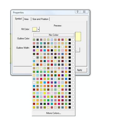
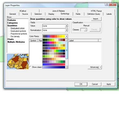
When you purchase Colors For Maps it now comes with a free .style file that you can load into ArcGIS and have instant access to all the colors in the booklet. All the colors in the coordinated and differentiated palettes sections can be selected by their page and color number in the ArcMap color selector. The colors from all three sections can be selected in the color ramps selector as well.
The colors are all organized by the page number that they correspond to in the booklet. I hope that makes them easy to find and use. If you don’t know how to get a .style file to work in ArcMap, here’s a link to a Mapping Center article on how to use them in ArcGIS 10.
You will notice one black and white color at the end of each set. This was the only way to make it so each page was on its own line in the selector box, since the booklet contains 10 colors per page while ArcGIS has room for 12 colors per line.
Scale Bar Inspiration
Posted by Gretchen in Inspiration on January 11, 2011
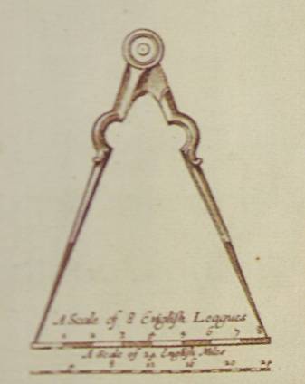
Looking for a new scale-bar idea? Well, maybe you weren’t looking for something quite like this. This scale bar is from a map of Virginia and Maryland authored by Augustine Herman Bohemiensis in 1670.

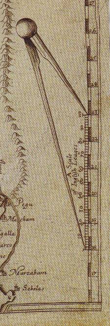
Here’s another one with the same idea, from a 1619 map by William Baffin and Thomas Roe titled “A Description of East India.”

And this one, from the same century, is from a 1664 map of New York (but at the time called New Amsterdam). It is so striking because it is in color! Who has ever seen a scale bar in color? What a strange concept. This one could potentially be implemented in a modern map, actually, perhaps on a children’s educational map.

Typefaces for Cartography Annotation – Part 2
Posted by Gretchen in Typography on January 10, 2011
(Also check out Typefaces for Cartography Annotation – Part One in this series.)
All examples are shown in 16 pt.
Helvetica
This typeface has 34 different fonts to choose from, including compressed, condensed, and narrow options. Arial and MS Sans Serif are similar. Its clarity and its generic form make it non-obtrusive.
![]()
Meridien
Meridien is a fluid and fairly complex typeface. The italic version shown here looks really good when labeling oceans and lakes. The way the serifs wisp out to rounded points make it look nice on maps with a certain nobleness.
![]()
FF Parable
This typeface looks great at small sizes, perhaps due to its very short descenders. It is a good choice for a map that will have a lot of levels of hierarchy within the text elements where you want something a little different looking. An added bonus is its three small cap fonts that would be nice for titles and other prominent text.
![]()
Beorcana
While developed for book type and therefore nicely legible at small sizes, it also looks quite nice at larger sizes. This calligraphy-inspired typeface is very interesting to the eye even though it is a sans-serif.
![]()
Cartography Businesses
Posted by Gretchen in Cartography Profession on January 7, 2011
The GIS/cartography profession is mostly dominated by people who are working as employees for government agencies and private companies where they have to be experts at a certain field (e.g., oil, environmental management, real estate, transportation). If you want to become a freelance GIS/cartographer or start your own cartography firm your best bet is to market yourself as a niche expert in one of those fields and do contracting to those same government agencies and private companies. Some of the more map-centric niches that a cartographer could occupy as a sole-proprietor, however, are:
- Novelty mapping – use places like etsy.com, ebay, and cafepress to directly sell products with a mapping component to the public. There are people who sell shaded-relief maps on ties, people who cut up old historic maps and make jewelry out of them. Once, I sold t-shirts on cafepress with a map of the Hood Canal on them that said “home” underneath the map. Thinking up your product line is an important first-step but the biggest issue for you with this type of business will be on-going customer acquisition through blogging, getting featured in print magazines and newspapers, and other media marketing.
- City mapping – create maps of major cities or even small towns, to be distributed freely through chambers of commerce and other such outlets. Make your living off of the advertising that you must feature prominently on the maps, often including the advertising for local businesses directly on the map itself. Expect to market these maps to real estate agents, local businesses, and other people who can both distribute and advertise.
- Advert mapping – market yourself to small businesses who would like to give their customers a freebie that also advertises their business. For example, a bike store in Seattle distributes free maps of local bike routes to customers that has the bike store logo featured prominently in the lower-right corner. As another example, a museum may want to commission you to map out local outdoor sculptures to provide a walking-tour guide for patrons. Expect to spend a lot of time identifying potential customers and marketing yourself to them.
- Alliance mapping – form an alliance with other business people. You do the cartography, someone else does the marketing, someone else does the web-presence, etc. Operates much like a firm except that each of you agrees on projects as they come and allows you both autonomy and the ability to focus solely on cartography.
- Web mapping – provide the development expertise along with the design skills to produce custom web maps for businesses. Expect your work to be highly variable with difficult to pin-down scopes, but with a high potential return and a potentially high customer base requiring less marketing on your part.
- Book mapping – market yourself to publishing companies as a person who can create maps for books. You may focus on fictional or non-fictional mapping and may need to produce some of your work in black and white and in small formats. Payment could be offered in nominal terms (e.g., $400 for a set) but the best method would be to contract for a percentage of revenue / royalty on book sales. You may get this kind of work directly from authors but this would be more difficult than simply marketing yourself to the major publishers themselves, who could use your work in multiple books.
- Graphic design mapping – align yourself with several large graphic design firms. They may need your help gathering data and getting it into graphic-design software in a usable format to ready a project for the design phase.


Recent Comments