Archive for January, 2011
Imagining Disclaimers of Yore
Posted by Gretchen in Creativity on January 5, 2011
I’ve been doing a little thinking about map disclaimers lately. This led me to the creative exercise of trying to imagine what the disclaimers on historic maps, if there had been disclaimers, would have said. Perhaps something like, “Beware the dragons in the western seas, the producers of this map are not responsible in the event of your death by a dragon or any other related water beast.”
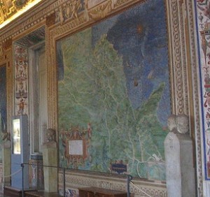
In the Gallery of Maps in Vatican City, Rome, there are 40 huge maps on the walls created by the 16th century cartographer Ignazio Danti*. If the commissioner of the maps, Pope Gregory XIII, had required Danti to include map disclaimers I imagine they might have said something like this:
Pope Gregory XIII provides these data as is. The Vatican Palace, Rome, is not responsible for any adverse outcomes associated with using these maps for the administration of the state, merchandise freight calculations, voyaging or other such uses. The locations of episcopal and archiepiscopal seats, cypress trees, castles, and battlements are not at a survey scale and are not complete.
*These maps are extremely accurate given the limitations of the instruments at the time and the sheer scope of the project. At that time, the tools used to determine geographic location were: compasses, Astrolabes, and gnomons (the part of a sundial that sticks up and creates a shadow).
Typefaces for Cartography Annotation – Part 1
Posted by Gretchen in Typography on January 4, 2011
You Might Also Be Interested In:
Type For Maps, my e-book on typography
Typefaces for Cartography Annotation – Part 2
Typefaces for Cartography Annotation – Part 3
This post is the first in a series and is inspired by a thread on typophile where typefaces that look good in cartographic annotation are discussed. Some of the typefaces recommended on that thread are shown here.
For cartographic labeling, we are usually interested in using typefaces that are legible at small sizes and that have a variety of fonts. By variety of fonts, I mean that it contains options like: boldface, oblique, reverse-oblique, small caps and so on. A typeface with a variety of fonts is helpful in that it can be used to produce a map with a rich label hierarchy that still looks unified.
To be legible at small sizes it is important that the letters be compact, have short ascenders and descenders, and have a fairly even line-weight. Something like this font, called Grassy, will not be a wise choice, for example…

With those ideals in mind, here are a few typefaces that you may want to consider in your next mapping project. All are in 16pt:
GARAMOND you likely have already heard of this font, a serif with a lot of history.

CISALPIN a relatively new font created specifically for cartography for legibility at small sizes. It only has five varieties, however, and they cost $54.00 each. You can find it here.

GILL SANS created in 1926 and fairly classic looking.

VENUS MAGER compact with some added height. You can find it here.

Screenshots Are A Timesaver
Several weeks ago I wrote about using screenshots for rough maps. This past week I’ve been doing just that for a project. This particular project isn’t about making beautiful maps – it was mostly about building a database of onsite septic systems to be honest with you – though I try not to mention that in everyday conversation. In addition to the data creation effort part of the project there was also a data gathering portion and a data analysis portion.
Now, with most GIS projects it seems that 50% of the effort is on the data and 50% is on the analysis of the data. There’s the time it takes to ask for and receive data, create data, pre-prep data, and learn about the data that should always be figured in to any GIS effort or it will go over time and over budget. The septic system project is one that actually consisted of 90% data prep work and only about 10% analysis work.
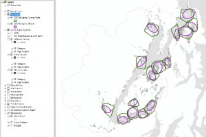
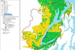
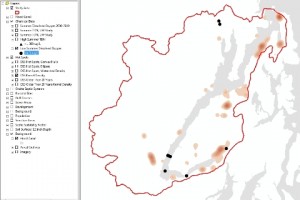
Now that it is time to transfer data and results to the client I need a quick and easy way to give the clients an overview of the vast amount of data collected and created and a few of the analytical results as well. The easiest way was with screenshots. It simply would have taken too long to create an automated map book that looked at all decent. Since I already had a master project file with all the data displayed nicely for web-casting to the clients and stakeholders, I simply selected certain layers, took screenshots, selected other layers, took screenshots, and repeat. They will also get the whole data package, layer files, and project files, but this makes me know for certain that they will see the items that I want to highlight in the correct symbology. If the client so wishes, these maps can be finalized into higher resolution maps with real legends and such. There are 42 maps, all of the same geographic area. Here are a few:


Recent Comments