Archive for category Best Practices
Five Ways to Make Your Maps Better
Posted by Gretchen in Best Practices on September 1, 2010
(I wanted to just say “time and effort” was all that was required but that didn’t seem detailed enough.)
- Learn to ask for feedback. Receive feedback non-defensively and filter it for the best ideas. Ask for feedback from GIS and cartography professionals but also from non-professionals. You never know what kind of novel idea a non-professional might come up with.
- Put in the time. Re-do, re-do, re-do. The London Tube map has been in the making since at least Henry Beck’s first diagrammatic attempt in 1931. He continued to redesign it until 1960 and it has certainly gone through many more iterations since then as well.
- Sleep on it. If you can allow your brain down-time to work on the map design process in your subconscious, better ideas will assuredly come to you. What we try to avoid is having the great idea come to us directly after turning the map in to the client or boss.
- Research. That’s right, no project occurs in a vacuum. What else has been done in the same vein? Aim to improve upon previous attempts.
- Use graphics processing software to better manage colors, fonts, and shading, to name a few.
How to use Hashing Effectively
Posted by Gretchen in Best Practices, Design on August 31, 2010
This is a snippet of an old map of Paris published by Karl Baedeker publishers in 1907 for Paris and Environs. I have often seen this map because it is in the inside cover of one of my children’s books, Adele & Simon by Barbara McClintock. However, it wasn’t until I really looked at it closely today that it struck me how phenomenally impressive it is that the cartographer managed to use hashing for the city blocks without overwhelming the map.
Hashing is very difficult to do without making a map just plain ugly and I usually advocate for using it sparingly, if at all. However, here it is just beautiful. The only critique that could possibly made of it is that the drafts-person did not use a steady line weight throughout, but somehow even that adds to its charm. If it isn’t visible to you in the little snippet above, the pinkish-red color is hashing, with a bolder line of the same hue surrounding each city block or section.
Did you also notice how the letters in the major street names actually ascend and descend above and below the road casings? In other cases the letters are at the southern end of the road, offset to such a point that the bottoms of the letters (even those without descenders) actually go a bit over the casing line. You can see this in the snippet above in the letters “o b,” which is the end of the name Rue Jacob.
The maps from this particular publisher were well-regarded for their detail, of which you can see quite a bit in just the small piece shown above, and their accuracy. A tremendous amount of detail was packed onto this map while still allowing for readability and only using the colors white, magenta (pinkish-red), blue, and black.
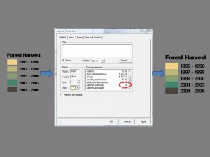
How To Create a Seamless Legend in ArcMap
Posted by Gretchen in Best Practices on August 5, 2010
A Five-minute Introduction to Cartography
Posted by Gretchen in Best Practices on July 8, 2010
Ignite Spatial Fort Collins.


Recent Comments