Archive for category Best Practices
Relax
Posted by Gretchen in Best Practices on October 27, 2010
Trying to make a decent map with a lot of data? Relax.
Striving for perfection at work? Relax.
Solving a major problem? Relax.
High achievement does not come from stress and anxiety. The best ideas come from the subconscious, which is working on your problems while you are actively thinking about other things. There are many ways to relax.
One of them is to break your foot and the concomitant forced relaxation it causes. If you would rather read about how this works as opposed to actually doing it yourself, check out this great, short read: Life In the Slow Lane.
Here I am telling people to just relax already:

In reality I am making this seem too simple. The counter-argument is that slothfulness never got anybody anywhere either. It stands to reason that one must alternate between states of actively thinking about a problem with states of subconsciously thinking about it via relaxing. And it also follows that one must recognize when the problem is solved and then act on the solution.
Geologic Map Units
Posted by Gretchen in Best Practices on October 25, 2010
Two major standards for geologic map unit symbolization are the International Commission on Stratigraphy and the American standard. In general, younger map units are given light colors and older map units are given dark colors. However, not all organizations apply this methodology. Traditionally the legend is displayed with the youngest map unit at the top and the oldest map unit at the bottom. Often, the agency from which the data are received has a color and symbolization standard that should be asked for in conjunction with the data.
Lithology (type of rock) codes will have optional subscripts. These should be separated into their own attribute column so that they can be displayed on the map (if labels are desired) as subscripts. The subscript labels require a bit of advanced labeling knowledge.
See the USGS Suggested Colors for Geologic Maps (pdf) for more information as well as the International Commission on Stratigraphy.
Spell Check
Posted by Gretchen in Best Practices on October 20, 2010
This is just a simple reminder post to always spell check your map products! Here’s a map that was recently published on the web. Among other problems, it has a spelling issue. In the sub-title no less:
Here’s the spelling error:
So, to sum-up, always spell check!*
*This photo is from a site called cakewrecks. If you want to laugh your head off and waste hours of your day, you’ll head to that site straight-away.
Typography Rules: A Pictorial Tutorial
Posted by Gretchen in Best Practices, Typography on October 12, 2010
There are a lot of standards in cartography regarding font color, choice, spacing, and so on. Here are some examples of just some of the rules or standards. These are all examples from a single, poster-sized map I made a few years ago.

Black is the usual color choice for most labels. The exceptions are brown for contour labels and blue or white for water features. Bold and upper case usually denote high-importance, or at least a higher level in some sort of hierarchy. The usual advice is that the best label placement is above and to the right of the point, however, how often are you presented with a “usual case”? Not as much as you’d like! In this case it had to be up and to the left as that was the only place the label would fit without crossing any of the other features.
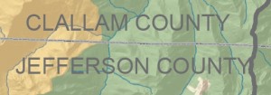
This isn’t a major rule, but it is nice to put county labels next to the county line that they belong to. This is especially effective when (as in this case) there are a lot of other labels on the map. If I had put the county labels in the center of the county they would have been mixed up with the watershed labels that are also on there.
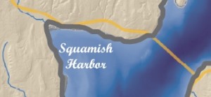
Here the harbor label is in a script font. Usually water features are labeled in white or blue, and in this case only white would do, since the bathymetry is shown in such a deep, dark, shade. Water features can also be written in simple italics instead of script – but remember that it is always nicer to use a font family that includes its own italics face as opposed to using a regular typeface with the italics converter (see Type Tips).
Here’s another example of positioning. The label “BELFAIR” could not be positioned anywhere except above and to the left of the point feature. In this case if the label had been above and to the right it would have crossed the watershed line and also been half-way inside the much lighter background portion of the map.
This label, which is for a watershed name, is not in all caps in order to distinguish it from the county labels. It still had to stand out from the dark green hillshade underneath, necessitating the white shadow.
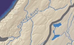
The usual advice for river labels is to make sure they are above the line because words generally have more ascenders than descenders. If you were to put it below the line the ascenders would vary the spacing between the feature and the lettering enough to make it look sloppy. When placing above the line, however, you still need to be mindful of the descenders so the label ought to be placed far enough above it so that the descender does not cross the feature (though as usual we can find effective counter-examples). Another bit of advice is to find the straightest portion of the river to place the label. However, in this case, this river has virtually no straight stretches. Finally, the label here could have been a bit darker in hue so that the second “t” doesn’t get lost on the tributary line.
A Case Against Innovation
Posted by Gretchen in Best Practices, Design on October 5, 2010
The contrarian that I am, I figured I’d try to formulate a good counter-argument against my oft-repeated admonitions to be creative, innovative, and novel. So this is it: I’m going to consider an argument against innovation that explains why certain cartographic conventions really are the best under certain circumstances. And I’m going to keep it short.
A great argument for this idea is in a book called Visual Thinking: for Design by Colin Ware – this is an excellent book by the way. In it, Ware says,
The theory of objects as patterns of patterns means that some objects will be easier to identify than others. . .if we want objects to be rapidly and reliably identified, they should be typical members of their class and shown from a typical viewpoint.
Some example implications for map design are as follows:
- Maybe choosing the color blue for roads won’t be good. The viewer may confuse them for rivers, albeit fairly straight ones.
- If you choose a projection that the audience is not used to, they may take a few extra seconds to think about the fact that the shape is different, and in those seconds you may lose credibility.
- Using a font that nobody is used to seeing for all your labels (Bauhaus 93 is pretty cool but maybe not for street labels?) reduces letter recognition time and thereby reduces legibility.
- As Peter Batty explains, when possible use the standard Google toolbar in your web maps since that is what the majority of users are already accustomed to and adept at.
In more general terms, use standard symbols to ensure map readability and standard content to ensure correct and rapid interpretation.
Web Map Usability Testing
Posted by Gretchen in Best Practices on September 21, 2010
I want to highlight one more talk from last week’s Ignite Spatial NoCo 2.0. Peter Batty of Ubisense spoke on usability testing. His key message was to make sure that you actually do usability testing. It doesn’t take long. You can look at what a user does with your site in the first few minutes and get an instant feel as to whether or not it is working as it is supposed to.
He says that the user sees something much different from what the designer sees. To explain this Batty uses the great example of an airline booking site (I think it was United) where there are three vertical panels but the user zones in on only the upper portion of the left panel – the one where you input your airports and dates.
Probably the best tip in the presentation is to not reinvent buttons and toolbars for your map. Use the standard Google-type interface since so many people are used to that. As I’m always saying though, if you strongly feel the standard solution is inadequate, make up your own solutions.


Recent Comments