Archive for category Best Practices
Map Exaggeration
Posted by Gretchen in Best Practices on January 27, 2011
A few types of map exaggeration:
- Area features with thick outlines
- Points, if you were to measure them at the scale of the map, that are much larger than the thing they represent
- Raster grid cells that represent points, where the points are smaller than the grid cells
- Vertical height multiplied by a factor of two or more on 3D maps
Mapping a large geographic area with a few small, spread out area features in it, is a prime reason to use map exaggeration techniques. In order to allow them to “pop” or have the right amount visual heft in comparison to a large surrounding empty space, it’ll be imperative to exaggerate their size in comparison to the other features. If you have 4 golf courses delineated that you want to show within a large county, they won’t be very visible unless you utilize exaggeration. Similarly, a 3D map of road steepness over a large geographic area may not adequately emphasize the hilliest areas unless the entire elevation surface is exaggerated.
In these cases, it is necessary that a note be made on the map to the effect of, “Golf course areas are not to scale,” for example. If the map could easily be misinterpreted and the audience will only be giving it a quick glance, then this note needs to be front-and-center. Otherwise it can reside in a less conspicuous location.
One instance when it is not absolutely necessary to state this caveat is when using map points to represent points on the landscape. Casual map readers and experts alike understand that small dots on a map are general location visualization devices and not to scale, therefore there is no need to explicitly state it. (In some cases, however, in maps such as the famous – infamous? – space-junk map, it would be wise to mention it.)
There is no one who does not exaggerate! ~ Ralph Waldo Emerson
New And Effective Map Design Qualities
Posted by Gretchen in Best Practices, Design on December 7, 2010
Some of the best, new cartography products out there have these qualities:
- Oblique views: Especially for maps of cities and towns both because of the scale and the subject. The view gives the reader a sense of being involved in the map instead of looking down from above.
- Subtle hillshading: The days of overly detailed elevation data used as backgrounds are over. So are the days of the dramatic black and white hillshade. Now we see hypsometric tinting that alludes to the slope of the land serving as a backdrop for the more salient features of the map instead of competing with them. If your elevation data are too detailed – generalize!
- Labels placed with care: Labels are not auto-generated and auto-placed. They are hand-placed as graphic elements where they will be most legible but least obtrusive.
- Integrated graphics: Graphics are used to enhance the display for informational maps. For example, I recently saw the use of magnifying glasses placed along the margins, each with a magnified view of a different part of the map shown inside.
- Background balance: Analytical maps, especially, can veer toward having backgrounds that are too simplistic (perhaps the cartographer does not want the background to compete with the data) to backgrounds that are too detailed (where the cartographer feels more information is more informative). Analytical maps that are effective will have a balance with enough background to provide a simple location awareness but not so much that it obscures the data.
- Integration: The rendering of objects is consistent within an overall scheme of color, line-weight and translucency so that nothing is jarring.
- Taste of reality: Some newer maps are taking on a look that is hard to describe. They are a blend of real and fake, sort of like a computerized world. This is achieved by the use of high-resolution imagery draped with 3-4 layers of hues for each type of feature such as grass, trees, and houses.
Map Balancing Tricks
Posted by Gretchen in Best Practices, Design on November 22, 2010
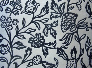
Last night I was sitting in the living room, drinking tea, thinking about not much of anything. My eye wandered to the rug on the floor (a portion of which is shown below). It’s very inexpensive but pretty cool looking. I got to wondering what it is that I like about it. One thing is that the pattern is very uniform across the entire extent. The balance between white-space and line work is just about equal throughout. While each individual part of the pattern is nice, it is really the picture as a whole that makes it pleasing.
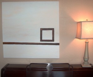
Juxtapose this with something else in the living room: a picture I painted about five years ago. I also think it is pleasing, but in a very different way. This painting (shown below) definitely does not have an equal balance of white space versus line work. In fact, it is quite the opposite. It has a very strong weight in a very small part of the overall piece – where the square is – and then a lighter weight along the line, and no weight elsewhere.
As I pondered that for a moment it came to me that maps are very much like these two objects in their aesthetic qualities. A map with an equal pattern of figure-ground like in the rug is quite elegant and a map with a strong focal-point like in the painting also has a positive aesthetic. Think about these in terms of a typical city-map where the grid is somewhat uniform across the whole map and a city map at a smaller scale (city and surrounding rural areas) where the city becomes the focal-point and the rural areas become the empty-space.
Now, following from this, it occurred to me that it is very lucky when a cartographer has one of these two options to choose from when composing a map. Often, a cartographer has to work with an area that has a geometry that does not fit in to either a pattern or a focal-point composition. It is in these instances when we grumble about the odd geometry of the landscape. It’s these times when we spend hours trying to make the data fit into one of the molds.
These situations are very difficult and can be the bane of the cartographer’s work. However, here are some techniques which you may find helpful in some situations. Please add your own tricks in the comments!
- Increase detail in sparse regions by adding more data, labels, or heavier hues
- Decrease detail in denser regions by generalizing lines, removing labels, decreasing symbol-size
- Use color to minimize odd geographic regions to achieve either a continuous balance or a strong focal-point
- Change the scale to a more visually balanced area – use location maps to show the overall area if you’ve zoomed in too far
- Try an oblique view (graphics software)
- Create more visual emphasis in some places and less in others with masking layers (same map, but lighter in areas, heavier in others)
The Forest AND the Trees
Posted by Gretchen in Best Practices, Workflow on November 8, 2010

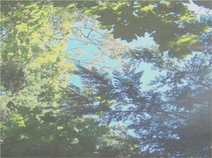
(This picture was taken on a rare sunny day in Poulsbo, WA, many years ago.)
“You can’t see the forest for the trees” is a common refrain when someone is paying too much attention to detail and not enough on the big picture. A cartographer who spends 90% of project time on such things as which orange-brown hue to use, which font to use in the legend, and deciding whether to use mixed case or upper-case for labels, will soon run out of time for what is just as important: the gestalt of the map. Without a unified presentation, a map product may not hold a readers attention long enough for those details to be fully appreciated or even understood.
A cartographer who spends 90% of project time on the big picture such as the visual hierarchy, choosing unified colors, and element placement also risks something: that there will not be time left to ensure the accuracy and readability of the information in the map. After all, a map that looks great at first-glance but contains inaccuracies, confusing labeling, or other such detail-problems will be useless.
These, then, are the two dangers: spending too much time examining the trees OR spending too much time thinking about the forest’s overall visual impact. How much time we spend on each of the two elements is going to depend on the cartographer’s level of experience. If the cartographer is well skilled in map details but not in big-picture elements then this cartographer is able to spend less time on the details and more on the overall picture. The opposite is also true. However, I would posit that many cartographers who are skilled in one area and not the other spend an inordinate amount of time on the portion that they are already skilled at and less on what they are not. In other words, we tend to get better at what we are good at and do not increase our skill in what we are not so good at. You shouldn’t have to spend a lot of time with the parts of map-design that you are skilled at, leaving you more time to focus on those aspects that do not come as easily to you.
A typical work-flow, using the forest and trees analogy, goes back and forth between the two aspects of map-making. It might look like this:
10% – Forest
30% – Trees
20% – Forest
30% – Trees
10% – Forest
In this example I’ve split the time up to be 60% detail work and 40% big-picture work. In my mapping projects I probably spend too much time on the big-picture items and not enough time on the detail work. (Please note that for analytical GIS projects I use an entirely different approach – often focusing first on details before circling back to the big-picture.)
Readers: how much time do you typically spend on big-picture versus detail work?
Integrated Instructions
Posted by Gretchen in Best Practices, Web Maps on November 6, 2010
Should a user need to read directions before using a Web map? No. Should a user need to click through 5-pages of instructions before being allowed to view a Web map? Never! (There really is a Web map out there that has 5-pages of instructions.)
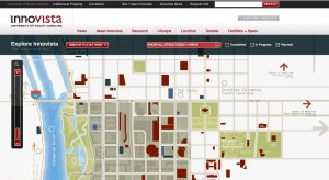
It’s all about integrated instructions now. Check out the Innovista Web map from the University of South Carolina for an example of how to do this nicely.
Penning Titles
Posted by Gretchen in Best Practices, Titles on October 31, 2010
The titles of maps, presentations, and papers have many flaws.* Does anyone stop to think more than two seconds about the title of their work? Sometimes it doesn’t seem like it. The major flaws in titles these days are twofold:
They don’t tell you about the work
and/or
They are boring
The problem with the first flaw is that you waste half your audience’s time because they thought they were going to look at, listen to, or read something different than what is actually being presented. Also, half the people who might have been interested are not paying attention because the title doesn’t tip off the subject matter adequately.
The second flaw is an aesthetic issue. A boring title does not necessarily guarantee a low audience count but a very interesting title, without a doubt, will increase the audience count. This is probably caused by the inordinately large number of instances of boring titles that audiences are bombarded with, making the audience somewhat immune to them but also thereby making the interesting ones stand out all the better.
A boring title is not necessarily bland. It might contain too much jargon or too many words, for example. A simple title that gets straight to the point is not necessarily boring. Some of my titles that I am particularly keen on include:
- Surf to Turf: Monitoring the Salmonscape in Northwest Washington Using GIS (link to presentation on SlideShare)
- Maps that Show Off (link to 30 minute lecture at Colorado State University – warning, the video is low-resolution)
- Colors For Maps (My new booklet – coming out Monday or Tuesday of this week! Stay tuned)
- Summer Chum Conservation Units (Title of a map – short and descriptive)
Remember, a good title leaves no doubt as to what the content is about. A great title hooks the audience. Have you heard any good titles lately?
*I know someone is going to think that papers in journals can’t possibly adhere to these guidelines. I really wish journal papers could have more interesting titles. Don’t you?


Recent Comments