Archive for category Design
Beginning a Cartography Project, Part 2: Sketch Maps
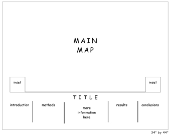
Once the audience for the map is properly investigated (see Part 1 in this series) it is time to consider the look and feel of the map. This part is going to depend a lot on what kind of map you are making: web map or static (paper) being the biggest two types. Regardless of what type of map, however, it is a good idea to start with sketch maps of potential layout designs.
These sketch maps work best when they are drawn by hand so that technology doesn’t get in the way of the design. When presenting to test-audiences you can always move these into a digital medium like the one shown above after sketching them by hand.
The sketch maps force you to consider which layout elements will be needed to support the map before getting too steeped in their details. For example, while sketching you may create an area for a legend, north arrow, and data source descriptions but you will be thinking about how they look in relation the larger design instead of wondering which data sources should be cited, how to design the legend, and so on.
The sketch map helps designers of web maps, in particular, in that it allows the web map designer to quickly and efficiently try out novel presentation methods (of which there is still a lot of room for growth in this medium). For example, many of our developer colleagues feel that traditional web maps that mimic GIS software by including clickable legends do not make sense to casual web users. A web user who views your web map may be better served with an entirely different approach. The sketch map is the place to start if you want to create and visualize new approaches for conveying legend information.
If you are working on a print design / static map project, the sketch map should be mindful of the shape of your geographic area. Is the area you are mapping oblong, rectangular, square, or oddly shaped? Does this affect where you will place the margin elements such as north arrow, scale bar, and legend?
Beginning a Cartography Project, Part 1: Your User
(This series is inspired by an article that I read that ranted about those who consider design at the end of a project instead of at the beginning. This article, however, did not offer any solutions as to how to go about it. I provide some of those solutions here. Please add your own in the comments to help the other readers out!)
Users: the audience for your finished map
Before you begin a cartography project, you must take some time to examine the needs of your users. To do this, first ask yourself whether the user is a narrowly defined person/group or whether it is a broad audience.
Narrowly defined users can be, for example: your boss, the executive suite at your company, or permit applicants.
Broad audience users can be, for example: readers of National Geographic, visitors to a non-niche website, or national park visitors.
Narrowly Defined Users
It’s not too hard to identify what these users already know and don’t know. In terms of what they already know, this can help you add items to the map that the user is used to and therefore will increase the map’s credibility and ease-of-use. It can also help you decide what is not necessary to include on the map, since it is already known. For example, let’s say you have to present a paper map to a group of county commissioners. If you already know that the county commissioners are used to seeing paper maps with USGS topographic backgrounds, then you could use a USGS topographic background on your own map. It also stands to reason that those commissioners are pretty familiar with the basic geography of their county so prominent county-name labels would not be necessary.
The narrowly defined users also have a certain number of things that they don’t know (i.e., the reason for the map). List these and ensure that your map covers all of them. Keep an agile design philosophy as you go so that you can incorporate new items as they come, since it isn’t always possible to enumerate all the unknowns at the beginning – though easier here than with broad audience users. For example, you could be making a map for a school redistricting committee. Your list of user unknowns might be include current district boundaries, population density, demographics, and future population growth patterns. Make sure that all the items on this list make it onto the final map. These items will drive the design in that you must revisit the list during implementation to ensure that these items stand out.
Broad Audience Users
If you have broad audience users then the first thing to consider is what kind of context you need. This can be difficult for you if you are too familiar with the data because you won’t be able to determine which details will be helpful to the user and which will simply obfuscate the results. Ask several potential users for their input at this stage. Ask them what basic geographic elements they will need to gain a quick overall understanding of the location. Then make several mock-ups and ask them for their input again, specifically in terms of what elements are potentially confusing to them. For example, a map of oil usage statistics in the U.S. for an international magazine audience might be originally created with abbreviations for the surrounding countries of Canada and Mexico. Your test-users will point out that the abbreviations, while perhaps known to those in the U.S., should be spelled out.
A good idea is to create mock-ups for this group with varying scales. Your mission is to find out from the test-users which scale gives them the most location-awareness while sacrificing the least amount of detail. To do this, the best method is to ask the questions separately (and without jargon) as in, “Which map or maps are zoomed-in too far for you to understand the location? Which map or maps does not show you [insert map purpose here] well enough?”
Remember:
1) Narrowly defined users: What does the user already know? What does the user not yet know that you want the map to tell them?
2) Broad audience users: What are the necessary geographic details that show the user where the location is? What elements will obfuscate the map’s message?
Good Cartographic Design: A Review
My good twitter pal @DonMeltz sent me a link to a map that was made in a GIS and did not exactly espouse the cartographic ideals that we so strive for here. For some reason, the link doesn’t work anymore. :-)*
While you can’t see the map you can learn from its mistakes. It contained many common pitfalls that we need to review from time to time.
#1. The map looked like a first-draft. It was where one of my maps might be after about 30 minutes of trying. You have to try harder than this. You must not leave it at “that looks good enough.” You must leave it at, “That could win awards.” Why? Because your career is a competition and you must strive to constantly update and refine your skills if you are to remain in the race. Plus, the profession deserves better than what some people put out as a professional product.
#2. If there are a lot of different categories of non-overlapping areas then seriously consider eradicating the outline around those boundaries. For example, let’s say you have a parcel dataset that you have split into 5 categories: farmland, park, residential, business, and transportation. You probably do not need those parcel outlines cluttering up the display if your only goal is to show where the different categories are. It is okay to have the categories show up as large blobs and will be much easier to read.
#3. It is okay to show political boundaries that reside outside of your map’s focus area but make sure they don’t look like tentacles coming out to grab the map reader. That is, make them subtle – something the reader will discover on a minute examination of the map – not something they see first thing.
#4. In general, sprinkling margin information all around the map in every nook and corner is not a good idea. Keep your title, legend, and other supporting information grouped in a few places – perhaps all along one side, or at most put the title at the top and the other information in a convenient nook. Also – suppress the need to put boxes around these elements. It is okay for the title to stand out on its own without a white box behind it. It should be integrated but visible. And here’s something you haven’t seen me write before: consider not putting a title on the map at all. Can your data stand on its own? An interesting thought!
#5. Make the central theme pop. If you are highlighting something make sure it is obvious. Yes, it seems obvious (ha!) but it had to be said.
#6. Go over every element and ask yourself: is this necessary? It isn’t that you need to make your map dull, boring, and devoid of information. It just means that a streamlined approach is almost always best. For example, the map that was the inspiration for this post had a list of data sources at the bottom. They were numbered. But there was no reason to number them – the numbers were not linked to anything else on the page. I’m sure the numbering seemed like a good idea at the time but it is something that a good and thorough review would have identified. I do stuff like that all the time – create elements that make sense but after I’ve completed a draft I realize that they need to be modified or removed.
*Oh yes, I like the emoticon
New And Effective Map Design Qualities
Posted by Gretchen in Best Practices, Design on December 7, 2010
Some of the best, new cartography products out there have these qualities:
- Oblique views: Especially for maps of cities and towns both because of the scale and the subject. The view gives the reader a sense of being involved in the map instead of looking down from above.
- Subtle hillshading: The days of overly detailed elevation data used as backgrounds are over. So are the days of the dramatic black and white hillshade. Now we see hypsometric tinting that alludes to the slope of the land serving as a backdrop for the more salient features of the map instead of competing with them. If your elevation data are too detailed – generalize!
- Labels placed with care: Labels are not auto-generated and auto-placed. They are hand-placed as graphic elements where they will be most legible but least obtrusive.
- Integrated graphics: Graphics are used to enhance the display for informational maps. For example, I recently saw the use of magnifying glasses placed along the margins, each with a magnified view of a different part of the map shown inside.
- Background balance: Analytical maps, especially, can veer toward having backgrounds that are too simplistic (perhaps the cartographer does not want the background to compete with the data) to backgrounds that are too detailed (where the cartographer feels more information is more informative). Analytical maps that are effective will have a balance with enough background to provide a simple location awareness but not so much that it obscures the data.
- Integration: The rendering of objects is consistent within an overall scheme of color, line-weight and translucency so that nothing is jarring.
- Taste of reality: Some newer maps are taking on a look that is hard to describe. They are a blend of real and fake, sort of like a computerized world. This is achieved by the use of high-resolution imagery draped with 3-4 layers of hues for each type of feature such as grass, trees, and houses.
Map Balancing Tricks
Posted by Gretchen in Best Practices, Design on November 22, 2010
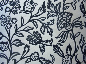
Last night I was sitting in the living room, drinking tea, thinking about not much of anything. My eye wandered to the rug on the floor (a portion of which is shown below). It’s very inexpensive but pretty cool looking. I got to wondering what it is that I like about it. One thing is that the pattern is very uniform across the entire extent. The balance between white-space and line work is just about equal throughout. While each individual part of the pattern is nice, it is really the picture as a whole that makes it pleasing.
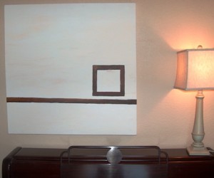
Juxtapose this with something else in the living room: a picture I painted about five years ago. I also think it is pleasing, but in a very different way. This painting (shown below) definitely does not have an equal balance of white space versus line work. In fact, it is quite the opposite. It has a very strong weight in a very small part of the overall piece – where the square is – and then a lighter weight along the line, and no weight elsewhere.
As I pondered that for a moment it came to me that maps are very much like these two objects in their aesthetic qualities. A map with an equal pattern of figure-ground like in the rug is quite elegant and a map with a strong focal-point like in the painting also has a positive aesthetic. Think about these in terms of a typical city-map where the grid is somewhat uniform across the whole map and a city map at a smaller scale (city and surrounding rural areas) where the city becomes the focal-point and the rural areas become the empty-space.
Now, following from this, it occurred to me that it is very lucky when a cartographer has one of these two options to choose from when composing a map. Often, a cartographer has to work with an area that has a geometry that does not fit in to either a pattern or a focal-point composition. It is in these instances when we grumble about the odd geometry of the landscape. It’s these times when we spend hours trying to make the data fit into one of the molds.
These situations are very difficult and can be the bane of the cartographer’s work. However, here are some techniques which you may find helpful in some situations. Please add your own tricks in the comments!
- Increase detail in sparse regions by adding more data, labels, or heavier hues
- Decrease detail in denser regions by generalizing lines, removing labels, decreasing symbol-size
- Use color to minimize odd geographic regions to achieve either a continuous balance or a strong focal-point
- Change the scale to a more visually balanced area – use location maps to show the overall area if you’ve zoomed in too far
- Try an oblique view (graphics software)
- Create more visual emphasis in some places and less in others with masking layers (same map, but lighter in areas, heavier in others)
On The Use Of Logos In Maps
Logos are awful. They weren’t made to complement your map in any way, shape, form, or especially color. They were made for an entirely different purpose: perhaps for a letterhead or website. So not only do they look strange when placed on a map, geoprofessionals tend to slap them on the map layout without regard to anything except the fact that they were asked (or sometimes not even that!) to do so. It is so much better to simply mention the company name(s) in the text on the map. If you can’t get away with that, put the logos in a place where they are not seen right away. Definitely do not line up 5 logos on the very top of the map layout. This causes the map reader to sit there and “read” the logos first!
However, even though I am usually against these things, I’ve seen a few examples lately where some really good cartographers have managed to incorporate the logos very nicely. In these cases the color schemes for the maps complement the logo colors – most likely this was intentional – and the logo tends to blend in well enough and be in such a position that it does not overwhelm the rest of the map. I don’t know if this is a trend or not, but the most effective logos out there lately are on tourist maps. For example, the logo for a neighborhood or commercial association that sponsored the map might be placed in the lower-right hand corner.
Here’s an example from Daniel Gray who designed this for the City of Moncton. He even manages to place this logo effectively at the upper-right hand corner:
What are some of the challenges you’ve had with logos?


Recent Comments