Archive for category Design
Lazy Design
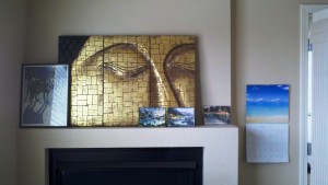
Looking at the mantle above the fireplace in my office is discomfiting. The five objects displayed were placed there unceremoniously when we moved into this house two years ago and they have not been moved since. On the bright side, it gives me a great platform to review some map design principles.
- WHO’S WOLF PICTURE IS THAT ANYWAY? The wolf picture belongs to another member of the family and really isn’t “me” but I put it up there anyway. This is what happens when you put things on a map to appease other people: they don’t match and you don’t care whether they look good or not because they aren’t yours. Logos, I’m looking at you. We are often forced to put logos on maps that just don’t integrate well but we do it because we have to. Try to at least change the positioning even if you can’t change the shape or colors of those logos.
- DID I REALLY COVER UP THE BUDDHA’S NOSE? It seems like the eyes and nose of the Buddha are probably the major aspects of the whole design, yet I covered up the nose anyway. Figure out what the best part, the most central idea, the biggest bang part of your map is and highlight it, don’t hide it.
- WHY ARE THE THREE WATERCOLORS SEPARATED? The three watercolors are by the same artist and on the same subject. They should be grouped together – especially since there are three of them (architect’s rule of three!). If you have similar elements on the map that can be grouped together, do so in groups of 3 or 5. This works well in map legends. If you’ve got 5 road types put them all together, slightly separated from the other legend items, for example.
- TOO MUCH CLUTTER? Even though there are 5 items grouped on the mantle (see above) it still looks bad. There are too many items. What would look best is just the Buddha with maybe two simple vases, one tall and one short, hanging out next to it. That would be three objects and the vases wouldn’t compete with the Buddha. If you can get rid of things on the map that don’t add value then take them off. If you get rid of too much (notice how I didn’t say I should only have the Buddha – no, it could have those companion vases) then it’ll be boring and bare.
- TOO FLAT? All those pictures are flat. A good map design can have many shapes and textures as long as they are all integrated into the big picture.
Small Multiples
There are several applications to GIS of the small multiples principle explained by Tufte in “Envisioning Information” and elsewhere.
The obvious application that comes to mind is the visualization of a time series. Sure, you can animate a time series instead, but then there’s the concern that the lack of ability to flick the eye back and forth between moments in time impedes the analysis process. Rather, a better method, if it is doable with your data, is to present the data in the same way in many small maps shown very close to each other.
When attempting small multiples you want the maps to be as close together as possible because the less time your eye needs to sweep from map to map the easier it is to make inferences about the whole dataset. They also commonly have the same spatial extent.
There are other uses for small multiples other than time series depictions. I’ve created quite a few small multiples layouts in my career as a GIS analyst. Here’s a few of them here.
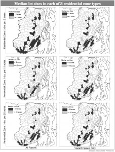
This one illustrates how you can present a variable in a chart-like fashion to show change on two axes. This one was done in 2006. If I were to do it over again I would definitely get rid of all those boxes around the maps. They don’t help.
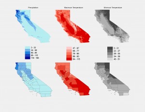
Another small multiples project involved presenting three variables in California with each variable presented first as a continuous raster and second as an area-normalized county breakdown. The legend is shared by the raster and the county maps so it can go in the middle.
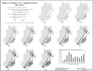
And here’s an example of the time-series small multiples layout. I like having the addition of graphs and charts on the same layout when needed. This one doesn’t have any bounding boxes around the individual maps – much better.
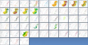
Then there’s the inadvertent small multiples layout that I made just the other day. I wanted to show off some map work that I had just completed on twitpic. All the maps were in a Word document so to show all 48 maps at the same time I just viewed them at about 10% scale or so and took a screen shot. It turns out to give a nice overview of all the different datasets in that project on one screen. A twitter friend mentioned that it was like Tufte’s small multiples, which then gave me the idea to write…guess…this blog post.
So if there is anyway that you can utilize the small multiples concept in your current or forthcoming projects I think you can see that it will make a big contribution. By allowing your map readers to “see” the data and analyze it with their own eye a great deal of credibility can be earned and perhaps even a few new conclusions.
Not to Complicate Things but…More on Complexity
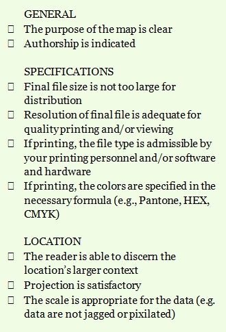
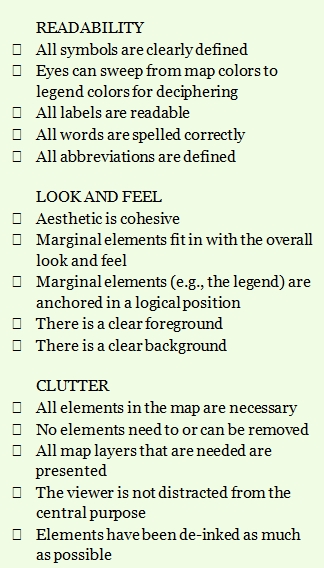
The other day I posted a checklist of things to evaluate when reviewing a finished map product. There’s a sub-section titled CLUTTER, with most of the items hinting that more is less, complexity is bad, and clutter is worse. There is one item, however, that speaks to the idea that the map ought to have all the layers of information on it that is needed. With that item I was hoping to convey the idea that one shouldn’t take away too much just for the sake of decluttering.
A few years ago I posted a map on Cartotalk for review and was quickly informed that the background had too much white-space. The original idea behind the white-space was, of course, to keep the map simple and uncluttered. But the critics were right in that having some sort of background, even a simple one, gives the impression that there’s something back there. The map reader needed context.
In Donald Norman’s “Living with Complexity” he states, “One fundamental principle is that there is a preferred range of complexity: things that are too simple are boring, shallow. Things that are too complex are confusing, upsetting. People prefer an intermediate level of complexity.”
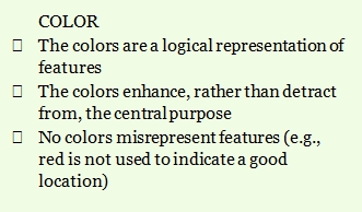
Map Evaluation Checklist
This list can help you evaluate the effectiveness of a map as well as help guide you during the design and implementation phase. If there are worthy additions to be made, please let us know in the comments.
Beginning a Cartography Project, Part 3: Colors and Type
Once the audience for the map is considered (see Part 1 of this series) and a sketch map is made and agreed upon (see Part 2 of this series), it is time to further the planning of the overall look and feel of the map by deciding on a color scheme and typography.
Color Scheme
Before you begin creating a color palette for the map with wild abandon, first find out if there are certain colors that must be used on the map. The first possibility is that the map should have colors that represent the company for which you are making it. For example, the Trust for Public Lands has an exact green color that they want to have on most of their products. You’ll need to get the specifications for that green color before designing a map for them. In this example the green hue is not something that has to be incorporated in the map itself, but rather needs to lend the overall layout the TPL signature look – so it is most useful as a border or background color to the entire layout.
The second possibility is that certain data layers on your map need to be represented with a particular color palette. For example, a geology map would need standard geologic colors and a soil age map could utilize a standard soil age palette. Furthermore, the usual standards regarding feature type and color will still hold true: blue for water, red/brown/black for roads, and so on.
Even if you are constrained by some of these color limitations, there will likely be features and elements that you need to create your own colors for. Begin creating your palette by compiling color swatches (I use PowerPoint for this, of all things, but any easy to use graphics program or even your GIS would do) for the colors that are required. Round out whatever there is left to render by picking and choosing colors, matching them with the colors you already have, and figuring out what looks good together. Don’t forget to consider the mood of the piece (loud or soft) as well as accent and background colors. I like to use a generic map in the GIS to populate the colors with so I can make sure they look good together in map form too.
Typography
Choosing the type for your map is much easier than choosing the colors if there aren’t a lot of annotation levels involved. The more annotation levels that you have (think 6 different city/town label groups) the more trouble you will have picking typefaces that have enough variation to capture the different levels while still allowing a cohesive look.
If you do have a lot of annotation levels then pick a typeface with a lot of flavors (e.g., oblique, italics, roman, bold, extra bold). As with colors, always ask your client if they have a corporate typeface that they would prefer you incorporate. Even if you don’t use it in the main map, you could use their typeface for the title and margin elements.
Initial Design Phase = Complete!
Well, that’s it. That’s all there is to the initial design phase. It’s a lot of upfront work and it isn’t your usual fumble-through it using intuition approach. With your audience on board from the get-go they’ll have more buy-in with the finished product. With a sketch map you won’t have to do many on-screen layout changes as you enter the build-phase. And with a design-board of colors you’ll have a template for your next cartography project.


Recent Comments