Archive for February, 2011
GISCI Poster Contest
Reprinted from the GISCI newsletter:
*********
We are pleased to announce our first annual map contest! We are seeking anyone who can incorporate our existing database of nearly 5,000 GISPs and generate a high quality cartographic representation of our member distribution. If you are up for a map design challenge, please enter!
Prizes: 1st Place – $500, 2nd Place – $250, 3rd Place – $100, People’s Choice – $500, plus honorable mentions. Each winner will also have their initial certification fee waived if the application is submitted within one year of the date the winners are announced. Current GISPs will have their renewal fees waived at their next recertification date.
Judges
- Roger Tomlinson, GISP – Father of GIS
- Gretchen Peterson, GISP – Renowned cartographer
- Kirk Eby, GISP – Treasurer of the Cartography and Geographic Information Society
Please visit our website for more details. Submissions will be accepted from March 1-31, 2011.
**********
Unfortunately I can’t seem to find a link to the “more details” referenced above. If you have the link please share it in the comments. When I saw the title they gave me – renowned cartographer – I have to say I was mighty pleased. (Nothing like a little flattery to get someone to judge a contest!)
Choropleth Limitations
Posted by Gretchen in Best Practices on February 12, 2011
*This post was updated on 1/27/2016.

County level choropleth map of planted soybeans by area, created by PetersonGIS via some crazy USDA data wrangling efforts. This data and the associated geo-analytics (gathered for most of the country) were used as part of the inputs to a Colorado State University climate model.
Choropleth mapping, which shows the distribution of a variable within an enumeration unit, is a staple in every cartographer and GIS professional’s arsenal. However, it is always good to keep in mind the limitations of our tools, and the choropleth map does have some. These limitations are:
- The distribution of the variable is static at the scale of the map. No inference can be made about the variable at a more detailed scale. For example, the distribution of noxious weeds can be shown by state within the U.S. However, the distribution of noxious weeds within states (by county, perhaps) cannot be determined from a state map.
- It can look like the variable is constant across the unit, possibly resulting in map-reading failure. (Similar to above.) For example, if a state is colored red to denote a high level of noxious weeds, this may make the map reader think the entire state is over-run with noxious weeds when perhaps it is only one area of the state.
- The change between the enumeration units can appear to be quite crisp when in reality the variable is probably much smoother across those boundary lines. One state might be green for noxious weeds and a neighboring state could be red even though the counties on either side of the state line are more alike than different.
- Usually, you don’t show the actual value for the variable, you show the area-weighted or population-weighted value. This could be a limitation if a future map-reader wants to use your values for a different analysis or visualization because the raw data counts aren’t available, only the ratio values. We aren’t generally concerned about this limitation as cartographers, but if you feel like your data will be needed as raw data values in the future, the raw data could be supplied along with the map in a database or table.
- Make certain that your choropleth shows area-weighted or population-weighted data when needed (hint: almost always). For example, a map of TV watchers will probably resemble a population distribution map and should therefore be normalized by population such as the number of TV watchers in each county divided by the number of people in each county.
- The enumeration units may not have much to do with the variable. Noxious weeds probably have much more to do with land use and soils, for example, than with the state administrative boundaries.
- If your study units are of widely different sizes it can be difficult to show the color shading adequately in the smaller units. For example, in a map of U.S. states the smallest units – D.C., Rhode Island, Delaware – can be difficult to see. Some modern maps alleviate this difficulty by using hexagons as the enumeration units, with each hexagon signifying a state, for example. However, these are only useful for well-known geographic units like U.S. states or Admin 0 level data (countries).
- Related to the above point, misinterpretation can occur if a very large unit is colored brightly. If a large state has the same noxious weed / area ratio as a smaller state, and they are both colored bright-red, the larger state may appear to have a bigger problem even though the ratio is the same.
You may also be interested in these posts:
Your donation in support of this blog is very appreciated! It’s simple to make a donation with PayPal using my link.
I've updated my post on Choropleth Limitations. https://t.co/sI04IvvaI2
— Gretchen Peterson (@PetersonGIS) January 27, 2016
Nice post on choropleth limitations to keep in mind. https://t.co/2DGgzpMax5
— Alexandre Neto (@AlexNetoGeo) January 27, 2016
Gifts to Clients
Posted by Gretchen in Cartography Profession on February 10, 2011
This morning I had the opportunity to meet a really nice group of freelancers here in Fort Collins, most of whom are members of Cohere, a co-working facility. The topic of discussion for the breakfast meeting was “how do you show your clients or customers that you care?” Most of the answers involved gifts. Things like a certain brand of chocolate bar (easier to mail because they are relatively flat), spirits with custom labels, forget-me-not flowers, restaurant gift certificates, and the like.
Those are all great ideas for gifts. However, gifts are not a common thing in the cartography/GIS business. Additionally, many of my clients are local government agencies where gifts above a certain dollar amount are prohibited.
I mentioned that I show I care in a different, although I hope just as meaningful way, by always being there for my clients. If something needs to be done over the weekend, I do it. I almost never claim that I am too busy to get a task done. How do I make this work, you might wonder? Because I will do whatever it takes to get that task done on time even if it means hiring sub-consultants to help out.
If I can give at least a portion of the task to someone else, I will (I’ve been very fortunate to have some great people to help out when needed). If the task involves something that is too complex for me to give to someone else, I’ll outsource other portions of my business tasks for that period of time, such as editing, organizing, writing, or invoicing.
This is why I love being a consultant. I can be this flexible with my duties in order to provide maximum return on my time and my client’s time.
A management consultant in the group mentioned that he shows he cares by always getting back to people within two hours. I do the same thing. Even if it is just a short email or call stating when I can get back to the person. There really is no excuse, in the age of email, texting, and twitter, that I can’t get back to someone in a short period of time. That’s right – even when I’m on vacation.
Now, the management consultant mentioned that occasionally he’ll have a client who will take advantage of this. However, I haven’t had that particular problem. People tend to respect other people’s time.
What are you doing for your clients to show them you care?
Interviewing the Map Audience
One of the first things you do when tasked with making a new map is to find out what the audience for the map needs to see in that map. It sounds simple enough but, incredibly, this step is skipped in a lot of mapping projects. Your audience – whether it is one person like your boss or client, one organization, or the readers of a magazine in worldwide circulation – needs to be considered. With most audience types you can either talk to the person who will be receiving the map or you can poll a cross-section of potential map-readers.
You might think that you need to come up with a list of questions to ask the map audience, and you’d be right. But here I want to focus on the thing you can do at the very beginning of your interaction with the map audience, before you start in on the detailed questions. You need to ask them:
What questions should the map answer?
So here you see that instead of giving you answers, per se, they are going to give you questions! Some example questions that the audience may give you are:
- Where is X most prevalent?
- Does the spatial distribution of X correlate with the spatial distribution of Y?
- What landmarks are along the route?
- What direction does X line feature flow?
- How does X relate to its surroundings?
- and so on
Now, the best part of this technique is that it gets the audience to focus on what really matters with the map: it’s story. It might be a bit cheeky, but it would be nice to ask at the end of the interview: if the map answers these questions, will you consider it a success? Now, you don’t have to actually ask this question but what I am getting at is that you’ve gotten the audience to focus away from the design-aspects of the map and toward the real meaning of the map. This leaves the design choices, which the audience sometimes gets very side-tracked by, up to you. Perhaps you can make it clear, up front, that your design choices (font, color, layout, and so on) will support and enhance the map in relation to those questions.
Once the map is completed, you must always listen with a careful ear toward any criticism that it may receive. However, if you feel that your design still has merit despite, for example, a criticism on the use of color, you can defend the choice in relation to how it helps to answer one of the questions gathered during the initial interview. For example, “I used that color in order to call specific attention to the landmarks, which was one of the things you asked for.”
When is Complexity Okay?
Posted by Gretchen in Best Practices on February 8, 2011
We often hear about simplifying and reducing in relation to map design. However, if you have enough time and patience to manipulate a lot of data layers and a lot of labels, you can make a complex map look good. So when do you know if your complex map is effective?
- When all the labels are legible
- When labels do not overlap
- When whitespace – or empty space – is still there
- When background and foreground are distinguishable
- When the colors are cohesive
- When there’s still a noticeable balance, either continuous pattern or strong focal point (see Map Balancing Tricks)
How I Made Valentine’s Day Stickers
Posted by Gretchen in Creativity on February 7, 2011
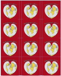
To make these Valentine’s Day stickers, I ordered these 2.5″ diameter white labels, then created an ArcMap project using the continent and world30 layers rendered with colors chosen from page 16 of Colors for Maps (colors 6, 1, 9, and 4). The projection was set to World Bonne (an old heart-shaped projection, not really in use anymore). The 2″ by 2″ map was imported into a Word template for the stickers. The Word background was set to the same background color as the map image.
Getting the text on there was difficult. I wanted it to say Happy Valentine’s Day but there just wasn’t enough room. I settled on Valentine’s Day 2011. Here’s the way they look in Word:
If you want to print these yourself: Click here to download the .docx file, then click Valentines2011.
After that it was just a matter of printing them on the InkJet. My elementary-school aged kids will be giving these out along with their valentine cards!




Recent Comments